1.191 FAQ-892 How to plot evenly spaced column/bar for unevenly spaced numeric X?Evenly-Space-ColBar
Last Update: 5/14/2021
If you have numeric X and select one Y column to plot column/bar chart
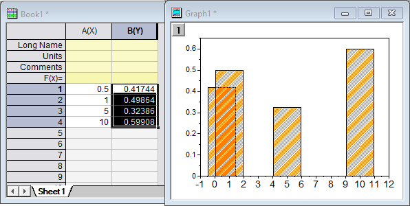
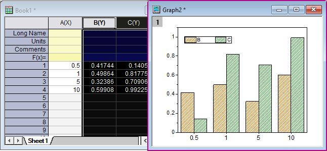
If you were to select B(Y) in the following worksheet and create a column plot (Plot > Basic 2D: Column), the default would be to create the graph shown to the right of the worksheet. This happens because Y values are plotted on a numeric X scale.
If, on the other hand, you had wanted to plot the bars as evenly spaced on the X axis, there are a couple of options:
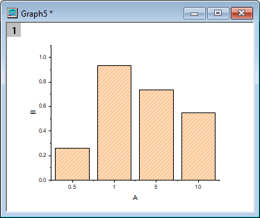
Plot by X Column Value:
Setting the X column as Categorical will treat the X values as categories rather than numbers.
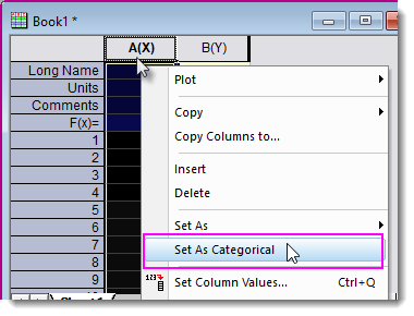
- Highlight and right-click on the X column and choose Set As: Categorical.
- Highlight Y column to plot a column/bar graph.
Notes:
- !!!Drawback: Since the X column Format is changed to Text, you will not be able to use it as numeric data for subsequent analysis such as curve fitting.
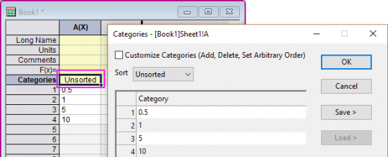
- If you want to reorder the categorical values, double click on the Categorical cell and then change the order in the Categories dialog.
- In Origin 2017 or earlier versions, column/bar chart always plots column/bars at numeric X location no matter you choose one or more Y columns. So if you have non-evenly spaced X values and want to plot them as evenly spaced columns/bars, you can follow the above method.
|
Plot by Row Number:
Rather than use X column values, this method plots against row number.
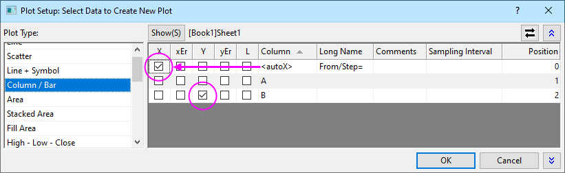
- Without selecting any worksheet data, click Plot > Basic 2D: Column and designate X and Y as shown below. If you do not see the <autoX> option under Column, right-click in the right panel and click on Allow Row# as X.
- Click OK.
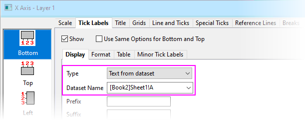
 | You can display the X values at each tick by double-clicking on X-axis labels, then setting Type = Text from dataset and from the Dataset Name drop-down, choosing the X dataset.
|
If you have numeric X and select multiple Y columns to plot column/bar chart
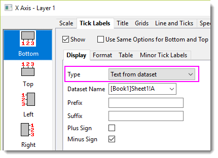
In Origin 2018 and later, Columns/Bars are plotted with evenly spaced X by default.
This is done by setting X tick labels as Text from X dataset.
| Notes:
If you want to show Columns/Bars at their actual numeric X locations, there are two approaches:
- Double-click on any X tick label to open Axis dialog.
- On the Tick Labels tab, set Display> Type as Numeric. Click OK.
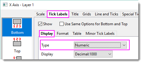
- Click the Rescale button
 to show the full scale range. to show the full scale range.
Alternately
- Select Preferences: System Variables... menu.
- Set system variable @DRX as 0. See this FAQ for information on setting the value of a system variable.
|
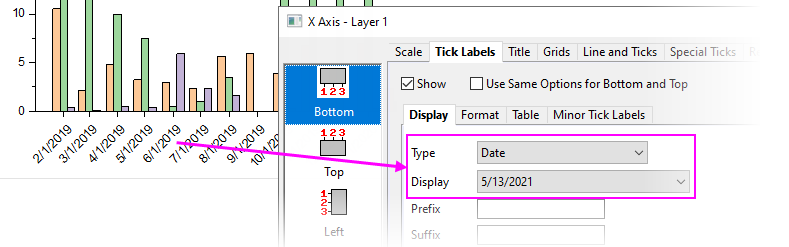
A note on plotting date-time data
Prior to Origin 2021b, date-time values in the X column would be treated as Text from dataset when labeling the X axis. This doesn't produce a true date-time scale.
This is changed and now date-time values in the X column will be treated as Date when labeling the X axis of the Column/Bar plot.
Keywords:unevenly spaced, column, bar, evenly spaced, equally spaced, isometric, discrete, date, time
|