1.2 FAQ-112 How do I add a second nonlinear x or y axis to my graph layer?2nd-Nonlinear-Axis
Last Update: 12/2/2025
Using the Built-in Menu
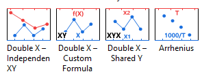
Starting with Origin 2026, you can use one of four built-in double X-axis templates. Access them by selecting Plot > Multi-Panel, Multi-Axis.
Other Methods
Method 1: Using the Double X Plot App
The Double X Plot can help to create a Double X Axis plot by selecting from a set of pre-defined templates
Method 2: Manually Creating the Graph
Opposite Axes in Same Layer
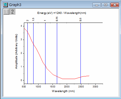
A single layer is comprised of 4 axes: bottom X, top X, left Y and right Y. The graph below is a single layer where both the bottom X axis and the top X axis are displayed. The bottom X axis is wavelength in nanometers as present in the raw data. The top X axis represents energy. Each tick label on top axis is calculated with formula: Energy (ev) = 1240 / Wavelength (nm).

Here are the steps:
- Double-click the bottom X axis to open the Axis dialog.
- Select the Line and Ticks tab. Select Top on the left panel. Check Show Line and Ticks checkbox.
- Still with Top selected on the left panel, go to Tick Labels tab. check the Show check box.
- On Display tab, Enter 1240/x in Formula box and click OK button.
- If the tick labels do not display as nice rounded numbers, you can open the Axis dialog again and set decimal places or display on Display tab of Tick Labels tab.
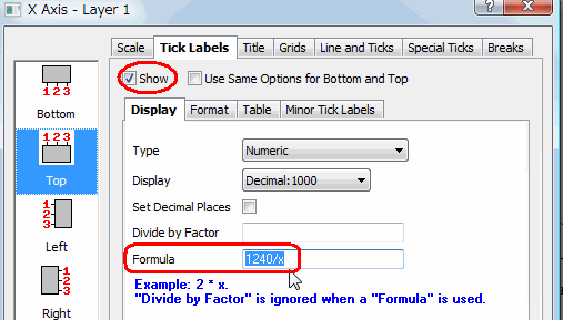
 | When creating a Formula for axis labels, use "x" to refer to the current axis, whether it is an X, Y or Z axis.
|
See Also: FAQ-122 How do I format the axis tick labels?
A New Layer
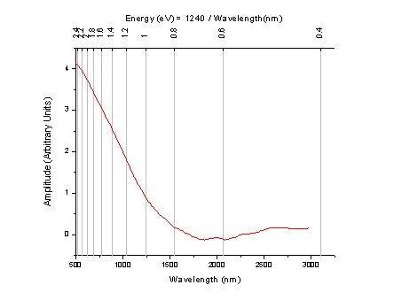
In the example above, top X and bottom X axes use the same settings. Only tick labels on top are calculated using the formula. If you want to control the top X axis independently, such as scale type and tick positions, e.g. show ticks in a reciprocal scale as the image below, you need to add a new linked layer with top axis showing.
Here are the steps.
- Select Insert: New Layer(Axes): Top X menu to add a linked new layer with Top X axis showing.
- Double-click the graph to open Plot Details dialog.
- Select TopX node on the left panel, and go to Link Axes Scales tab.
- Choose Custom in X Axis Link group, and enter the following formula to calculate the Start and End Values of the Top X axis.
- Next to X1 = enter: 1240/x1
- Next to X2 = enter: 1240/x2
- Click OK to close the dialog.
- Double-click the top x axis to open the Axis dialog.
- On Scale tab, select Reciprocal in the Type field.
- On Grids tab, check the Show check box under the Major Grid lines branch.
- On Tick Labels tab, choose the Format tab, and select 90 in the Rotate (deg.) dropdown list.
Note: If you want to change the scale range, please double click bottom axis to change its From and To values. Top axis range will update accordingly.
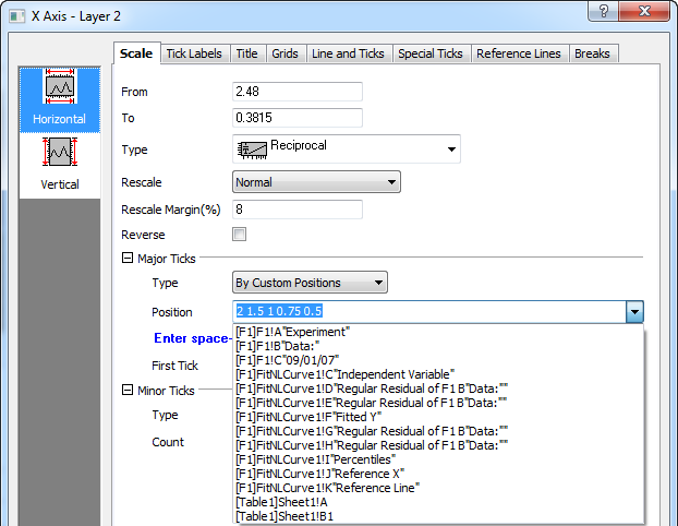
Tick Location From a Dataset
Continue with A New Layer section, you can even position major or minor ticks at specified locations (therefore, also the grid, if any), such as the image below.
Here are the steps:
- Double-click on top axis to open the Axis dialog.
- On Scale tab, under Major Ticks branch, select By Custom Positions from Type drop-down list
- In Position combo box, enter 2 1.5 1 0.75 0.5 directly. Or, select the column from the drop down list if tick positions are stored in a column.
You may also wish to view this Quick Help: special ticks
Keywords:link, formula, equation, frequency, wavelength, energy, reciprocal, non-linear, scale, arrhenius
|