2.43 FAQ-479 What is a Sparkline and how do I customize it?Sparkline
Last Update: 5/26/2022
Sparkline is a term coined by Edward Tufte[1]. The term refers to a small graph that illustrates data content and can usefully be included in a document. You can add a small graphical image (line plot, box chart or histogram) to the column heading of any worksheet column containing numeric data. Highlight the column(s) and select Column: Add or Update Sparklines.
A dialog will open where you can choose to plot Y columns against their associated X column, Plot Y Against X. This box is unchecked, so by default all columns (including X columns) will be plotted against the worksheet row index. For more information on the sparkline dialog, please see the X-Function help file for sparklines.
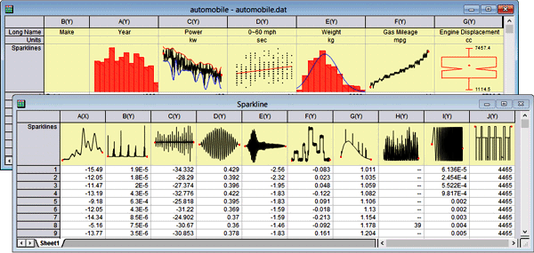
Adding sparklines to your worksheet, allows you to quickly view the shape or distribution of the data across many columns in a sheet without having to create graph windows. Each sparkline object is in fact an embedded graph which can be brought up for editing by double-clicking on the sparkline.
 | Sparklines can, in large numbers, cause Origin to act sluggishly. If your project is difficult to work with and you suspect sparklines may be contributing, you can prevent sparkline creation and hide existing sparklines in the project using system variable @SPK. Additionally, you can delete sparklines from the current project using delete -spk.
|
Keywords:graph, curve, word size, view, data, embed, aspect ratio, stretch
Minimum Origin Version Required: 9.1 SR0
|