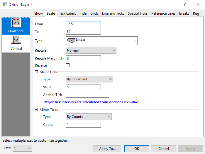
8.4.2.1.2 The Scale TabAxesRef-Scale
This tab provides controls for axis scale, including the axis scale range, axis type, major and minor tick positions.etc. For 2D graphs, you can separately customize the Horizontal and Vertical; for 3D graphs, there are three axes (X, Y and Z) to be customized.
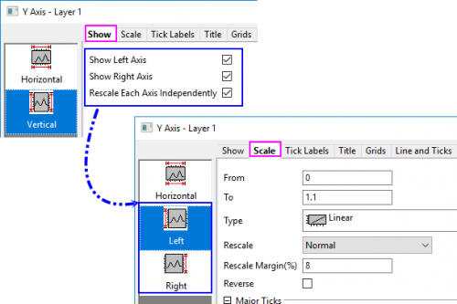
 | Since Origin 2023, once you have shown both right Y and left Y axis, and set Rescale Each Y Independently in the Show tab, there will be two seperate vertical icons Left and Right to let you cusotmize the left Y axis scale and right Y axis scale seperately.
|
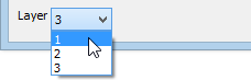
Layer Selection
Before customizing the scaling elements, you can use the Layer list to switch between layers in a multi-layer graph.
From
Set the initial scale value in this text box.
To
Set the final scale value in this text box.
Type
This drop-down list will be grayed out if it is not supported for a specified plot type. In addition, some of the following options may not be available for some plot types.
| Linear
|
Standard linear scale: X'=X. 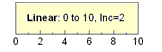
|
| Log10
|
Base 10 logarithmic scale: X'=log(X). 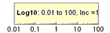
|
| Probability
|
Represents the inverse of a cumulative Gaussian distribution: X'=norminv(X/100). Plotting a cumulative Gaussian distribution produces a sigmoidally-shaped curve. This curve, when displayed on a probability scale, appears as a straight line. Since probabilities are expressed as percentages, all values must fall between 0 and 100. The probability scale range is 0.0001 to 99.999.
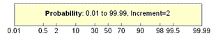
|
| Probit
|
Like the probability scale, a sigmoidally-shaped curve plots as a straight line. In this case, however, the scale is linear, and the increment between tick marks is exactly one standard deviation. The value "5" on the scale shows the mean, or 50% probability. "6" is one standard deviation away, etc.
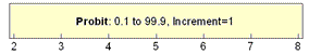
|
| Reciprocal
|
Reciprocal scale, where X'=1/X.
|
| Offset Reciprocal
|
Offset reciprocal scale, where X'=1/(X+offset). Offset is defined as 273.14, where 273.14 is the absolute temperature for 0° C. 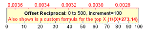
|
| Logit
|
Logit=ln(Y/(100-Y)). As with the probability and probit scales, a sigmoidally shaped curve plots as a straight line.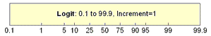
|
| ln
|
Natural log scale (base e logarithmic scale). 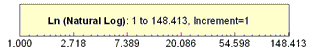
|
| log2
|
Base 2 logarithmic scale. 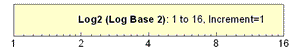
|
| Double Log Reciprocal (Weibull)
|
Double logarithmic reciprocal scale: X'=ln(-ln(1-X)). 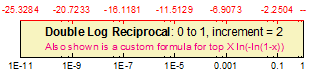
|
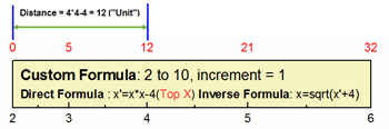
| Custom Formula
|
User-defined axis space by Direct Formula and Inverse Formula
- Enter a formula to define a one-dimensional space transformation for the axis.
- Enter a formula to define a one-dimensional inverse space transformation for the axis.
- Note: This formula must be the exact inverse of Direct Formula. The From value of this axis cannot exceed the range of the Inverse Formula.
Two formulas are using x to represent the variable. For example:
Direct Formula: x*x-4
Inverse Formula: sqrt(x+4)
|
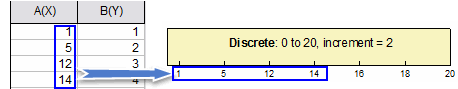
| Discrete
|
Use the X values of the first plot in the current layer as tick labels. This scale type is linear except it takes X values as tick labels and eliminates the extra (like weekends and holidays in Financial Plots). If the Scale range(set by From and To controls) is larger than the actual X data range, the excess part will show as linear scale according to the Major and Minor Ticks settings.
|
| A Note on Log10 Scales:
If the log scale range is within one decade, the ticks and grids will be linear. The LabTalk system variable @TL determines whether to use linear tick marks by the following relation:
10 * log10(max/min) <= value
Thus, to support linear tick locations for two decades, set this variable to 14. For example, you could enter the following in the Script window:
@TL = 14 ;
The default value for @TL is 10.
|
Symmetrical Log Scale
This option is shown, when Scale Type is Log10, Ln or Log2.
Generally, Origin only supports positive values for the Log10, Ln or Log2 scale. Check this Symmetrical Log Scale option, it will support positive and negative values on the log scale.
When this option is available, these two options Linear Range Threshold and Linear Range Length are shown in the dialog.
Linear Range Threshold
There is not zero value in the log plot, so you can use Linear Range Threshold to define a range of values near zero within which the plot is linear, to avoid having the plot go to infinity around zero.
The default value of Linear Range Threshold is 1.
Linear Range Length
Specify ratio of one major tick interval of current log scale. The default value is 1
Rescale
| Fixed
|
The axis is not rescalable. If you try to change the scale or perform an operation which changes the scale (for example, using the Scale In  tool), Origin preserves the From and To values. If both axes in a 2D graph layer are set to Fixed, using the Scale In tool opens a dialog box asking if you want to change to Normal mode and rescale. Click Yes to temporarily override the scaling restriction. tool), Origin preserves the From and To values. If both axes in a 2D graph layer are set to Fixed, using the Scale In tool opens a dialog box asking if you want to change to Normal mode and rescale. Click Yes to temporarily override the scaling restriction.
|
| Normal
|
The axis is rescalable. Alter the axis scale and use the Scale In tool (for 2D graph layers) without restriction.
If you are adding or removing datasets from the graph using the Plot Setup or Layer Management dialogs, you will need to select the Rescale check box in those dialogs, if you want to automatically adjust scales on data change.
|
| Auto
|
This option is similar to the Normal option, but also allows Origin to automatically scale the axis to accommodate plotted data, if necessary.
Note: If you hide/unhide a data plot the axis will not rescale automatically even though the Rescale is set to Auto. Set system variable @PAR = 1 to trigger auto-rescale for such cases.
|
| Fixed From - Normal To
|
The From value of the axis is fixed and can only be changed by editing the From text box value in the Axis dialog box, while the To value of the axis is in Normal mode.
|
| Normal From - Fixed To
|
The From value of axis is in Normal mode, while the To value of the axis is fixed and can only be changed by editing the To text box value in the Axis dialog box.
|
| Fixed From - Auto To
|
The From value of axis is fixed, while the To value of axis is allows Origin to automatically rescale.
|
| Auto From - Fixed To
|
The From value of axis is allows Origin to automatically rescale, while the To value of axis is fixed.
|
Rescale Margin(%)
When rescaling graph axes, this setting can be used to pad dataset minimum and maximum values by some percentage of the difference between the minimum and maximum data values in the N dimension. Because other factors also enter into the resulting scale -- rounding of minimum and maximum values, the scale increment, minor ticks, etc. -- Rescale Margin is best treated as an approximate value.
- If you set Rescale Margin(%) = 0 and set Minor Ticks (By Counts) = 0, then a Normal rescaling will result in From and To values that correspond to dataset minimum and maximum values, i.e. the resulting axis scale will add no padding to minimum and maximum values.
- The default method of padding dataset minimum and maximum values should generally suffice but for more precise control, users can manipulate the value of system variable @RRT. When Rescale Margin(%) exceeds the value of @RRT, the default method is used. When Rescale Margin(%) is less than the value of @RRT, then dataset minimum and maximum values are padded by quantity n * (data.max - data.min), where n = Rescale Margin(%), to arrive at scale From and To values.
- This control is also available for polar axes (both angular and radial axis) and radar chart axes. It is not supported for graphs created from a matrix.
Reverse
Check this box to reverse the From and To scale values.
Major Ticks
Type
| By Increment
|
Set the major ticks of this axis by increment specified in the Value text box. Tick labels are placed at each major tick mark. For example, type 10 to display a major tick mark at every tenth value.
|
| By Counts
|
Set the total major tick number displayed on this axis by the absolute number specified in the Count text box.
|
| Min & Max
|
Only show the ticks at the minimum and maximum of the X scale.
|
| By Custom Positions
|
Set the location of the major ticks using an existing dataset or a series of space-separated numbers in the Position combo box.
|
| By Plot Column Label
|
Use values in a column label row to label major ticks. Set label row in the Column Label drop-down list. (See the fourth box chart in this list for an example.)
|
Value
This option is only available when By Increment is selected for Type. Set the major tick increment for this axis in the associated text box. If the scale units for this axis are time series values, then the value in the Increment text box must indicate the increment in appropriate time series terms. The permissible time series step increment units and their allowable abbreviations are:
| Increment
|
Abbreviation
|
| sec
|
s
|
| min
|
m
|
| hour
|
h
|
| day
|
d
|
| week
|
w
|
| month
|
mo
|
| quarter
|
q
|
| year
|
y
|
For time series graphs, set the size of the increment by typing a number followed by an increment unit. For example, 1month sets a major tick increment of one month. 4Q sets a major tick increment of four quarters. (Do not leave a space between the number and the increment unit.)
Count
This option is only available when By Counts is selected for Type. Specify the desired absolute number of total major ticks in the associated text box.
Notes:
- The maximum number of major ticks is controlled on the Axis tab of the Options dialog box (Preference: Options). You will not necessarily see this number of ticks used as Origin will still try to display reasonable numbers for Tick Labels.
- It is also allowed to use minus value for major tick numbers, so as to make the tick label numbers rounded-up. In case of negative major tick numbers, Origin will try to get the best range to make sure the tick labels are integers and the total tick number will try to be closest to the absolute value which was set, but not exactly the same.
|
Position
This option is only available when By Custom Positions is selected for Type. Select the dataset as the major tick locations in this drop-down list. Also you can enter the desired dataset name or a series of numbers separated by Space.
| In the Position combo box, the most recently active worksheet columns are listed first. So, instead of scrolling down, close this dialog box, click on the desired book and sheet, then reopen this dialog box.
|
Column Label
This option is only available when By Plot Column Label is selected for Type. This combo box list Auto and the available column label rows (Long Name, Units, Comments etc.)
- Auto: Determined by plot's own. It mainly means index.
For Box/Waterfall plot, it means following the selection in the X position drop-down list of the Plot Details dialog.
Anchor Tick
This option is available when By Increment or By Counts is selected for Type. Specify the major tick you want to make sure to show on axis.
For example, if your X axis range runs from -3 to 3 and increment is 2. and you want to make sure 1 shows . Set Anchor Tick to be 1, the major ticks show at -3, -1, 1, 3.
Notes: When using calendar-accurate date values as tick labels, the option can be used to specify the value of the first major tick label to be displayed, and at what value subsequent minor ticks should fall. by entering text with format below
- Specify both a major and minor tick value, include a comma after the major tick value, followed by the minor tick value.
For example, if your X axis range runs from 1/1/99 to 12/31/99, you could specify that the first major tick label fall at 1/4/99, and that all subsequent minor tick marks fall on a Monday, by entering any of the following in the Anchor Tick text box:
- 1/4/99, Monday
- 1-4-99, Mon
- Jan 4 1999, M
|
Minor Ticks
Type
| By Counts
|
Set the number of minor ticks displayed between adjacent major ticks specified in the Count text box. For example, select By Increment for major tick Type, type 1 in the Value text box, and type 1 in the minor tick Count text box to set the tick sub-step to 0.5. One minor tick will display between each pair of major ticks.
|
| By Custom Positions
|
Set the location of the minor ticks using an existing dataset or a series of space-separated numbers in the Position combo box.
|
Count
This option is only available when By Counts is selected for Type. Specify the desired absolute number of minor ticks in the associated text box. If the scale units for this axis are time series values, then Origin uses the number to automatically determine the most appropriate minor tick labels.
Position
This option is only available when By Custom Positions is selected for Type. Select the dataset as the Minor tick locations in this drop-down list. Also you can enter the desired dataset name or a series of numbers separated by Space.
|