16 How to Handle Repetitive TasksHandling-Repetitive-Tasks
Automating Origin
Batch Processing
Analysis Report Sheets
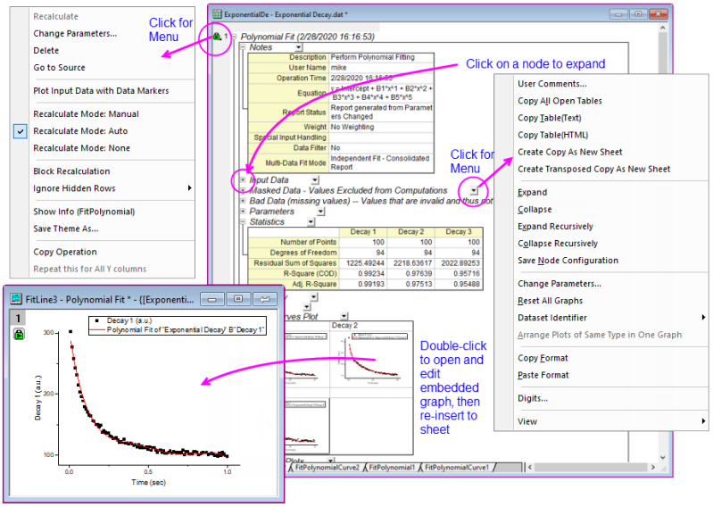
Analysis operations, such as those performed with the tools listed in the Analysis chapter or in the Statistics chapter, create detailed Analysis Report Sheets.
- Analysis Report Sheets contain tables that are organized in a tree structure.
- Expand or collapse each branch to show or hide table contents.
- Tables are not static reports. They are constructed using placeholders linked to particular analysis results and thus, results can be recalculated with changes to input or analysis parameters.
- You can add comments to the sheet or copy tables and paste or paste-link them to other windows in your project.
- Analysis Report Sheets often contain embedded graphs such as fit curves or residual plots. To customize these plots, double-click on them. This opens the embedded graph in a separate window where -- as with any Origin graph -- you can customize it using Mini Toolbar buttons or Plot Details controls. When you are done customizing, click the Close
 button and re-insert the customized graph back into the report sheet. button and re-insert the customized graph back into the report sheet.
For more information on Analysis Report Sheets, see the Origin Help File.
Recalculation
Recalculation of Results
All Analysis and most data processing dialog boxes in Origin include a Recalculate Recalculate control. This control allows you to tie output operations to the source data. When Recalculate is set to Auto or Manual, changes to the source data will trigger an update of the output (pending, in the case of Manual). This allows you to analyze multiple datasets by, for instance, serial import of a new data file to replace existing data. This feature is also the basis for creating Analysis Templates. The Analysis Template concept is explained below.
Auto Recalculate
Manual Recalculate
Lock, Recalculate
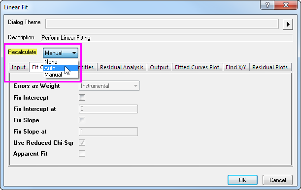
The Recalculate control has three modes:
| None
|
- No lock is displayed in the output.
- Changes to the input data will not result in an update of the output.
|
| Auto
|
- An auto green lock
 displays on the output columns and graphs of the output data. The main operation lock displays on the left-most column as , while any related operations columns to right of the main operation display the "+" icon displays on the output columns and graphs of the output data. The main operation lock displays on the left-most column as , while any related operations columns to right of the main operation display the "+" icon  . .
- The output will be automatically updated when input data is changed.
- You can also click on a lock icon and open the dialog to make changes to the analysis settings, including changing the Recalculate mode.
|
| Manual
|
- A manual green lock
 is displayed in up-to-date output columns, and graphs that contain plots of the output data. Any related operations columns to right of the main operation display the "+" icon . is displayed in up-to-date output columns, and graphs that contain plots of the output data. Any related operations columns to right of the main operation display the "+" icon .
- A yellow lock
 indicates that input data have changed and recalculation operations are pending. You can trigger updates individually by clicking on a yellow lock and selecting Recalculate from the shortcut menu; or you can update all pending operations by clicking the yellow Recalculate button indicates that input data have changed and recalculation operations are pending. You can trigger updates individually by clicking on a yellow lock and selecting Recalculate from the shortcut menu; or you can update all pending operations by clicking the yellow Recalculate button  on the Standard toolbar. on the Standard toolbar.
- You can also click on a lock icon and open the dialog to make changes to the analysis settings, including changing the Recalculate mode.
|
Tips for Managing Recalculation Operations
- A left-click on the lock displays a menu that provides multiple options including changing analysis parameters, opening source data sheet, switching to result sheets, and controlling the status of the operation such as switching from manual update to auto update.
- The Standard toolbar displays a Recalculate button that shows green
 when all project operations are up-to-date and yellow when there are recalculation operations pending. If you have opened a project and you see that the Recalculate button is yellow, understand that calculations are pending and that the data and data plots you see in the project may not be up-to-date. when all project operations are up-to-date and yellow when there are recalculation operations pending. If you have opened a project and you see that the Recalculate button is yellow, understand that calculations are pending and that the data and data plots you see in the project may not be up-to-date.
- If a lock icon appears dark gray in color
 , this indicates that the associated operation was performed in OriginPro and the window or project has been opened in standard Origin. The operation is not supported by standard Origin and to modify or re-run the analysis, you will need to locate a computer with an OriginPro license. , this indicates that the associated operation was performed in OriginPro and the window or project has been opened in standard Origin. The operation is not supported by standard Origin and to modify or re-run the analysis, you will need to locate a computer with an OriginPro license.
- If a lock icon appears red
 something has occurred which makes recalculation operations impossible. Such conditions are rare but would occur if, for instance, you passed a project file that included a user-defined curve fitting operation to a colleague but failed to pass along your user-defined fitting function. something has occurred which makes recalculation operations impossible. Such conditions are rare but would occur if, for instance, you passed a project file that included a user-defined curve fitting operation to a colleague but failed to pass along your user-defined fitting function.
- Having many recalculation operations in your project file can slow down your work. You can block recalculation -- both Manual and Auto recalculation -- by clicking on a lock icon and choosing Block Recalculation from the popup menu. Placing a block on pending recalculations places a yellow "block" icon
 on each associated operation in the chain. Placing a block on up-to-date calculations places a green "block" icon on each associated operation in the chain. Placing a block on up-to-date calculations places a green "block" icon  on each operation in the chain. To remove the block, click on the "block" icon and clear the check mark (Note that clicking the yellow Recalculate button on the Standard toolbar does not update blocked operations). on each operation in the chain. To remove the block, click on the "block" icon and clear the check mark (Note that clicking the yellow Recalculate button on the Standard toolbar does not update blocked operations).
- To suspend all recalculation, press Ctrl+0, choose Analysis: Pause Auto Recalculate (worksheet only) or click the Pause Auto Recalculate button
 on the Standard toolbar. on the Standard toolbar.
- You can hide the lock icons on your graph window by clicking on the graph and, from the main menu, choosing View: Show and clearing the check mark beside Lock Icons. This does not remove associated operations from the graph window. To re-display the icons, repeat the procedure.
Dialog Themes
Dialog Box Themes
Themes, Dialog Box
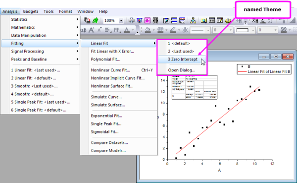
Settings in analysis dialogs and most other data processing dialogs can be saved as a Dialog Theme file. Once saved, these Theme files containing your custom settings can be recalled as needed. Multiple theme files can be saved from a dialog, allowing for easy repeat analysis of datasets that may each require different settings.
Last used dialog box settings are automatically saved as a <last used> Theme. Origin also allows you to save your custom settings as the <default> Theme. The default Theme, last used Theme, and any named Theme that you have saved, can all be accessed from the Dialog Theme fly-out menu that opens from the dialog box. The same Themes are also available from the main menu item associated with the analysis dialog box.
Dialog Themes are managed with the Theme Organizer tool, available from the Tools menu.

|
Tutorial: Saving and Re-using a Dialog Theme
- Import the file Linear Fit.dat from the Samples\Curve Fitting\ subfolder.
- Highlight column B and select Analysis: Fitting: Linear Fit...
- In the Linear Fit dialog that opens, check the Fix Intercept checkbox (under Fit Options) and set the Fix Intercept at edit box to 0.
- Click the
 button next to the Dialog Theme control and select Save as .... In the Theme Name box, enter Zero Intercept and press OK. Press OK again to close the Linear Fit dialog box and perform the analysis. FitLinear1 and FitLinearCurve1 result sheets are added to the workbook. button next to the Dialog Theme control and select Save as .... In the Theme Name box, enter Zero Intercept and press OK. Press OK again to close the Linear Fit dialog box and perform the analysis. FitLinear1 and FitLinearCurve1 result sheets are added to the workbook.
- Return to the source data and highlight column C. Select Analysis: Fitting: Linear Fit from the menu. You will see a fly-out menu with multiple Theme options including the Zero Intercept Theme you saved in the previous step.
- Select your saved Theme. The analysis is automatically performed on Column C using the settings saved in the Theme. Note that the dialog box does not open.
|
 | Tips for Working with Themes:
- Hold the SHIFT key while clicking on your Theme in the main menu and the associated dialog box will open with settings from the selected Theme loaded into the dialog box.
- The default Theme Origin shipped for an analysis is called System Default. Click the fly-out menu in the analysis dialog and choose System Default to load it.
- Click the fly-out menu in the analysis dialog and choose Delete to delete Themes you have created, including any customized <default> Theme.
- The customized <default> Themes for all analysis dialogs are saved in Defaults.xml in the User Files Folder. Deleting this file restores system default settings of all analysis dialogs.
|
Workbook and Project Templates
Templates, Workbook
Templates, Project
There are a number of reasons for saving a single workbook or an entire project, as a "template" file. Here are a few typical scenarios.
- You might import data files that always have a fixed number of columns with a repeating pattern of column designations (e.g. XYyError, XYyError, etc.) so you create a custom workbook just for importing these files (File: Save Template As).
- You regularly import data files of similar structure and you perform some routine graphing and analysis operations on the data, then generate a report using a worksheet or a workbook embedded Notes window. This would be a typical example of an Analysis Template (File: Save Workbook As Analysis Template).
- You perform some operations similar to those described in the previous example but you can't save your workbook as an Analysis Template because all data are cleared from the workbook on saving and that would destroy a sheet of reference values that you rely on for your analysis. Instead, you could opt to clear only the imported data and save your workbook as a window file (File: Save Window As). This preserves the sheet of reference data and like the Analysis Template, saves analysis and graphing operations with the workbook.
- You routinely import data, do some analysis and generate a report and would like to make use of the Analysis Template concept (as in the second bullet point), but you have multiple windows in your project, including Layout windows that cannot be embedded in the workbook. So, a single workbook Analysis Template won't do the job. In this case, you could save the project without data by "cloning" it (File: Clone current Project).
The Workbook as Template
The workbook can contain worksheets with data, metadata, floating or embedded graphs, embedded matrices and notes, plus scripts, variables and other supporting data. Embed Graphs, Origin Templates
You can save a workbook as a template for repetitive graphing and/or analysis tasks. Depending on your needs, there are three options for saving your workbooks -- as a workbook (OGWU), as a template (OTWU) or as an Analysis Template (OGWU):
- Workbook (OGWU): Choosing File: Save Window As saves all workbook content.
- Analysis Template (OGWU): Choosing File: Save Workbook as Analysis Template clears all data columns that are used in analysis operations in the workbook before saving. Operations are preserved as are data that are not associated with analysis operations.Analysis TemplatesTemplates, Analysis
- Template (OTWU): Choosing File: Save Template As saves the structure of the workbook, plus any analysis operations that exist in the workbook, but all data including data that are not associated with these analysis operations, are cleared.
| The New Book dialog is a template library for managing workbook, matrixbook and Analysis Templates. See Workbooks for an overview of dialog box features.
|
|
|
Tutorial: Creating an Analysis Template
- Start with a new workbook and import the file Samples\Curve Fitting\Sensor01.dat.
- Select column B and use the Analysis: Fitting: Linear Fit and open the Linear Fit dialog.
- Change the Recalculate drop-down to Auto.
- Click the Fit Control tab, check the Fix Intercept check box and enter 0 in the Fix Intercept at edit box.
- Click OK to close the dialog and perform the linear regression.
- Answer "Yes" to the prompt and switch to the FitLinear1 report sheet to view results including plots of the best-fit line and residuals.
- Now switch back to the original data sheet and import the file Samples\Curve Fitting\Sensor02.dat. The analysis results will be automatically updated with this new data. Note that you could continue to use this workbook for importing other data; or you could right-click the workbook window title and choose Duplicate without Data to create a new workbook with the linear fitting operation saved into it. This allows you to import new data into the new workbook and thus save a project with multiple such workbooks, if desired.
- With the workbook active, select the menu File: Save Workbook as Analysis Template..., and in the dialog that opens, give a name such as Linear Fit of Sensor Data and click Save.
- Choose File: Recent Books and select the template that was saved in the previous step. The workbook will open and the data sheet will be empty.
- Import the file Samples\Curve Fitting\Sensor3.dat into the empty data sheet (1st sheet). The analysis results will be automatically generated upon data import.
|
Analysis Templates can include summary sheets and custom report sheets (worksheet-based or HTML), making them an ideal medium for importing, analyzing, plotting and reporting the results of your routine analyses. When used in combination with the the Batch Processing tool, you can repeat a set of analyses and graphing operations for any number of data files and create a PDF summary report for each one, as it is processed. View the Batch Plotting and Batch Analysis sections of this chapter for examples of using the workbook as a template for handling repetitive tasks.
| Notes windows now support HTML. Notes windows can be added to the workbook (right-click on sheet tab and Add Notes as Sheet) making it easy to incorporate HTML reports into your Analysis Templates. For more information, see HTML Reports From Notes Windows.
|
The Project as Template
The Origin project file can also be used as a "template" for carrying out repetitive graphing and analysis tasks -- particularly when your analyses and graphing tasks can't be resolved within a single workbook.
The basis steps of creating a "project template" are as follows:
- Create the desired graphs and/or analysis results from data in your workbook(s) and save the project.
- After saving the project, choose File: Clone current Project. A small dialog opens for configuring your cloned project:
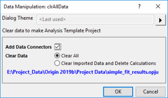
- Add Data Connectors: Check this box to add Data Connectors from the cloned project to your saved project. Each cloned worksheet will have a connection to the original worksheet in the saved project. If you plan to import data from other similar files in your cloned project, you should CLEAR this box.
- Clear All: Clear imported data only. Analysis operations are preserved in the cloned project.
- Clear Imported Data and Delete Calculations: Clears imported data and analysis operations.
- Click OK to create your cloned project. Selected data are cleared and the cloned project named UNTITLED is added to the workspace.
- Name and save the cloned project and when you are ready to process more data files, you can open it and import new data:
- If your analysis and graphing operations are linked to a particular set of data files that are periodically updated, you don't necessarily need to use Connectors. You can simply re-import the files (Data: Re-import... or Re-import Directly).
- If your operations are linked using Data Connectors, click the Connector icon
 and from the popup menu choose Import (this Connector only) or Import All (all Connectors in the book). and from the popup menu choose Import (this Connector only) or Import All (all Connectors in the book).
- One possible scenario is that you store all of your data in a single Origin project file. If you have added Data Connectors from your cloned project, to your original project then you can selectively import just the data that you need to perform your graphing and analysis operations. When you have finished, you can save the file to a new name, preserving your cloned project for re-use.
Batch Plotting
Batch Plotting
Origin provides several methods for batch plotting of graphs from multiple datasets or files. The following two sections outline how to create multiple graphs from (1) data that is already in worksheets, or (2) multiple data files. In addition to these two procedures, batch plotting can also be performed programmatically using LabTalk script or Origin C.
Duplicating Graphs with Data from Other Books/Sheets/Columns
If you have several workbooks, worksheets or columns with similar data structure as you the data used to plot the graph, you can have Origin clone that graph via Window: Duplicate (Batch Plotting) menu with new data. There are two cases:
- If you have plotted a graph with a single dataset and customized it, and want to clone the graph with other data in the same worksheet: Choose Window: Duplicate (Batch Plotting): Duplicate with New Columns. Pick other data (columns) that you want to plot. Each column will be plotted as a new graph.
- If you have plotted a graph with data in one worksheet or workbook and customized the graph, and you want to clone the graph with other worksheets or workbooks with a similar data structure: Choose Window: Duplicate (Batch Plotting): Duplicate with New Sheets/Duplicate with New Books. Origin will list all worksheets or workbooks with a similar data structure. Pick the worksheet or workbook you want to plot from. Each worksheet or workbook will be plotted as a new graph.Graphs, Cloning with New Data
The Workbook as a Template for Processing Multiple Files
If you want to plot graphs from many data files but don't want to import all files to workbooks before plotting, you can import one file, create the desired graph(s) based on that data, then add the graph(s) to your workbook and save the workbook as a template. Using this template you can process multiple files, creating a workbook for each file and its corresponding graph.
|
|
Tutorial: Creating graphs from multiple data files
- With a new workbook active, choose Data: Import From File: Single ASCII and import the file Sensor01.dat from the Samples\Curve Fitting subfolder of the Origin installation folder.
- Highlight column B and create a line+symbol graph of the data.
- Double click on the X axis to open the Axis dialog. Make sure Scale tab is active. Select both Horizontal and Vertical on the left panel and set Rescale to be Auto and click OK. This will ensure that the graph scale will update automatically on data change.
- In the workbook, right-click on the worksheet tab and select Add Graph as Sheet, then select the graph created above and click Done. This will add a new workbook sheet containing an embedded graph.
- Switch to the data sheet, double-click on the tab rename the sheet as Data.
- Select the Worksheet: Clear Worksheet menu item to clear the data in this sheet. Note that this step is optional. Clearing the data will reduce the size of the template saved in the next step.
- Select the File: Save Window As... menu item, assign a name such as Sensor Data and Graph and press Save.
- Now we can use this template to process multiple files. Select the File: Batch Processing... menu item.
- In the dialog box that opens set the Batch Processing Mode to Load Analysis Template, then set the Analysis Template control to point to your saved template.
- Set Data Source to Import from Files and select the three files Sensor01.dat, Sensor02.dat, and Sensor03.dat from the Samples\Curve Fitting subfolder.
- Set the Data Sheet(s) to Data and set Result Sheet to <none>.
- Press OK to close the dialog box. You should get three workbooks with the data imported into the first sheet and the graphs updated in the 2nd sheet. To further edit any of the graphs, double-click on the graph to pop up an editable page.
|
| If processing of your data requires some custom import settings, those settings will be saved to the data sheet by default. Settings thus saved to the sheet will be used for import when batch processing of multiple files using the workbook as a template.
|
Batch Analysis
Origin provides several ways to perform batch analysis of multiple files, data columns, or data plots.
Analyzing Multiple Datasets in Dialogs
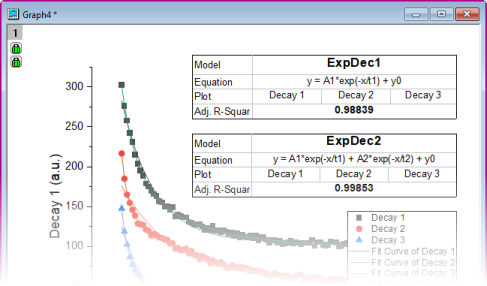
Some analysis dialog boxes, for instance Linear Fit and Nonlinear Fit, support analysis of multiple datasets. Report sheets created by these dialog boxes include a summary table listing the parameter values for each dataset and other pertinent results such as goodness-of-fit indicators. The summary table can be copied to an external sheet for further processing.
|
|
Tutorial: Fitting Multiple Datasets
- Open a new workbook and import the file Samples\Curve Fitting\Multiple Gaussians.dat from the Origin installation folder.
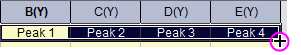
- Set the Long Names of the four Y columns as Peak 1, Peak 2, Peak 3 and Peak 4.
- Select all four Y columns, and use the Analysis: Fitting: Nonlinear Curve Fit... menu item to open the NLFit dialog box.
- Select Gauss from the Function drop-down list, then press the Fit button to perform fitting and close the dialog box.
- Switch to the FitNL1 report sheet. You will see a table named Summary which lists the fit parameters and fit statistics for each dataset.
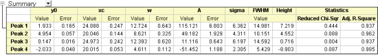
|
| In the NLFit report sheet, click on the downward-pointing arrow button  next to the table named Summary and select Create Copy as New Sheet. This will create a copy of the table in which all cells are linked to the report. Any updates/changes to the fit will automatically update the values in this copied sheet. This sheet can then be used to plot or to perform secondary analysis on the fit parameters. next to the table named Summary and select Create Copy as New Sheet. This will create a copy of the table in which all cells are linked to the report. Any updates/changes to the fit will automatically update the values in this copied sheet. This sheet can then be used to plot or to perform secondary analysis on the fit parameters.
|
| When enumerating something like a column Long Name, as you did in step 2 above, enter the string in the first cell (e.g. "Peak 1"), select the cell and hover over the lower-right corner. When the cursor becomes a "+", drag across the other cells and the contents of the first cell will be extended to those cells.
|
Using Gadgets for Analyzing Multiple Curves
GadgetsRegion of Interest (ROI)
Origin includes several gadgets for performing interactive analysis on plotted data. Gadgets allow selecting a data range of interest, switching from one dataset to another, and setting various preferences specific to the analysis being carried out.
Most gadgets offer an option to perform the analysis on all data plots in the current layer, or all data plots in the graph page. This allows for performing repetitive analysis on multiple datasets using the same settings, and generating a table of results across all datasets.
Batch Analysis Using an Analysis Template
Analysis Templates
Templates, Analysis
Analysis Reports
Reports, Analysis
The Batch Processing tool allows you to process multiple files or datasets using an Analysis Template. Simply perform the analysis on one of the files, include all desired results and report sheets in one workbook, and save that workbook as an Analysis Template. The Batch Processing tool then uses the Analysis Template to process multiple files/datasets. You have the option to retain one workbook for each file/dataset, and additionally, to create a summary table with select analysis parameters and other metadata that you have pre-configured in your analysis template.
|
|
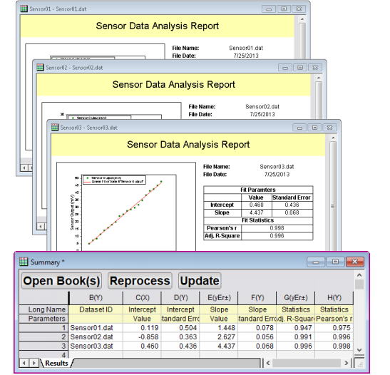
Tutorial: Batch Analysis of Multiple Files using an Analysis Template
- From the main menu, choose File: Batch Processing.... This opens the Batch Processing dialog box.
- Set Batch Processing Mode to Load Analysis Template.
- Press the browse button
 to the right of the Analysis Template box and browse to and select the file <Origin Program Folder>\Samples\Batch Processing\Sensor Analysis.OGW. This Analysis Template contains multiple sheets set up for linear regression analysis, reporting, and summary tables. to the right of the Analysis Template box and browse to and select the file <Origin Program Folder>\Samples\Batch Processing\Sensor Analysis.OGW. This Analysis Template contains multiple sheets set up for linear regression analysis, reporting, and summary tables.
- Set Data Source = Import From Files, then click the browse button to the right of the File List and from the Samples\Curve Fitting folder, select files Sensor01.dat, Sensor02.dat and Sensor03.dat .
- Set Dataset Identifier to File Name, Data Sheet(s) to Data, and Result Sheet to Result. Note that these are the names of existing sheets in the Analysis Template.
- Uncheck Delete Intermediate Workbook.
- Click OK to close the dialog box and process the three files (you can answer "No" to the prompt). You will obtain three books with the data, analysis results, and report for each file, and a fourth book containing the summary table of analysis results from all files.
|
| Saving the initial workbook as an Analysis Template is optional. You can simply save the Origin project (.opj) and next time replace the data in your workbook to update all results and graphs. The Batch Processing tool also has an option to repeatedly import files into the active window, allowing you to simply re-use an existing book within a project (which contains all desired analysis and graphs) as an on-the-fly template for the batch analysis.
|
| You can batch generate analysis reports using a custom MS Word template, with the option of outputting a PDF and/or an MS Word file for each report. Additionally, you can opt to combine reports into a single file. For information on Batch Processing with a Word Template for Reporting, see this tutorial.
|
Repeating Analysis on Other Datasets or Data Plots
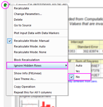
For some analysis operations, you can perform the analysis on one dataset or data plot and then repeat the analysis for all other data. This feature is available via a special shortcut menu entry, when you click on the lock associated with the operation.
- In worksheet columns or reports, clicking the lock will show the menu command Repeat this for All Y columns. Selecting this will repeat the analysis on all other Y columns in the source data sheet.
- In a graph, clicking the lock will show the menu command Repeat this for All Plots. Selecting this will repeat the analysis for all other data plots in the graph page, even if the plots are in different layers.
This is particularly useful for such analysis dialog boxes as smoothing or interpolation that support input of only one dataset. As long as the data are contained in one worksheet or plotted in one graph, the analysis can be repeated on all other datasets.
 | Users should note a change for Origin 2022b: In earlier versions, if the original analysis output created a new sheet or book, Repeat this for All would create a new sheet or book for the remaining Y columns or plots. Users expressed a desire to send all output to a single sheet regardless of the original output specification. If input columns share a common X dataset, the X dataset will be written to the output sheet only once. To roll back to the previous behavior, set @RAO = 0 (default is 1).
|
|
|
Tutorial: Smoothing Multiple Columns in a Worksheet
- Import the file Samples\Curve Fitting\Multiple Gaussians.dat into an empty workbook.
- Select column B and click Analysis: Signal Processing: Smooth to open the smooth dialog box.
- Accept the defaults and press OK to perform smoothing. A new column will be added with the smoothed data.
- Click on the lock in the output column and select Repeat this for All Y columns. Three more columns of smoothed data with same settings will be generated from the data in columns C thru E.
|
Duplicate this Operation
Output produced by the Origin's analysis operations is linked to its source data by a particular analysis and a particular set of analysis parameters. This linkage is signified by the placement of an "operations lock" on analysis output and -- unless the user turns off recalculation for a particular operation -- such results are generally "locked" to editing. You can find out more by reading about Analysis Report Sheets and Recalculation, in the introductory sections of this chapter.
The lock icon placed on analysis output can be clicked on to open a menu, giving you post-analysis access to operation parameters and other information. This includes the dialog box and parameter-set used to produce the analysis output, opened by clicking Change Parameters.
Towards the bottom of this menu, you will see a Duplicate this Operation entry.
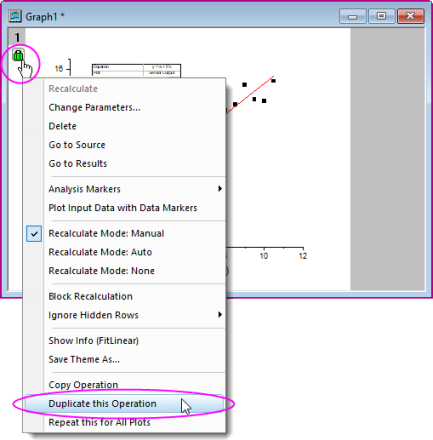
One possible use of the feature goes like this:
- The user performs an analysis operation on a data plot, say, a fitting operation using the nonlinear curve fitter (NLFit).
- The user is not sure which fitting function best models her data so she tries a fit using one potential function.
- The user clicks the resulting operations lock and chooses Duplicate this Operation.
- A duplicate analysis is run and a second operations lock is added to the graph window.
- The user clicks the second operations lock, chooses Change Parameters and when the NLFit dialog opens, chooses her alternate fitting function and performs a new fit operation. The new fit operation results in new output which can now be compared to the output generated by a fit of the first fitting function.
Repeating Analysis Using Data Filters
Data Filters for Repetitive TasksRepetitive Tasks, Filters for
Large multi-column datasets can be quickly reduced by applying filter conditions to one or more columns. This Data Filter feature can also be used in conjunction with the colcopy (column copy) X-Function to produce multiple graphs from the same source data using different filtering conditions. The filtered data can also be analyzed, allowing you to compare graphs and analysis results across multiple filter conditions.
Selected columns from the source data sheet can be copied to create child sheets where the filter condition stays synchronized with the parent sheet, or is locked to the child sheet. When the source data sheet is updated, all child sheets, associated graphs and analysis results will automatically update using their respective filter conditions. Additionally, the filter condition of a particular child sheet can be pushed back to the parent sheet at any time.
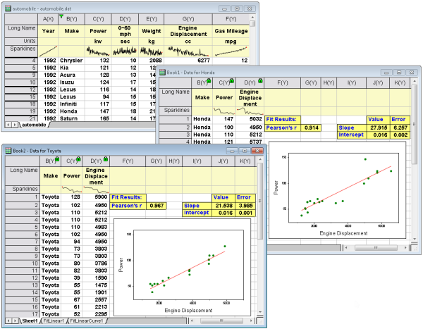
The image below displays the source workbook with data for several makes of automobiles. Two books were created with a subset of columns and a data filter to restrict the data to a particular make of automobile. Linear regression analysis of the filtered data was performed, allowing comparison of the results across the two filters.
|
|
Tutorial: Locking a Filter Condition on Copied Columns
- Import the file Samples\Statistics\Automobile.dat
- Click on the Make column, then click the Add/Remove Data Filter button
 on the Worksheet Data toolbar. on the Worksheet Data toolbar.
- Click on the filter icon that was added to the column, and uncheck all makes but Honda (Hint: Clear the check mark beside Select All, then check Honda and click OK).
- Hold down the CTRL key and click and select the Make, Power and Engine Displacement columns. Next, right-click and select Copy Columns to... from the shortcut menu.
- In the dialog that opens, expand Copy Labels and place a check mark beside Long Name and Units, then click OK. A new worksheet will be added to the workbook and it will contain only the Honda data, for Power and Engine Displacement.
- Click and hold the tab of the new worksheet and drag it to an empty spot in the Origin workspace to create a separate workbook.
- Click on any of the locks in the columns of this copied sheet, and select Worksheet Filters: Lock. The filter conditions will be locked to this sheet. If you change the filter condition in the original data sheet, this copied sheet will not be affected.
- You can now return to the original automobile book, click the filter icon and change the filter condition to Toyota, then use Copy Columns to to create another worksheet.
- Highlight column B in your Honda workbook,then right-click and choose Set As: X. Do the same for the Toyota book.
- Highlight column C in your Honda workbook and click the Scatter button
 on the 2D Graphs toolbar. Do the same for the Toyota book. This gives you two plots of Power vs Engine Displacement, one for Honda, one for Toyota. on the 2D Graphs toolbar. Do the same for the Toyota book. This gives you two plots of Power vs Engine Displacement, one for Honda, one for Toyota.
- Click on the Honda graph and choose Analysis: Fitting: Linear Fit. Accept the dialog defaults and click OK. Do the same for the Toyota graph. A linear fit is performed for both datasets and an Analysis Report Sheet is generated for each.
- Compare the fitting results for the two automobile makes.
|
| By default, when there is a data filter on a column that is input for an analysis operation, filtered data (hidden rows) are ignored in the analysis. To include hidden rows, click on an analysis lock icon and set Ignore Hidden Rows = No.
|
Automating Tasks Using Programming
Programming Origin
In addition to the above mentioned methods for automating tasks Automating Origin using the interface, graphing and analysis features can also be accessed programmatically from the LabTalk scripting language, from Origin C or from Python (internal or external). Access to Graph Themes and templates, and Analysis Templates can be programmed. You can set up some of the procedures manually by first creating templates (graph templates, Analysis Templates™, etc.) using the graphical user interface, and then write your code to call the templates as needed.
You can get a broad look at what programming options are available in Origin by browsing the Programming Chapter of this User Guide. More in-depth programming-related information is linked to from that chapter.
Topics for Further Reading
|