9.1.4 Setting the Page Color and Other Page Display PreferencesSet-PageDisplay
Use controls on the Plot Details Display tab at the Page level to set page color, connect plotted lines across axis breaks and/or missing data points, ignore missing data when calculate bar/column width, and to control the Master Items feature.
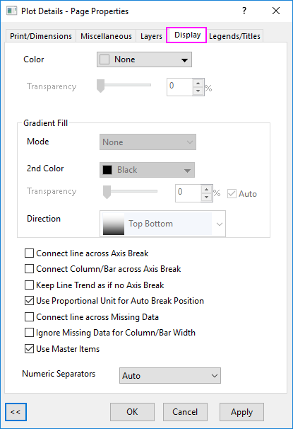
Color
This control, combined with the Gradient Fill control below, determines the page color.
- Select None from the Color drop-down list.
When None is selected and the page is exported or copied to the Clipboard, the page is transparent (displays the background color of the host application).
- Select a color from the Color drop-down list.
- Make sure Gradient Fill is set to None.
- Move the slider or enter an integer from 0 (no transparency) to 100 (full transparency).
 | To specify the background color for the graph page globally, you can set it in the Page Tab of Preferences: Options dialog, when graph page color is None in this Display tab.
If the page background color is customize in this Display tab, this color will follow the setting in this tab.
|
Gradient Fill
Set the page color of current graph as graduated colors.
- Select a color from the Color drop-down list
- Select One Color, Two Colors or More Colors from Mode drop-down list.
- Specify the Lightness and Direction for One Color Mode; specify another color from 2nd Color drop-down list and Direction for Two Color Mode; specify a palette from Palette drop-down list and Direction for More Colors mode.
- Move the slider or enter an integer from 0 (no transparency) to 100 (full transparency). When Auto is checked, follows the transparency of the Color.
For detailed information about Gradient Fill options, please view this topic.
Connect line across Axis Break
To connect the clipped ends of a line or a line + symbol data plot at an axis break:
- Select Connect line across Axis Break.
In a line + symbol data plot, the line across the break region displays as a dashed line.
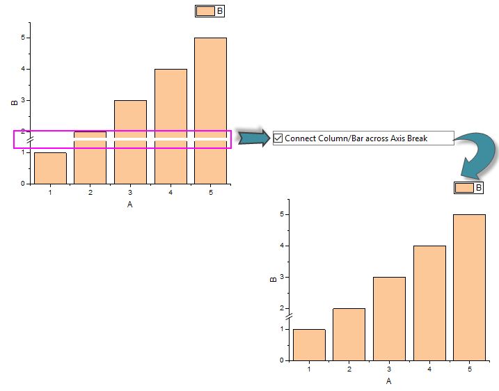
Connect Column/Bar across Axis Break
For the Column/Bar chart, when you add any break on Y axis, the columns/bars will be broken at this break by default. You can check this check box to connect the columns/bars to show them without any break.
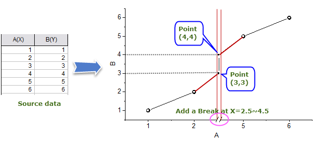
Keep Line Trend as if no Axis Break
To keep the line trend(real line slope) before and after axis break as if there is no axis break:
- Select Keep Line Trend as if no Axis Break.
The following is a simple example to show you how this option works:
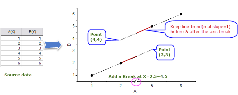
If uncheck this check box while there is any axis break, the slope on either side of the break will be not reflective of the actual slope between the data. The following is a simple example to show you how the lines be connected without keeping the real slope:
Use Proportional Unit for Auto Break Position
Since Origin 2018, once you check the Auto Position box for axis breaks in Breaks tab of Axis dialog, you can use this option to show each segment of axis break in proportion.
The diagram below will show you how axis break positions is decided automatically by using the proportional unit:
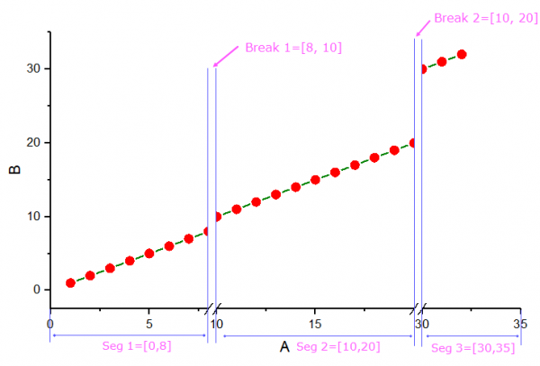
Total Length = Axis Length - Length of Break 1 - Length of Break 2
also you can say
Total Length = Length of Seg 1 + Length of Seg 2 + Length of Seg 3
Then, Seg 1, Seg 2 and Seg 3 will be rescaled according to their length proportion 8 : 10 : 5(that is (8-0):(20-10):(35-30)) on Total Length.
Connect line across Missing Data
To connect lines across missing data in line and line + symbol data plots:
- Select Connect line across Missing Data.
Ignore Missing Data for Column/Bar Width
To ignore missing data for calculating column/bar width in Column and Bar charts:
- Select Ignore Missing Data for Column/Bar Width.
It is especially useful when the data has large number of missing data and thus make the column/bar extremely slim. Note: this option only ignore the missing when calculating the column/bar width. It does not eliminate the missing from the column/bar chart.
See Notes for 3D Bar Graph.
Use Master Items
Origin provides a "Master Items" feature that allows you to include a standard set of properties and annotations in a group of graph windows. This is useful for applying a custom background, a company logo, or other labels and images to all or only selected graph or layout pages in your project. Once you have created your master items, use this check box to apply them to graphic export, Clipboard, and printed output.
Note that each graph page has its own master items control:
- Select Format: Page to open the Plot Details dialog box.
- Select the Display tab.
- Select the Use Master Items check box.
To learn more about creating and including master items in your graphs and layout pages, see Creating a Master Page Layout for Graphs.
Numeric Separators
This drop-down provides control of the numeric separator used in worksheets and graphs.
Default Auto means the numeric separator follows the Separator settings in the Numeric Format tab of Preferences: Options dialog. Alternate choices exist for those who want another separator in the graph page.
|