17.2.2 Creating Box ChartsCreate-Box-Chart
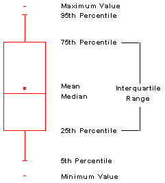
The box plot, which is also called a box and whisker plot or box chart, is a graphical representation of key values from summary statistics.
To create a box chart:
- Highlight one or more Y worksheet columns (or a range from one or more Y columns).
- Select Plot: Statistical: Box Chart.
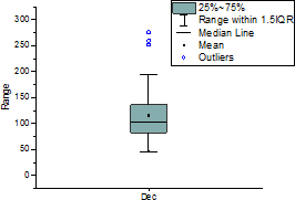
Each Y column of data is represented as a separate box. The column names or labels supply the X axis tick labels. By default, the box is determined by the 25th and 75th percentiles. The whiskers are determined by the 5th and 95th percentiles. Additional values can be represented in Origin's box chart, including the minimum, median, mean, maximum, the 1st and 5th percentiles, and 95th and 99th percentiles.
You can also create a grouped box chart, from either indexed data or raw data.
To customize the Box Chart display:
- Double-click on the box chart.
or
- Right-click and select Plot Details.
Both actions open the Plot Details dialog box with the box chart data plot icon active on the left side of the dialog box. The box chart controls are available on tabs on the right side of the dialog box.

For more information on Box Chart customizations, see the following topics:
Box Chart Examples
Box chart has been largely improved in the previous versions and now it has many variations. Several typical examples are displayed below. All examples were created from the data in BoxChartExample.ogw, in the <Origin EXE folder>\Samples\Graphing folder. The table references datasets (columns) in the BoxChartExample worksheet and menu entry to create the graph, and also lists key settings and main customizations made in the Plot Details dialog box.
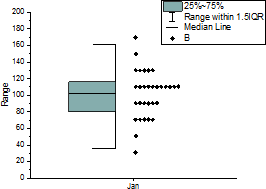
Typical Box
|
Plotted from Col(H)
Menu Entry:
Plot: 2D> Box: Box Chart
|
Box tab:
- Check Outliers
- Check Outliers in Line
- Set Box Width(%) to be 20
Outliers tab:
- Set symbol shape and color
|
|
Plotted from Col(B)
Menu Entry:
Plot: 2D> Box: Box Chart
|
Box tab:- Set Type to be Box(Right) + Data (Left)
Symbol tab:- Set Symbol Color as By Points: Index:Col("Group")
Data tab:- Set Bins Alignment to Right
|
|
Plotted from Col(B)
Menu Entry:
Plot: 2D> Box: Half Box
|
Box tab: - Set Type to be Half Box(Left) + Data(Right)
- Check Draw Data On Top Of Box
- Set Box Width(%) to be 20
Data tab:- Uncheck Jitler Points
- In the Bins Alignment section, change Data Width (%) to be 0.
Symbol tab:- Set the symbol shape and size.
|
|
Plotted from Col(B)
Menu Entry:
Plot: 2D> Box: Box Overlap
|
Box tab: - Set Type to be Box + Data Overlap
- Set Box Width(%) to be 40
Data tab:- Check Snap Points to Bin
- In the Bins Alignment section, select Left.
|
|
Plotted from Col(B) through Col(H)
Menu Entry:
Plot: 2D> Box: Box Chart
|
Box tab:- Check Box Width by Parameter
- Select Box Width(%)(a column label row) to be Width.
- Select X Position to be X Position
Double click on X axis to open the Axis dialog:Scale page- Under Major Ticks, set Type as By Plot Column Label and then Column Label as X Position
Tick Labels-Bottom page- Under Display, set Type as Column Name or Label and then Display as Column headings.
|
|
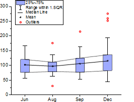
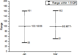
Plotted from Col(E) through Col(H)
Menu Entry:
Plot: 2D> Box: Box Chart.
|
Box tab:
Connect Lines tab:- Check Connect Mean
- Check Connect Percentiles, and set Percentiles(%) to 25 75
|
|
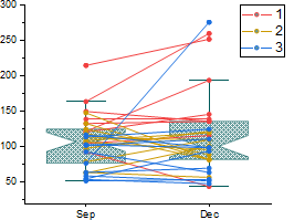
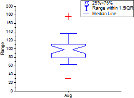
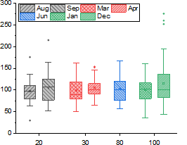
Plotted from Col(G) and Col(H)
Menu Entry:
Plot: 2D> Box: Box Chart.
|
Box tab:- Set Type to be Box + Data Overlap
- Set Style to be Notched Box
Data tab:- Set Data Width(%) to 0 under Bins Alignment section
Connect Lines tab:- Check Connect Data Points
- Set Color to Index:Col("Group")
|
Other Box Shape
|
Plotted from Col(B) and Col(C)
Menu Entry:
Plot: 2D> Box: Box Chart
|
Group tab:- Select None for Increment of Border Color
Lines tab: - Set Style, Caps Length, Caps Style, and Caps Width of Whisker
- Uncheck Median Line
- Check Mean Line
Box tab:- Select No Box for Style under Box section
- Check Whisker and Mean under Labels section
Spacing tab:- Set Gap Between Boxes (in %) to 50
|
|
Plotted from Col(F)
Menu Entry:
Plot: 2D> Box: Box Chart
|
Box tab:- Select Notched Box as Style under Box section
- Uncheck Outliers
- Set Box Width(%) to 40
Percentile tab:- Under Type section, check Max and select + for shape, check Min and select - for shape.
- Uncheck 99%,Mean, Median and 1%
|
|
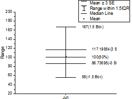
Plotted from Col(E)
Menu Entry:
Plot: 2D> Box: Box Chart
|
Box tab:- Change the Style under Box section to be I-shaped Box.
- Change the Range to be SE.
- Set Coef to 3.
- Set Box Width(%) to 50.
- Check Box Rangs, Whisker and Median under Labels section and select Both for Show.
Label tab:- Set Horizental Offset to be 90
Note: In order to completely display labels in this case, the Clip Data to Frame check box (Display tab of Layer Properties dialog) must be cleared.
|
|
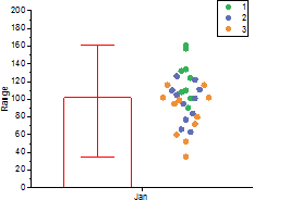
Plotted from Col(B)
Menu Entry:
Plot: 2D> Box: Box Chart
|
Box tab:- Set Type to be Bar(Left) + Data (Right)
- Select Median for Represent under Bar section
- Set Range to Min-Max and Both for Direction under Error Bar section
Symbol tab:- Set symbol color as Index:Col("Group")
|
|
Plotted from Col(F) through Col(H)
Menu Entry:
Plot: 2D> Box: Bar Normal
|
Box tab:- Set Type to be Bar(Left) + Data (Right)
- Set Range to SD under Error Bar section
Disturibution tab:- Set Curve Type to be Lognomal
|
|
Plotted from Col(B) through Col(H)
Menu Entry:
Plot: 2D> Box: Interval Box
|
Box tab:- Set Type to be Box
- Uncheck Outliers
- Set Style to No Box under Box section
- Set Range to Confidence Interval under Whisker section
Percentile tab:- Set Mean symbol shape and size
Line tab:
|
Violin
|
Plotted from Col(E) through Col(G)
Menu Entry:
Plot: 2D> Violin Plot: Violin with Stick
|
Box tab:
Disturibution tab:- Set Curve Type to be Lognomal
- Check Show Symmetric Distribution Curve
- Set Scale to Count
- Set Extend Data Points to within Distribution Curve
Group tab:- Set Increment of Distribution Fill row to be By One
|
|
Plotted from Col(E) through Col(G)
Menu Entry:
Plot: 2D> Violin Plot: Half Violin
|
Box tab:- Set Type to be Half Box(Right) + Data(Left)
- Set Style to be No Box under Box section
Distribution tab:- Set Curve Type to be Kernel Smooth
- Check Distribution Curve Next to Box
- Check Show Symmetric Distribution Curve
- Set Scale to Area
- Check Scale to Maximum(%) and set it to 200
Group tab:- Set Increment of Distribution Fill row to be By One
|
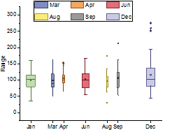
Grouped Box
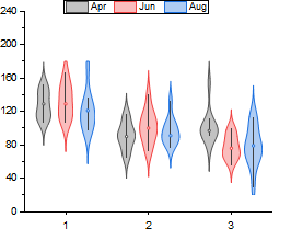
|
Plotted from Col(D) through Col(F)
Menu Entry:
Plot: 2D> Grouped Box: Grouped Box Chart-Box.
- Set Group Column(s) to be Col(Group)
- Set Graph Theme to be Box_Violin
|
Box tab:- Set Type to be Box
- Set Styple to be No Box under Box section
- Uncheck Outliers
Distribution tab:- Set Curve Type to be Kernel Smooth
- Check Show Symmetric Distribution Curve
- Set Scale to be Count
- Set Scale to Maximum(%) to 100
Line tab:- Uncheck Mediuan Line
- Set Caps Length to 0 under Whister section.
|
|
Plotted from Col(B) through Col(H)
Menu Entry:
Plot: 2D> Grouped Box: Grouped Box Chart-Row.
- Set Group Number to be 1
- Set 1st Graph Row to be Width
|
Group tab:- In the Border Color row, set Increment to be By One and Subgroup to be Between Subgroup
|
Column Scatter
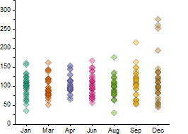
|
Plotted from Col(B) through Col(H)
Menu Entry:
Plot: 2D> Scatter: Column Scatter
|
Box tab:
Data tab:- Set Data Width(%) to 0 under Bins Alignment section
|
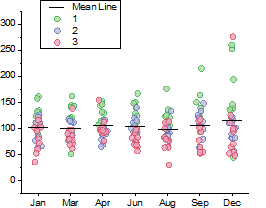
|
Plotted from Col(B) through Col(H)
Menu Entry:
Plot: 2D> Scatter: Scatter Interval
|
Box tab:- Set Type to be Box + Data Overlap
- Set Style to be No Box under Box section
- Set Range to be None under Whisker section
Symbol tab:- Set Edge Color and Fill Color to By Point> Index:Col("Group")
|
|