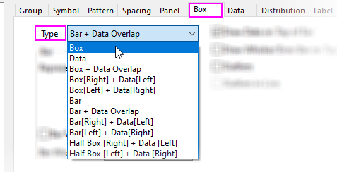
9.6.1 The (Plot Details) Box TabPD-Dialog-Box-Tab
Type
Choose from Box, Data, Box + Data Overlap, Box(Right) + Data(Left), Box(Left) + Data(Right), Bar, Bar + Data Overlap, Bar(Right) + Data(Left), Bar(Left) + Data(Right), Half Box(Right) + Data(Left) or Half Box(Left + Data(Right) in the Type drop-down List.
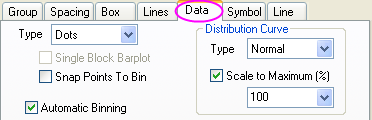
By default, the box chart displays only a Box - not the (binned) Data. You can display the box and binned data, or only the binned data. The binned data is saved in a Binn worksheet. This worksheet contains the bin centers, counts, cumulative sums, and cumulative probability.
- To access the Binn worksheet, right-click on the box chart and select Go to Bin Worksheet from the shortcut menu.
Note that when you select a display that includes the binned data, the Plot Details Data tab becomes available for editing the bins and overlaying a distribution curve.
Box
| Style
|
- No Box
- Box
- I-shaped Box: Just show horizontal lines for the box.
- Diamond Box: Show the box shape as a diamond.
- Notched Box: This is a useful variation of the box-and-whisker chart. Notches on the box represent the confidence interval about the median value. If notches of two box plots do not overlap, we can assume that the two median values differ at the 95% confidence level (McGill, R., J.W. Tukey, and W.A. Larsen. 1978. Variations of Box Plots. The American Statistician. 32. 12).
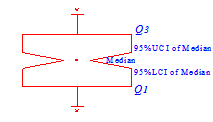
- 95% LCI of Median: Median - 1.58 * (IQR/sqrt(n))
- 95% UCI of Median: Median + 1.58 * (IQR/sqrt(n))
|
| Range
|
- SE (standard error)
- SD (standard deviation)
- Perc 25, 75 (25/75th percentiles),
- Perc 10, 25, 75, 90 (10/25/75/95th percentiles)
- Constant (value set in the Coef Combo Box)
- Custom Percentiles <P, 100-P> (The percentiles can be specified in the P combo box.)
Note: When the box Style is set to No Box or Notched Box, the Range drop-down list will be grayed out .
|
| Coef
|
Select or type in a factor by which to expand the box (default is 1). This can be useful, for instance, in combination with the SD option in the Range drop-down list to show how data points are distributed within 2 or 3 standard deviations of the mean.
Note: When the box Range is set to Perc 25, 75 and Perc 10, 25, 75, 90, the Coef combo box will be grayed out.
|
| P
|
Specify percentiles value for box range in this combo box. The P value can be set between 0 to 100. When it is set to 30, that means the box range is 30% to 70%.
Note: P combo box is only available when Custom Percentile <P, 100-P> is selected in Range drop-down list.
|
| Box Width by Parameter
|
Specify whether to control the box width by the column label row in the source column. Choose the parameter in the Box Width(%) list.
|
| Box Width(%)
|
Select or type a factor to control the box width in the combo box. This is a percent and only values from 0 to 100 are acceptable.
When the Box Width by Parameter check box is selected, the box width is controlled by the column label row listed in this drop-down. The parameters include: <Sample Size>, Long Name, Units, Comment, Sampling Interval and Parameter.
<Sample Size> means using the sample size of the plot data to decide the box width by different groups.
|
| Scaling Factor
|
Type or select a value by which to scale the associated parameters (default is 1). For example, select 0.25 to scale each parameter value by a factor of 1/4. By default, Auto is selected which means mapping maximum value of the parameter you selected in Box Width(%) option to the full box width 100%.
|
Whisker
| Range
|
Use the Range drop-down list to determine the quantity displayed by the whiskers (or choose No Whiskers).
Choose from No Whiskers, 10-90th, 5-95th, 1-99th, SD (standard deviation), SE (standard error), Outlier, Min-Max, Constant, Custom Percentiles <P, 100-P> or Confidence Interval.
|
| P
|
Specify percentiles value for whisker range in this combo box. The P value can be set between 0 to 100. When it is set to 30, that means the whisker range is 30% to 70%.
Note: P combo box is only available when Custom Percentiles <P, 100-P> is selected in Range drop-down list.
|
| Probability(%)
|
Specify the confidence levels for which the confidence intervals will be computed in this combo.
Note: Probability combo box is only available when Confidence Interval is selected in Range drop-down list.
|
| Coef
|
Select or type a value n into the Coef combo box to expand the whisker by a factor of n.
|
| Direction
|
This option is only available, when Box Style = No Box.
Specify how to show the whisker on the plot.
- Plus: Only show the upper whisker.
- Minus: Only show the lower whisker.
- Both: Show both upper whisker and lower whisker.
|
Note that if you select Outlier from the Range drop-down list and accept the default Coef value of 1.5, whisker length will be determined by the outermost data point that falls within upper inner and lower inner fence (a Coef = 3 would be determined by the outermost data point that falls within the upper outer and lower outer fences).
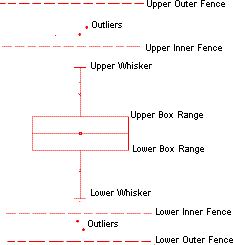
Upper Inner Fence = 75th Percentile + (1.5 * Interquartile Range)
Lower Inner Fence = 25th Percentile - (1.5 * Interquartile Range)
Bar
| Represent
|
Specify the value that the height of the bar represents.
Choose from Mean, N(number of data), Median, Min, Max, Sum, SD (standard deviation), SE (standard error).
|
| Bar Width by Parameter
|
Specify whether to control the box width by the column label row in the source column. Choose the parameter in the Box Width(%) list.
|
| Bar Width(%)
|
Select or type a factor to control the box width in the combo box. This is a percent and only values from 0 to 100 are acceptable.
When the Box Width by Parameter check box is selected, the box width is controlled by the column label row listed in this drop-down. The parameters include: Long Name, Units, Comment, Sampling Interval and Parameter.
|
| Scaling Factor
|
Type or select a value by which to scale the associated parameters (default is 1). For example, select 0.25 to scale each parameter value by a factor of 1/4.
|
Error Bar
| Range
|
Use the Range drop-down list to determine the quantity displayed by the error bar (or choose None).
Choose from None(no error bar), 10-90th, 5-95th, 1-99th, SD (standard deviation), SE (standard error), Outlier, Min-Max, Constant, Custom Percentiles <P, 100-P> or Confidence Interval.
|
| P
|
Specify percentiles value for error bar range in this combo box. The P value can be set between 0 to 100. When it is set to 30, that means the whisker range is 30% to 70%.
Note: P combo box is only available when Custom Percentiles <P, 100-P> is selected in Range drop-down list.
|
| Probability(%)
|
Specify the confidence levels for which the confidence intervals will be computed in this combo.
Note: Probability combo box is only available when Confidence Interval is selected in Range drop-down list.
|
| Coef
|
Select or type a value n into the Coef combo box to expand the whisker by a factor of n.
|
| Direction
|
Specify how to show the error bar on the plot.
- Plus: show error bars above the top of data bar
- Minus: show error bars below the top of data bar
- Both: show error bars both above and below the top of the data bar
|
X Position
Specify whether link the X-axis to a real scale. By default, it set to Auto that does not link to the real axis scale. In this drop-down list, these column labels can choose as the parameter to control the scale: Long Name, Units, Comment, Sam
Data and Whisker Drawing Options
| Draw Data on Top of Box/Bar
|
This option available for Box + Data Overlap or Bar + Data Overlap options. Data symbols will be drawn overlaying the box or bar.
|
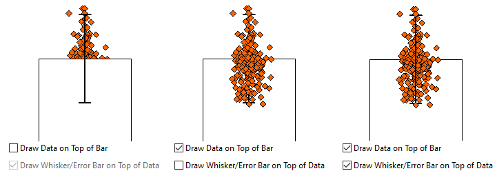
| Draw Whisker/Error Bar on Top of Data
|
This option is available when the previous option Box + Data Overlap or Bar + Data Overlap is selected. This option and the Draw Data on Top of option above, interact as in the following example:
|
| Outliers
|
Data points that lie outside of the whiskers are treated as outliers. Selecting the Outliers check box adds a separate Outliers tab to Plot Details. Use controls on the Outliers tab to customize the style properties of Outliers and Extreme Values.
When Type = Data, you'll note that outliers are included among the plotted points (Outliers is enabled and unavailable). For others (Type = Box or Bar, or one of the Box/Bar/Half Box + Data variants), you can opt to create a separate plot of Outliers.
If you opt to plot a Data variant and you enable Outliers, data points that constitute outliers will be plotted twice -- once as Data and once as Outliers. Beginning with Origin 2021b, you can press CTRL + double-click† on an outlier within the Data plot to create a special point but you cannot create a special point within the Outliers plot. Outliers must share a single set of plot properties (color, symbol shape, etc).
|
| Outliers in Line
|
Specify whether the outliers of box plot align in a line in the center of the box plot.
|
|
†CTRL + double-click opens the Plot Details Symbol and Label tabs for the designated special point. You can also CTRL + single-click and use Mini Toolbar buttons for basic customizations.
|
|