8.4.2.7.1 The Scale Tab for Other Special GraphsAxesDialog-Scale-Tab
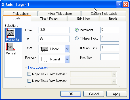
Selection
| Horizontal
|
This is, by default, the bottom and top X axes. However, if you have exchanged the X and Y axes (Graph: Exchange X-Y Axis) or if you are editing an axis of a bar, floating bar, or stacked bar graph, then the Horizontal icon is associated with the left and right Y axes.
|
| Vertical
|
This is, by default, the left and right Y axes. However, if you have exchanged the X and Y axes (Graph: Exchange X-Y Axis) or if you are editing an axis of a bar, floating bar, or stacked bar graph, then the Vertical icon is associated with the bottom and top X axes.
|
| Z Axes
|
This is, by default, the front and back Z axes. This option does not appear in 2D graphs.
|
After you finish editing the properties of an axis, you can begin editing any other axis in your graph by selecting the appropriate icon from the Selection list box. To prevent your selections from applying to your graph, click the Cancel button at any time during the editing process (but before clicking Apply).
From
Set the initial scale value in this text box.
To
Set the final scale value in this text box.
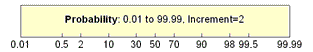
Type
| Linear
|
Standard linear scale: X'=X. 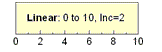
|
| Log10
|
Base 10 logarithmic scale: X'=log(X). 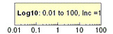
|
| Probability
|
Represents the inverse of a cumulative Gaussian distribution: X'=norminv(X/100). Plotting a cumulative Gaussian distribution produces a sigmoidally-shaped curve. This curve, when displayed on a probability scale, appears as a straight line. Since probabilities are expressed as percentages, all values must fall between 0 and 100. The probability scale range is 0.0001 to 99.999.
|
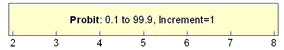
| Probit
|
Like the probability scale, a sigmoidally-shaped curve plots as a straight line. In this case, however, the scale is linear, and the increment between tick marks is exactly one standard deviation. The value "5" on the scale shows the mean, or 50% probability. "6" is one standard deviation away, etc.
|
| Reciprocal
|
Reciprocal scale, where X'=1/X. 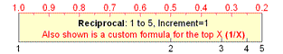
|
| Offset Reciprocal
|
Offset reciprocal scale, where X'=1/(X+offset). Offset is defined as 273.14, where 273.14 is the absolute temperature for 0° C. 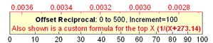
|
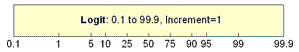
| Logit
|
Logit=ln(Y/(100-Y)). As with the probability and probit scales, a sigmoidally shaped curve plots as a straight line.
|
| ln
|
Natural log scale (base e logarithmic scale). 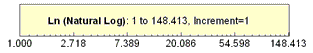
|
| log2
|
Base 2 logarithmic scale. 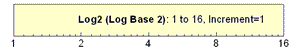
|
| Double Log Reciprocal
|
Double logarithmic reciprocal scale: X'=ln(-ln(1-X)). 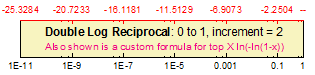
|
| A Note on Log10 Scales:
If the log scale range is within one decade, the ticks and grids will be linear. The LabTalk system variable @TL determines whether to use linear tick marks by the following relation:
10 * log10(max/min) <= value
Thus, to support linear tick locations for two decades, set this variable to 14. For example, you could enter the following in the Script window:
@TL = 14 ;
The default value for @TL is 10.
|
Rescale
| Manual
|
The axis is not scalable. If you try to change the scale or perform an operation which changes the scale (for example, using the Enlarger tool), Origin preserves the From and To values. If both axes in a 2D graph layer are set to Manual, using the Enlarger tool opens a dialog box asking if you want to change to Normal mode and rescale. Click Yes to temporarily override the scaling restriction.
|
| Normal
|
The axis is scalable. Alter the axis scale and use the Enlarger tool (for 2D graph layers) without restriction.
|
| Auto
|
This option is identical to the Normal option, but also allows Origin to automatically scale the axis to accommodate plotted data, if necessary.
|
| Fixed From
|
The "From" value of the axis is fixed and can only be changed by editing the From text box value in the Axis dialog box.
|
| Fixed To
|
The "To" value of the axis is fixed and can only be changed by editing the To text box value in the Axis dialog box.
|
Increment
Select this radio button and set the major tick increment for this axis in the associated text box. Tick labels are placed at each major tick mark. For example, type 10 to display a major tick mark at every tenth value.
If the scale units for this axis are time series values, then the value in the Increment text box must indicate the increment in appropriate time series terms. The permissible time series step increment units and their allowable abbreviations are:
| Increment
|
Abbreviation
|
| sec
|
s
|
| min
|
m
|
| hour
|
h
|
| day
|
d
|
| week
|
w
|
| month
|
mo
|
| quarter
|
q
|
| year
|
y
|
For time series graphs, set the size of the increment by typing a number followed by an increment unit. For example, 1month sets a major tick increment of one month. 4Q sets a major tick increment of four quarters. (Do not leave a space between the number and the increment unit.)
#Major Ticks
Select this radio button to set the absolute number of major ticks displayed on the axis. Type the desired value in the associated text box. The maximum number of major ticks is controlled on the Axis tab of the Options dialog box (Preferences: Options). You will not necessarily see this number of ticks used as Origin will still try to display reasonable numbers for Tick Labels.
| Notes: It is also allowed to use minus value for major tick numbers, so as to make the tick label numbers rounded-up. In case of negative major tick numbers, Origin will try to get the best range to make sure the tick labels are integers and the major tick numbers will try to be closest to the absolute value which was set, but not exactly the same.
|
#Minor Ticks
Specify the number of minor ticks to display between adjacent major ticks in this text box. For example, select the Increment radio button, type 1 in the associated text box, and type 1 in the # Minor Ticks text box to set the tick sub-step to 0.5. One minor tick will display between each pair of major ticks.
If the scale units for this axis are time series values, then Origin uses the value in the # Minor Ticks text box to automatically determine the most appropriate minor tick labels. This option is available only if the Enable Minor Labels check box is selected on the Minor Tick Labels tab of the Axis dialog box.
First Tick
Specify the position of the first major tick, and the increment for each minor tick, in the First Tick text box. This text box can be left blank for most graphs. However, when using calendar-accurate date values as tick labels, you may want to specify the value of the first major tick label to be displayed, and at what value subsequent minor ticks should fall.
For example, if your X axis range runs from 1/1/99 to 12/31/99, you could specify that the first major tick label fall at 1/4/99, and that all subsequent minor tick marks fall on a Monday.
To edit the First Tick text box:
- Type the desired major tick value.
- To specify both a major and minor tick value, include a comma after the major tick value, followed by the minor tick value.
When working with date values, Origin recognizes most common date notations. For example, to create an axis that starts at 1/4/99 and has minor tick marks at all Mondays, enter any of the following in the First Tick text box:
1/4/99, Monday
1-4-99, Mon
Jan 4 1999, M
Ticks Location
Major Ticks for Dataset
Specify the location of the Major Ticks using existed dataset. Check the front check box to activate this item.
Minor Ticks for Dataset
Specify the location of the Minor Ticks using existed dataset. Check the front check box to activate this item.
| This group settings only can be used to specify where the ticks are. To specify what show in these positions, you should turn to the Tick Label tab of Axis dialog. For an instance, please refer to this help page.
|
|