9.3.2 Using a Dataset to Control Plot ColorPlotColor-DatasetControl
You can use a column of values in an Origin worksheet (or Excel workbook) to control data plot colors for plots of data from the same worksheet or workbook:
- Any one of up to 155 columns on either side of the plotted data can be designated as the color control dataset.
- If the source worksheet has more than 155 columns to the right of Y dataset, columns up to 155 can be listed as color control columns, starting from (and including) the values in plotted Y column.
- If the worksheet has fewer than 155 columns to the right of the Y dataset, then columns located both at left and right sides of Y dataset can be used.
Setting color control by dataset is done via a data plot element's color button (for example, the Symbol Color button in the Plot Details dialog box).
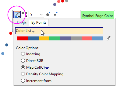
There are several types of dataset color control, available from the By Points tab of the Color Chooser. The first three modes are available for general graph types, the remainder are reserved for specific graph types.
- Indexing: This option uses a dataset of integers or text strings that are indexed to colors in a specific Color List.
- Direct RGB: This option uses a dataset of RGB composite values, each calculated from a separate R,G and B value.
- Color Mapping: This option uses a dataset of real numbers that are binned and the customizable bin ranges are mapped to a customizable list of colors.
- Density Color Mapping. Used only with the Density Dots scatter template.
- Y Value: Color Mapping: When there are multiple Y data plots in a graph, this option set the colormap based on Y value respective, and with the same the colormap level and fill setting.
- Y Value: Plus-Minus-Total: This option fills columns/bars with different colors according to the condition that if the corresponding Y value is Positive, Negative or Total. (Only available for Bridge Chart)
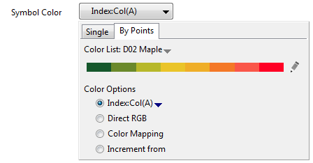
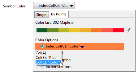
Indexing
This option uses a dataset of integers or categorical values that are indexed to colors in a specific Color List.
To use this option:
- Double-click on the data plot that you wish to modify. This opens the Plot Details dialog box.
- Select the Symbol tab, Pattern tab, etc.
- Click the Symbol Color button, Fill Color button, etc. When the Color Chooser opens, go to the By Points tab and select Indexing: Dataset (Dataset being the name of the column that stores the color control data).
- Click Apply.
|
Note: The column Format of the indexing column must be either Numeric or Text & Numeric and the column should contain integers or, in the case of categorical data, strings corresponding to categories. Any numbers to the right of a decimal point will be dropped.
|
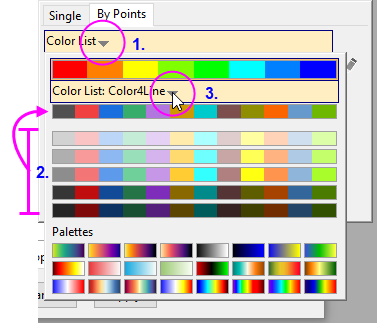
To customize index colors:
Prior to Origin 2019, indexing to a column of worksheet values added a Color List tab to Plot Details and it was on this tab that you could customize the color list. Beginning with Origin 2019, you customize the color list in this way:
- Click the element's color button (e.g. for symbol = Symbol Color).
- Click on the pencil icon
 to the right-side of the current Color List. to the right-side of the current Color List.
- Follow these procedures for loading, modifying and saving your color lists.
Direct RGB
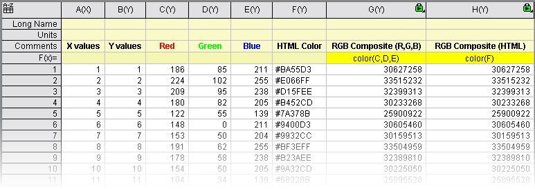
To apply RGB colors to your Origin plots, you must generate an RGB composite value. The RGB composite value is calculated from:
- Worksheet columns containing triplet components of Red, Green, and Blue. The R, G, and B component values range from 0 to 255 (e.g. (255,0,0)).
- A Worksheet column of HTML color values (e.g. #FF0000).
To Compute the RGB Composite:
- Use the color() function, in conjunction with the Set Values feature to calculate your composite values, as shown in the following image (note use of spreadsheet cell notation in the F(x)= row, highlighted in yellow):
Once you have a dataset of RGB composite values:
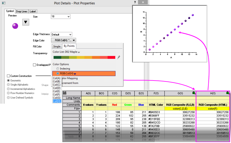
- Double-click on the data plot that you wish to modify. This opens the Plot Details dialog box.
- Select the Symbol tab, Pattern tab, etc.
- Click the color button (e.g.Edge Color), click the By Points tab, then select Direct RGB: Dataset, where Dataset contains the RGB composite values.
 | You can use the color() function to return a single RGB composite value in the Script Window or Command Window, using either HTML color codes or RGB triplets:
- Open the Command Window (Window: Command Window) or Script Window (Window: Script Window).
- Enter your values in either form, as shown in the following examples, then press <Enter>:
color(#FF0000)=
color(255,0,0)=
- Origin returns:
color(#FF0000)=16777471
color(255,0,0)=16777471
|
Color Mapping
With this option you create a mapping relationship between ranges of 2D Y values or 3D Z values and an associated scale of colors. The 2D Y values or 3D Z values are then used to determine the color of the associated data point, based on the assigned color map. The Y or Z values are real numbers.
- Double-click on the data plot that you wish to modify. This opens the Plot Details dialog box.
- Select the Symbol tab, Pattern tab, etc.
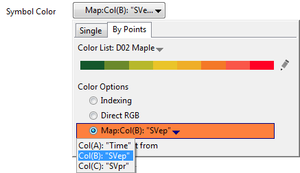
- Click the Symbol Color button, Fill Color button, etc. and on the By Points tab, select Color Mapping: and choose a color control dataset from the popup menu.
- Click the color button once again (e.g. Symbol Color), click on (1) Color List and (2) click on the displayed color list, including one of several tint-and-shade variants shown below the color list or (3) click the drop-down next to the displayed color list and choose another color list.
| You can also apply a colormap and change color lists using controls on the plot-level Mini Toolbar. Select a plot and use the plot symbol's color control button (e.g. Symbol Edge Color) to access controls.
|
An Example:
- Start with a new project or a new workbook. Import the data file <Origin Program Folder>\Samples\Graphing\Template.dat by clicking Import Single ASCII
 on the Import toolbar. on the Import toolbar.
- Highlight column(A) and column(B),and then select Plot > Basic 2D: Scatter to create the plot.
-
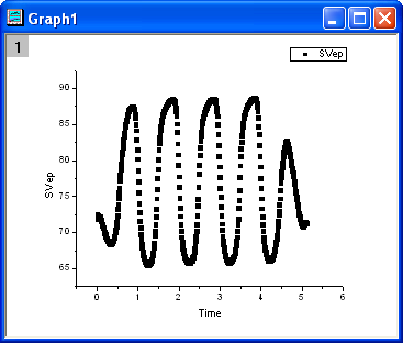
- Double-click on the data line in the above graph. This opens the Plot Details dialog box.
- Select the Symbol tab.
- Click the Symbol Color button, go to By Points tab and select Color Mapping: Col("SVep").
- The graph should look like the picture below:
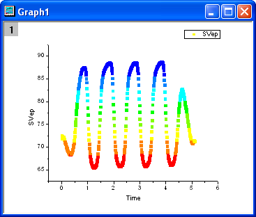
Origin automatically creates a color scale of 8 colors (and 8 equal scale increments) spanning the range of Y or Z values, then adds one color above and one below max/min values, to represent values outside the data range. Each data point is then mapped to the color scale.
To simply change the color list, follow instructions at the beginning of this Color Mapping topic. If you wish to change other properties of the colormap -- number of levels, increment, etc. -- you can do so using controls on the Colormap tab of Plot Details:
- Double-click on the plot to open Plot Details, then select the Colormap tab. Click on the Level or Fill column header to assign custom Y or Z value ranges to associated colors.
- Select Insert: Color Scale to display a color scale and the associated dataset mapping relationship in the graph.
| Note: Double-click on the scale to open the Color Scale Control dialog box and modify the scale. For more information, see Color Scales.
|
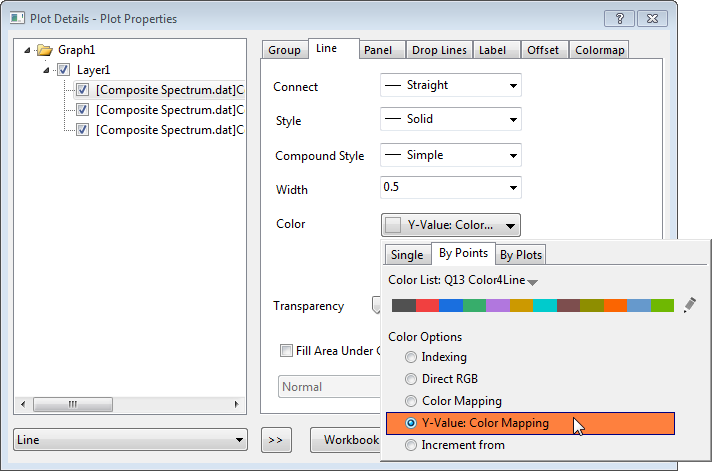
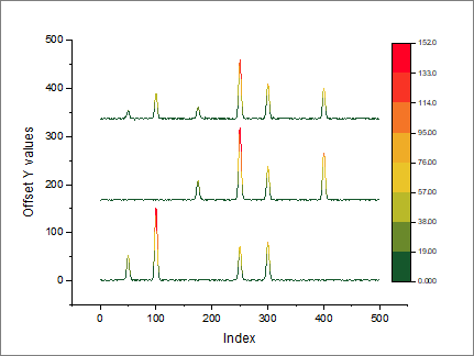
Y Value: Color Mapping
This option is only available for the 2D Group plot with Dependent edit mode. When there are multiple Y data plots in a graph, you can use this option to set the colormap based on Y value respective, and with the same the colormap level and fill setting.
An example
- Start with a new project or a new workbook. Import the data file \Samples\Curve Fitting\Composite Spectrum.dat by using "Import Single ASCII" button,
- Highlight all columns, and then select Plot: Basic 2D: Stacked Lines by Y Offsets to create the plot.
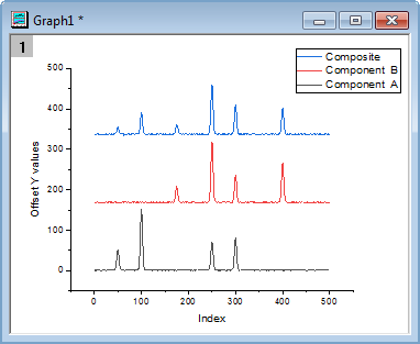
- Select Format: Plot... to opens the Plot Details dialog.
- Select the Line tab.
- Click the Color button, go to By Points tab and select Y Value: Color Mapping
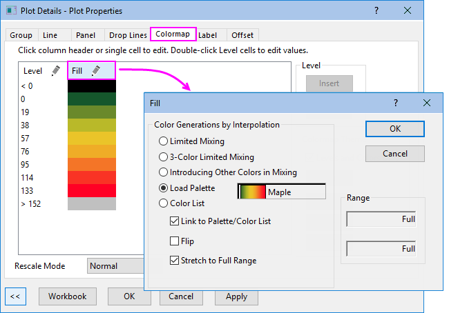
- Go to Colormap tab. Set colormap as the image below:
- Finally, if you wish to add a color scale to the graph, click the Color Scale button
 on the Add Object to Graph toolbar. on the Add Object to Graph toolbar.
| A color scale is the default legend type for a color-mapped plot but you can add an independent color scale to any plot. For more information, see Adding an independent color scale.
|
Y Value: Plus-Minus-Total
This option is only available for the Bridge chart (also call McKinsey-style waterfall plot). The Bridge chart is a special column/bar plot with Enable Brigde Chart selected on Bridge Chart tab in layer level.
This option is accessible from Fill Color/Pattern Color drop-down list on Pattern tab of Plot Details dialog. It fills columns/bars with different colors according to the condition that if the corresponding Y value is Positive, Negative or Total. The Total can be set in Data Indices for Total/Subtotal option on Bridge Chart tab.
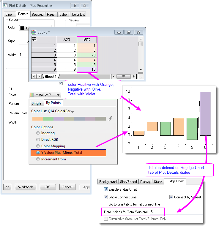
You can see the fill color sequence in Color List at the bottom. Note that only the first 3 colors will be used for Y Value: Plus-Minus-Total option: The 1st color in the list will be assigned to Positive Y, the 2nd color to Negative Y, and the 3rd to Total.
You can modify the color list by Ctrl+Clicking the Color List bar to open the Increment Editor.
|