8.5.6 Bubble ScaleBubbleScale
From Origin 2015, it is supported to add a bubble scale object to your 2D graph. From Origin 2017, it also supported for 3D Scatter graph. The bubble scale is a specialized label object that displays a legend of bubble size level and the corresponding numerical labels for the bubble plots. The size of the bubbles are controlled by the Symbol tab of Plot Details dialog. Note that in 3D graph, if layer projection is set to "perspective", the bubble scale may look like not accurate as an object gets farther from the viewer it will appear smaller on the screen.
Adding a Bubble Scale to a graph
When you create a Bubble graph or Bubble Color Map graph, a bubble scale will be added to the graph as legend by default.
In addition, for any 2D symbol plot and 3D Scatter plot that size indexing has been used, bubble scale could be added in any of the following ways:
- Select Insert: Bubble Scale.
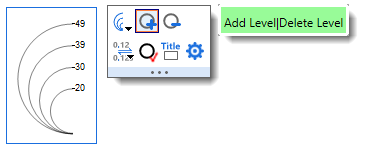
- Click the Add Bubble Scale button
 on the Graph toolbar. on the Graph toolbar.
- Right-click the legend to select Add Bubble Scale from the context menu.
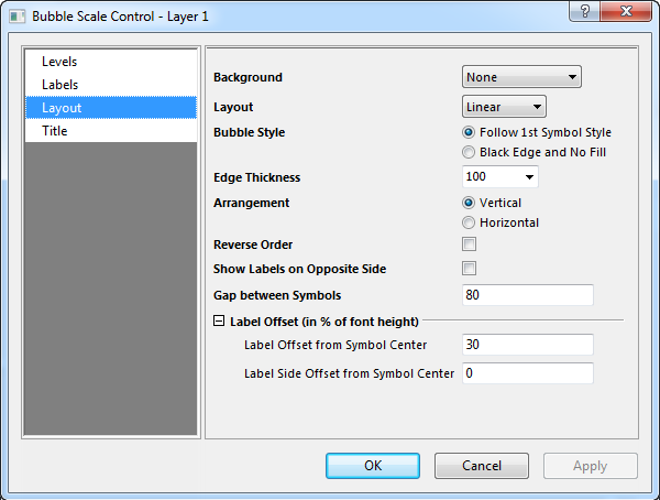
Bubble Scale Control dialog
 | There are Mini Toolbars dedicated to legend and color scale customization. Available buttons will vary by plot/legend type. To display the toolbar, click to select the legend or color scale object.
|
This dialog is used to control and customize the style of the bubble scale. It is designed with tree node structure, so in order to do customization, first select a desired page in the left panel, and then change the settings on the right panel.
To open the Bubble Scale Control dialog:
- Double-click on the bubble scale.
or
- Right-click on the bubble scale to select Properties... from the context menu.
Levels
From
Set the initial value of bubble scale in this text box.
To
Set the final value of bubble scale in this text box.
Levels
| Type
|
- Set the levels of the bubble scale by increment specified in the Value text box.
- Set the levels number displayed on this bubble scale by the absolute number specified in the Count text box.
- Set the value of the levels using an existing dataset or a series of space-separated numbers in the Dataset combo box.
|
| Value
|
This option is only available when By Increment is selected for Type. Set the increment value for this bubble scale in the associated text box.
|
| Count
|
This option is only available when By Counts is selected for Type. Specify the desired absolute number of total scale levels in the associated text box.
|
| Dataset
|
This option is only available when By Dataset is selected for Type. Select the dataset as the bubble scale in this drop-down list. Also you can enter the desired dataset name or a series of numbers separated by Space.
|
| First Level
|
This option is available when By Increment or By Counts is selected for Type. Specify the value of the first level for bubble scale. Note that this value should be within the From and To range for bubble scale, and when it is not specified, the From value will be used.
|
Labels
Display
The display of bubble scale level labels can be customized by the controls under this tree node.
For a detailed description on those controls, you can refer to the help file of Tick Labels in Axis Dialog
Format
| Color
|
Select the desired labels color from this drop-down list. Create custom colors by selecting the Define Custom Colors button and specifying the RGB in the Color dialog that opens.
|
| Rotate(deg)
|
Origin supports arbitrary rotation of bubble scale labels. Type a positive number in this text box to rotate labels counterclockwise, and a negative number to rotate labels clockwise (Origin will change the typed negative number into the corresponding positive number counterclockwise).
The <auto> option means that the bubble scale labels will rotate according to the direction of bubble scale object, means labels will always be perpendicular with the bubble scale object.
|
| Font
|
- Select labels font type from this drop-down list.
- Type or select the desired text size (in points) for the labels.
- Specify whether or not to use bold style for the labels
- Specify whether or not to use italic style for the labels
- Specify whether or not to use underline style for the labels
|
Layout
Background
Select the desired background for bubble scale object from this drop-down list.
Layout
This drop-down menu provides two options for bubble scale layout:
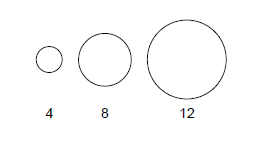
| Layout = Linear
|
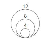
Layout = Nested
|
|
|
Bubble Style
| Follow 1st Symbol Style
|
The bubble style of the scale follows the symbol style of the first data point in the data plot.
|
| Black Edge and No Fill
|
Set the edge color to Black and the fill color to None for the bubble style, regardless of the symbol style.
|
Edge Thickness
Use this combo box to select or enter the edge thickness of the symbols in the scale.
The value is the percentage of original thickness of the symbols, which reaches to about 1 pixel.
Then, when it is set to 200, that means the edge thickness of the symbols in the scale will be 2*(original line thickness), which should reach to about 2 pixels.
Select Auto to follow the edge thickness of the source plot.
Arrangement (Linear)
This radio button is only available for the linear layout bubble scale (Layout is set to Linear).
| Vertical
|
When this is selected, the bubble scale object will always be along the vertical direction.
|
| Horizontal
|
When this is selected, the bubble scale object will always be along the horizontal direction.
|
Reverse Order (Linear)
This check box is only available for the linear layout bubble scale(Layout is set to Linear).
Select this check box to reverse the bubble scale and associated labels.
Half Circle (Nested)
This check box is only available for the nested layout bubble scale(Layout is set to Nested).
Select this check box to only show the left half of symbols in the bubble scale.
Show Label on Opposite Side
Specify whether to show labels on the opposite side of the bubble scale.
Gap between Symbols (Linear)
This option is only available when Layout is set to Linear. It is used to specify the gap between the closest edges of bubble symbols, note that there is a minimum limitation with the gap size to avoid overlapping.
Label Offset (in % of font height)
The options under this branch are used to control the gaps in the bubble scale object. The options are different based on different layout type. All the settings are based on the unit in % of current bubble scale label font height.
Linear
| Label Offset From Symbol Edge
|
Specify the gap between the closest edge of the largest bubble symbol and its associated label.
|
| Label Side Offset from Symbol Center
|
Specify a side offset to shift the labels along the direction of the bubble scale object in relation to the corresponding bubble symbol center. Both positive and negative values are allowed and means shift towards opposite directions.
|
Nested
| Label Offset from Symbol Center
|
Specify the horizontal gap between labels and symbol center. Both positive and negative values are allowed and means shift towards opposite directions.
|
| Label Side Offset from Symbol Top
|
Specify the vertical gap between the bottom of labels (when Rotate (.deg) = 0) and the top of the corresponding bubble symbol. Both positive and negative values are allowed and means shift towards opposite directions.
|
Show Leader Line (Nested)
This check box is only available for the nested layout bubble scale(Layout is set to Nested).
Select this check box to show the leader lines in bubble scale, which is a line object connecting the label and its reference bubble. The line object starts at the symbol top of the reference bubble, and ends at the middle of the label text left side if there is no gap. If this check box is selected, the controls for leader line styles will be expanded and you could customize the leader line with the following options:
| Line Thickness
|
Select the width of leader line from the combo box or type in another value.
|
| Auto Reposition to Avoid Overlapping
|
Select this check box to automatically set new positions for labels so that they will not overlap. When this check box is selected, the following three options will be available to specify criteria for re-position and also possible to define a polyline as leader line.
|
| Gap between Labels (% font)
|
Type in a value to define the vertical gap between labels. This actually defines the criteria of auto re-position. Note that in order to avoid overlapping labels, the value of this check box should be set to a non-negative value. The value is in % of the font height of label text, which is defined in the Font tree node in the Labels page.
|
| Landing Line for Symbol (% line)
|
Type in or select a value to define the length of landing line for symbol. The value is in % of the leader line length in horizontal direction.
|
| Landing Line for Label (% line)
|
Type in or select a value to define the length of landing line for label. The value is in % of the leader line length in horizontal direction.
|
| Gap between Line and Symbol (% font)
|
Type in a value to define the offset between the symbol top of reference bubble and the adjacent start point of the leader line (i.e. landing line of symbol). The value is in % of the font height of label text, which is defined in the Font tree node in the Labels page.
|
| Gap between Line and Label (% font)
|
Type in a value to define the offset between the adjacent end point of leader line (i.e. landing line of label) and the middle of the label text left side. The value is also in % of the font height of label text.
|
Title
| Show
|
Specify whether to show the title for the bubble scale
|
| Title
|
Type the text to be used in the bubble scale title. By default the syntax is %(?S, @options), in which ?S refers to the data set for size indexing, and @option determines which column meta data to be used. For details, refer to legend text substitution notation.
|
| Position
|
Specify the position of the title in relation to the bubble scale object: Top, Bottom, Left and Right.
|
| Rotate(deg.)
|
Origin supports arbitrary rotation of the bubble scale title. Type a positive number in this text box to rotate title counterclockwise, and a negative number to rotate title clockwise (Origin will change the typed negative number into the corresponding positive number counterclockwise).
The <auto> option means that the bubble scale title will rotate according to the direction of bubble scale object, means it will always be perpendicular with the bubble scale object.
|
| Color
|
Specify title text color from this drop-down list.
|
| Font
|
- Select the title text font in the drop-down list.
- Specify the bubble scale title size in the combo box.
- Specify whether or not to use bold style for the title.
- Specify whether or not to use italic style for the title.
- Specify whether or not to use underline style for the title.
|
|