8.8.3 Adding Error Bars to Your GraphAdd-ErrBar-to-Graph
Origin can draw error bars on a graph to indicate error or uncertainty in a reported measurement. Origin provides customization controls for error bars in both 2D and 3D graphs.
In 2D graphs, you can
- Use both X and Y error bars
- Use both plus and minus directions
- Set style of error bars, including color, line width, cap width, and transparency.
- Specify how to skip error bars when drawing.
|
- Draw error bars as lines, with fill color between error bars and data.
- Use both X and Y error bars in column graphs.
- Draw error bars in polar graphs as arcs.
|
In 3D graphs, you can:
- Use both plus and minus directions.
- Set style of error bars, including color, width, and transparency
|
- Select data for error bars.
- User error bars in such 3D graphs as XYZ 3D scatter, matrix 3D scatter, 3D color fill surface, and 3D color map surface.
|
 | Error bars are a standard feature of box charts and are added automatically when the box chart is created. Options for controlling error bars (whiskers) in box charts are found on the Box and Lines tabs of Plot Details.
|
Using a dataset to supply error bar values
Method 1 - Preset Plot Designations
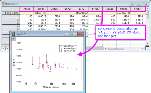
This method requires you to preset the worksheet's column Plot Designations prior to creating your plot. Each designated error bar dataset must be to the right of the data of the Y dataset with which it is associated (example: Y1, yEr1, Y2, yEr2, Y3, yEr3, etc).
- Set up your worksheet so that the columns are designated Y1, yEr1, Y2, yEr2, Y3, yEr3... (the error bar column must be to the right of the Y data column).
- Select both your Y data and your error bar data.
- Choose your 2D plot (e.g., scatter, line + symbol, column/bar) or 3D XYY plot.
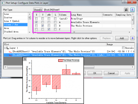
Method 2 - Using Plot Setup Dialog
Use the Plot Setup dialog (Origin workbook) or the Select Data for Plotting dialog (Excel workbook) to plot a data set as error bars. Note that these two dialogs allow you to designate any worksheet column as an error bar data set regardless of the worksheet column's plotting designation or relative column position.
Note:
- The above two methods are only available for the 2D plot (including polar graph) and the 3D XYY plot, but not for the 3D Surface, 3D Bars and 3D Scatter plots.
- Both X and Y error bars can be added by the above two methods.
|
Method 3 - Using Plot Details Dialog for 3D Graphs
Error bars also could be added in the 3D graph from existing datasets by the Plot Details dialog. This method requires the error data to be as a data column locates in the same worksheet (for worksheet data), or as a matrix object in a same matrixsheet (for matrix data).
It is possible to add error bars for 3D Bars, 3D Trajectory and 3D Scatter plots created from worksheet data, or 3D Surface, 3D Bars and 3D Scatter plots created from matrix data.
- User error bars in such 3D graphs as XYZ 3D scatter, matrix 3D scatter, 3D color fill surface, and 3D color map surface.
The procedure is:
- Double click on the plot to open the Plot Details dialog.
- Go to the 3D Error Bar tab and click Enable and do the customization.
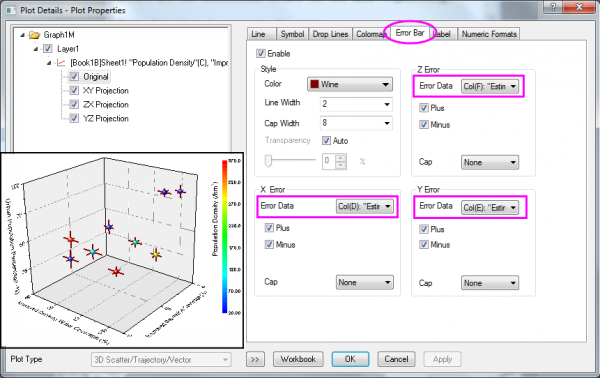
The error bars for 3D plots are only available for the Z direction, except for the 3D Scatter and 3D Trajectory plots created from worksheet data. In these two plots, error bars for all X, Y and Z directions are available.
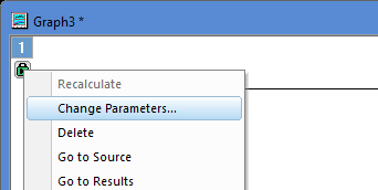
Method 4 - Adding Error Bars to Grouped Plots with Indexed Data
Error bars are also supported for grouped plots, such as the grouped column plot (see image below), which can be accessed by selecting menu Plot > Categorical.
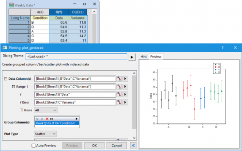
When plotting such graphs, if a dataset contains a column with error, variance, or uncertainty, it should be included in the Data Column(s) field, or can be entered directly in the Y Error field.
However, in some cases users may want to add this column to a plot after the graph has already been constructed. In these cases, error data may be added by clicking on the Lock icon in the corner of the grouped graph and selecting "Change Parameters...", at which point additional input data can be specified using the Plotting dialog.
Adding error bars to an existing graph by calculating simple dataset statistics
You can add error bars to a 2D graph by calculating simple dataset statistics:
- With the graph window active, click Insert, and then click Add Error Bars....
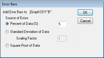
This method creates error bar values by calculating either:
- A user-specified percentage of each data point.
- Standard deviation with specified scaling factor of the data set.
- Square root of each data value.
When error bars are added to a data plot, the error data is output to a new column on the source worksheet. The column includes a comment indicating the error bar type. The formula used for error bar calculation will appear in the Set Column Values dialog.
Customizing error bars
The Plot details dialog provides customization controls for error bars in both 2D and 3D graphs.
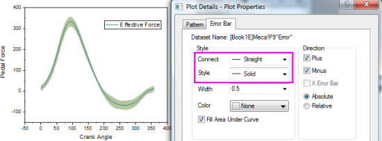
In 2D graphs
The Plot Details dialog lists the error bar data under the associated plot in the left panel. When the error bars icon is selected, an Error Bar tab displays on the right side of the dialog box.
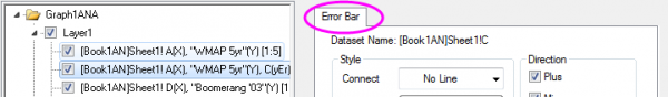
In this tab, you can:
- Specify plus and/or minus directions.
- Set style of error bars, including color, line width, cap width, and transparency.
- Specify how to skip error bars when drawing.
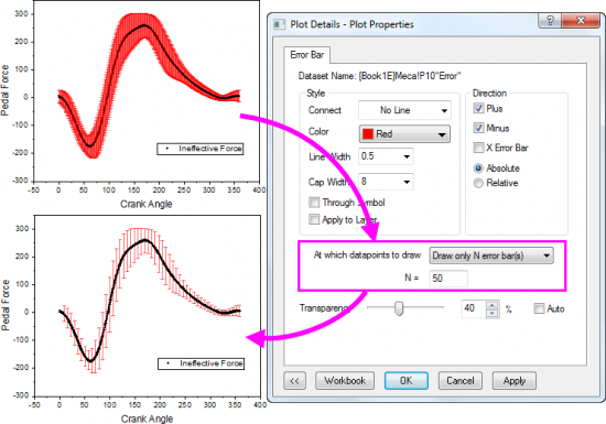
- Draw error bars as lines, with fill color between error bars and data.
 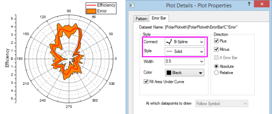
Note: For polar plots, you can only draw error bars as lines for error measured on the "r" factor.
In 3D graphs,
When the Original plot icon is selected on the left panel of the Plot Details dialog, an Error Bar tab displays on the right side.
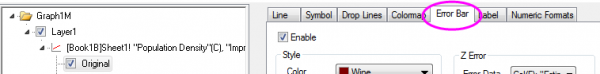
In this tab, you can:
- Specify plus and/or minus directions.
- Set style of error bars, including color, cap width and cap direction, width, and transparency.
|