Fitted Curve Plot Analysis
Fitted_Curve_Plot_Analysis
The fitted curve as well as its confidence band, prediction band and ellipse are plotted on the Fitted Curves Plot, which can help to interpret the regression model more intuitively.
Confidence and Prediction Bands
How can we know whether the actual y value (or the mean value of y) is different from at a particular x value at a particular x value  ? We can resort to the confidence intervals. Given a confidence level α, we can calculate the confidence interval forby ? We can resort to the confidence intervals. Given a confidence level α, we can calculate the confidence interval forby : :
 \,\!")
In the following figure, for a chosen confidence level (95% by default), the confidence bands show the limits of all possible fitted lines for the given data. In other words, we have 95% confidence to say that the best-fit line (possibly one of the dash lines in the figure below) lies within the confidence bands.
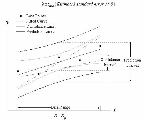
From the expression of confidence interval, we know that the width of the confidence band is proportional to the standard error of predicted y value,  . So the band will become narrower as the standard error decreases; if the error is zero, the confidence band will "collapse" into one single line. Besides, the term . So the band will become narrower as the standard error decreases; if the error is zero, the confidence band will "collapse" into one single line. Besides, the term ^2") can also affect the band width. The further is from can also affect the band width. The further is from  , the greater becomes. Therefore, the confidence bands usually flare outward near the ends of the data range. , the greater becomes. Therefore, the confidence bands usually flare outward near the ends of the data range.
The case of prediction band is similar, but it uses a different expression:
 \,\!")
It is different from the expression of confidence interval in that there is a constant term. Thus, the prediction band is wider than the confidence band.
The prediction band for the desired confidence level (1−α) is the interval within which 100(1−α)% of all the experimental points in a series of repeated measurements are expected to fall. By default, α is equal to 0.05. For a prediction band with (1−α)=0.95, we have 95% confidence to say that an expected data point will fall within this interval. In other words, if we add one more experiment data point whose independent variable is within the independent variable range of the original dataset, there is 95% chance that the data point will appear within the prediction band.
Ellipse Plots
We can use ellipse plots to graphically examine correlation in simple linear fitting. During linear regression, the two variables, X and Y are assumed to follow the bivariate normal distribution. This distribution is the co-effect of (X, Y) and is shaped like a bell surface.
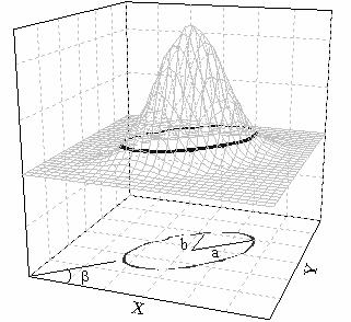
For a given confidence level, such as 95%, we can conclude that 95% of variables pairs (x, y) will fall in the confidence area included by the upper ellipse, and the projection of the confidence area on XY plane is the confidence ellipse for prediction. The confidence ellipse for the population mean use the same idea and just shows the confidence ellipse of the mean ") . .
The shape of the ellipse is determined by the correlation coefficient, r. Strong correlation means a long a (major semiaxis) and a short b (minor semiaxis). Also, the orientation of the ellipse also depends on r.
|