28.1.6 The 3D and Contour Graphs Toolbar3D-Contour-Graph-Toolbar
3D Graphs and 3D Surface Graphs
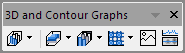
Origin's 3D Graphs Toolbar (when a worksheet is active)
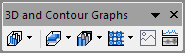
Origin's 3D Graphs Toolbar (when a matrix is active)
Origin supports a wide variety of 3D XYZ and 3D Surface graph types, all of which are provided on one comprehensive 3D Graphs toolbar.
Plotting is quick and easy. Simply select the desired XYZ or matrix data and click on a plot type button. The rotation and size of the graph can be updated graphically or by specifying specific values. Additional properties of your 3D graph can be edited by double-clicking on any object in the graph to bring up its related properties dialog.
Since Origin's basic 3D plots originate from an Origin worksheet and its 3D Surface plots originate from an Origin matrix, the 3D Graphs toolbar is window sensitive (as can be seen below).
The following table shows all the built-in 3D XYZ and 3D Surface graph types, such as XYZ Scatter plot graphs and 3D Wire Frame surfaces, that Origin offers. Learn more about the graph type, please refer to the 3D XYY graphs, 3D XYZ graphs and 3D surface graphs pages.

|
3D scatter graphs are frequently used when the data are not arranged on a rectangular grid. Simple 3D scatter graphs display an object or marker corresponding to each datum. More complicated scatter graph include datum specific marker attributes, drop-lines and combinations of the scatter data with additional objects such as a fitted surface.
|

|
Trajectory plot is trivariate plot in which a comparison of 3 measures is presented, one measure along each axis. The plot can include projections onto any or all planes. Settings for the actual data and each projection can be edited independently. This includes line, symbol, and drop line settings.
|

|
Plots selected XYZZ data into a 3D Scatter with Error Bar plot.
|

|
Plots a 3D Vector plot with selected XYZXYZ data.
|

|
Plots a 3D Vector plot with selected XYZdxdydz data.
|

|
A 3D tetrahedral plot is created from XYZZ worksheet data. The Z columns can be in multiples of 2, in which case, Z-Z pairs will be grouped in the layer and plot Symbol Edge Color will be incremented.
|

|
3D Bar plots can be created from worksheets to visualize the XYY values in them. The height of each bar represents the second Y value in the source worksheet that corresponds to the XY coordinates of the bar.
|

|
3D stacked bar can be created from XYY worksheet data. All Y columns with same Z value will be stacked on Y direction.
|

|
3D 100% stacked bar can be created from XYY worksheet data. All Y columns with same Z value will be stacked and their total length will be normalized to fill the whole Y axis range.
|

|
Creates 3D Ribbon plots with the XYY values in a worksheet. The height of each ribbon represents the second Y value in the source worksheet that corresponds to the XY coordinates of the ribbon.
|

|
Creates 3D Wall plots with the XYY values in a worksheet. The height of each wall represents the second Y value in the source worksheet that corresponds to the XY coordinates of the wall.
|

|
Creates 3D Waterfall plots with the XYY... values in a worksheet. Each data set is displayed as a line data plot and arranged by a specified parameter in the Z dimension.
|

|
Creates 3D Waterfall plots with the XYY... values in a worksheet. Each data set is displayed as a line plot and arranged by a specified parameter in Z direction. The color map is applied in the Y dimension.
|

|
Creates 3D Waterfall plots with the XYY... values in a worksheet. Each data set is displayed as a line plot and arranged by a specified parameter in Z direction. The color map is applied in the Z dimension.
|

|
Creates 3D Color Fill surface with matrix value. The Z values determine a surface of X and Y grid lines with fill colors on the front and the back of the surface.
|

|
The 3D X Constant with Base Color Fill Surface plot draws grid lines parallel to the X axis only when creating a 3D Color Fill Surface.
|

|
The 3D Y Constant with Base Color Fill Surface plot draws grid lines parallel to the Y axis only when creating a 3D Color Fill Surface.
|

|
3D Color Map Surface plots are trivariate plots in which a comparison of 3 measures is presented. Each subset, or level, of Z values (as defined by the user) in a 3D Colormap Surface graph is represented by a different fill color and can be further delineated by displaying a contour line inbetween each level.
|

|
Creates 3D Color Fill surface with Error Bar.
|

|
Creates 3D Color Map surface with Error Bar.
|

|
Creates multiple Color Fill surface, in which color varies from one to another.
|

|
Creates multiple Color Map surface, in which color varies from one to another.
|

|
Creates 3D Wire Frame graph for matrix data, in which the Z values determine a surface of X and Y grid lines.
|

|
For the Wire Surface graph,the Z values in a matrix determines a surface of X and Y grid lines and secondary lines are placed between the grids.
|

|
3D Bar plots can be created from XYZ data or matrices. The height of each bar represents the Z value in the source XYZ or matrix that corresponds to the XY coordinates of the bar. It provides a quick view of the trends of the data and shows how the Z data changes with the X and Y data.
|

|
3D stacked bar plot can be created from XYZZ.../XYZXYZ... data or matrix with multiple objects. For XYZ data, all Z values at same X and Y coordinate will be stacked cumulatively; for matrix data, all objects in current matrixsheet will be stacked cumulatively.
You are also allowed to create this kind of 3D stacked bars from Virtual Matrices which are supposed to be created in advance with X-Function w2vm.
|

|
3D 100% stacked bar plot can be created from XYZZ.../XYZXYZ... data or matrix with multiple objects. For XYZ data, all Z values at same X and Y coordinate will be stacked cumulatively; for matrix data, all objects in current matrixsheet will be stacked cumulatively. The total length of each stacked bar will be normalized to fill the whole Z axis range.
You are also allowed to create this kind of 3D stacked bars from Virtual Matrices which are supposed to be created in advance with X-Function w2vm.
|

|
Creates 3D scatter graph for matrix data.
|
|
|
Creates 3D Scatter with Error Bar for matrix data.
|

|
Creates 3D Color Map surface with Projection .
|
Contour Graphs
Origin's 3D Graphs toolbar, Contour Plots fly-out when a worksheet is active.
Origin's 3D Graphs toolbar, Contour Plots fly-out when a matrix is active.
Several contour graph/contour plot templates are included in Origin. To create a contour plot, one click access is provided via the 3D Graphs toolbar (see below).
Origin's contour graphs include the ability to apply a color fill and/or fill pattern to the contours, display contour lines (equipotential lines) and contour labels, as well as adjust contour levels. A color scale object can be included with the contour plot to serve as a legend. Contour labels can even be graphically attached to a contour line with the click of your mouse.
For more advanced control, XYZ Contour plots (created from XYZ worksheet data using triangulation) can employ a custom boundary around the data.
Next list is each of the built-in contour plot types Origin offers. To learn more about the selected coutour graph template, please refer to the contour graph page.

|
A contour plot that uses a color map for the color fill and fills to the contour lines.
|

|
A black and white contour plot that includes contour Lines and contour labels (i.e no color fill).
|

|
A contour color fill plot that uses a gray color mapping for the color fill and fills to the XY grid.
|

|
Allows you to dynamically create horizontal, vertical, and arbitrary line segment profiles of the matrix data.This kind of graphs are frequently used to visualize and analyze terrain elevation data or electromagnetic field data.
|

|
Polar contour graphs in polar coordinates from both XYZ data and matrix data. For XYZ data, X is the Angular (Units are in degrees), Y is the Radius and Z determines the contour; for matrix data, the X and Y coordinates of matrix data represents the Angular (Units are in degrees) and Radius respectively.
|

|
Polar contour graphs in polar coordinates, here X data for r, Y data for theta,along with the Z data for Z.
|

|
Plots selected X Y Z data into a contour plot on Ternary coordinate.
|

|
Plot data in matrix/virtual matrix into a Heatmap plot.
|

|
Plot data in matrix/virtual matrix as a Heatmap plot with labels.
|
Image Graphs
Origin comes with two built-in image graph types. To access these image graphs, Origin provides one click access via the 3D Graphs toolbar (see below).
The following list shows the built-in image plot and the image histograms offered by Origin. If a link appears to the right of a button, click on it (or the plot type button) to learn more about the graph.

|
Allows you to plot matrix data as an image graph. The image graph displays the image on xy-axes. Once plotted, you can annotate the graph as desired.
|
|
|
Provides a quick way to analyze the image data and generate profiles. You can create horizontal, vertical and arbitrary line profiles of the image data dynamically.
|
|