1.33 Correlation Plot(Pro)Correlation-Plot
Summary
This Correlation Plot app can be used to plot the correlation coefficient matrix, which is very useful to reveal the relationship between variables.
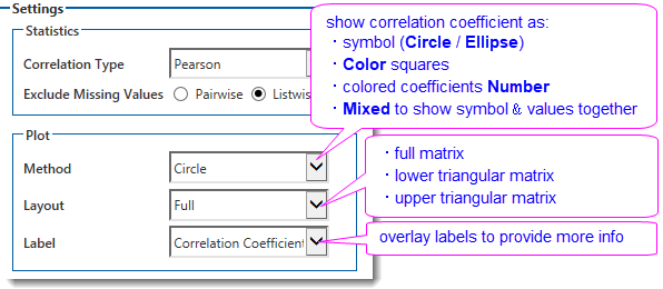
The correlation coefficient can be visualized as Circles, Ellipses, Colored Squares, Colored Coefficients Values or Mixed to show symbol and coefficients values together. And you can choose to plot the correlation matrix in full layout, or lower/upper triangular matrix. In addition, you can overlay different labels on graph to provide more information, like correlation coefficient values, or the p values, or the Insignificant Mark to indicate which paired for variables are not significantly related. or Significant Mark to indicate the significance.
Tutorial
This tutorial uses App’s built-in sample project. To open this sample OPJU file:
- Right click the Correlation Plot App icon in the Apps Gallery and choose Show Samples Folder.
- A folder will open. Drag-and-drop the project file CorrelationPlotEx.opju from the folder onto Origin.
| Notes: If you want to save the project after changing, it is recommended saving to a different folder location (e.g. User Files Folder).
|
Steps
Full Layout
- With workbook ProteinConsum active, click the Correlation Plot icon from Apps Gallery.
- In the dialog that opens,
- select col(B) - col(J) as variables in the left panel
- choose Method to Circle to plot correlation coefficient as circles.
- choose Layout to Full to plot the full matrix.
- choose Label to Correlation Coefficient
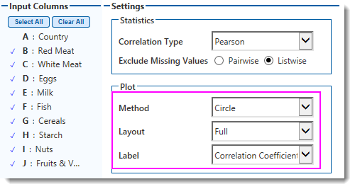
- Click OK button to create the graph.
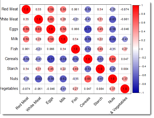
Here we got the correlation plot whose color and size are mapped to the correlation coefficient values. The stronger the correlations is, the larger the circle is. Positive correlations are displayed in red and negative correlations in blue color. The Correlation Coefficients are overlaid on the circles.
Lower Triangular Layout
Now let's plot a lower triangular correlation matrix with colored square symbols.
- Activate workbook ProteinConsum again, click the Correlation Plot icon from Apps Gallery.
- In the dialog that opens,
- select col(B) - col(J) as variables in the left panel
- choose Method to Color to plot correlation coefficient as colored square symbols.
- choose Layout to Lower Triangular Matrix to plot the matrix as lower triangular layout.
- choose Label to Significant Mark to overlap significant mark on the graph
- In Significant Level edit box, enter
0.05 0.01 0.001
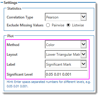
- Click OK button to create the graph.
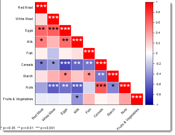
he correlation with strongest relation (p <=0.001) are marked with three stars (***), and the less strong ones (p <= 0.01) are marked with two stars (**), and the ones whose p <=0.05 are marked as one star (*)
Mixed Layout
Finally let's plot a “mixed” correlation matrix.
- Highlight column B to J in workbook ProteinConsum, click the Correlation Plot icon from Apps Gallery. Data will be selected automatically in the dialog.
- Set the dialog as follow:
- choose Method to Mixed
- choose Lower Triangular radio button.
- choose Upper Triangular to Ellipse to show the symbol as ellipses
- choose Labell to Insignificant Mark, and enter
0.05 in Significant Level edit box.
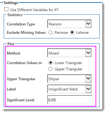
- Click OK button to create the graph.
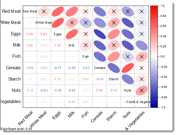
This correlation plot displays the correlation values in lower triangular matrix and symbols in the upper triangular matrix. The ellipse symbol’s color, shape and orientation are mapped to coefficient values. Orientation of ellipse shows whether the correlations are positive or negative. The insignificant mark is overlayed on the graph. If the correlations are not significant related, a cross (X) is marked on the symbol.
|