1.14 Colormap for Map DataColormap-for-Map-Data
Summary
This Colormap for Map Data app can be used to create a map with the Shapefile data and fill each region with colors mapping to specified values. This tutorial will show you how to plot a US map of 2016 Olympic game medals distribution over each state.
Tutorial
1. Import Shapefile Data
- Find out Colormap for Map Data app in Apps gallery (docked to the right of Origin workspace), right click on it and select Show Samples Folder. Under the folder there are 3 files: cb_2015_us_state_20m.zip, US_medals.ogw, and colormap_US_medals.opj. Unzip cb_2015_us_state_20m.zip to 8 files and among them there’s one Shapefile (.shp file). Shapefile is a popular data format for storing map data. Origin has provided the Import Shapefile app for importing such data.
- Go back to Origin, create a new project by File: New: Project. Then in the Apps gallery, click the Import Shapefile app to bring up the import dialog.
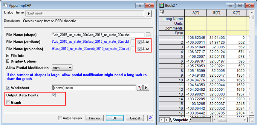
- Within the dialog,
- select the .shp file unzipped in step 1
- check Auto checkbox of both File Name (attribute) and File Name (projection)
- make sure Output Data Points checkbox is checked.
- clear Graph checkbox
keep other settings the default values. Click OK to import.
2. Reorder Shapefile Data
- Go to Book2 where the shapefile data is imported. Click the Colormap for Map Data app from the Apps Gallery. A toolbar with 2 buttons shows up.
- Click the 1st button to bring up the ReorderShapefileData dialog. Select NAME column (col(J)) for Names for ID, by clicking on
 button. button.
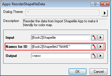
- Click OK to reorder the data based on state NAME.
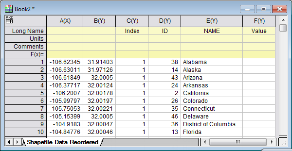
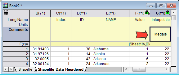
In the output worksheet Shapefile Data Reordered, there are 6 columns. The first 2 columns are the longitude and latitude of the map data respectively. You can put "Longitude" and "Latitude" to Long Name of column A and B. The 3rd column is the state ID that each coordinate corresponds to, and the 4th column is the ID of each state (5th column). If Names for ID is not specified in step 2, the 5th column will be empty. The last column is now empty, which is used to fill the values for mapping colors.
3. Create Map with Colormap of Specified Data
- Drag and drop US_medals.ogw file from the App sample folder into Origin’s workspace. A workbook, Book3 containing the US medal data is generated.
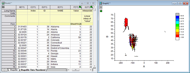
- Activate worksheet [Book2]"Shapefile Data Reordered". Highlight the Value column (col(F)) and select Column:Set Column Values…
- In the Set Values dialog, type the following formula below Col(F)= :
lookup(E,[Book3]Sheet1!A,[Book3]Sheet1!B,2)
This will map the state medal numbers referring to the state column in this worksheet.
- With Book2 activated, click the 2nd button of the app’s toolbar, a graph of the map data is created. The color on the graph is now mapped to number of medals in column F, also the related labels are added to the corresponding regions.
4. Customize the Graph
- Go to worksheet Shapefile Data Reordered, change the comments of column G to "Medals".
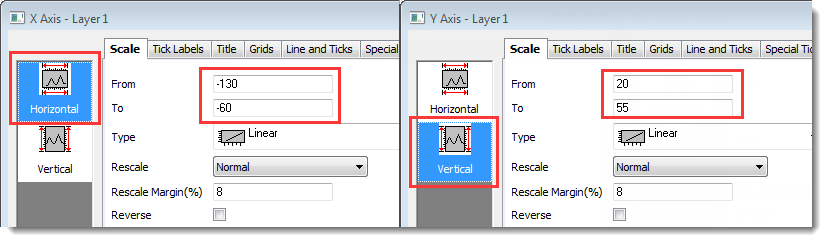
- Go to the created graph. Double click on the X axis to bring up the Axis dialog.
- On Scale tab, set From = -130, and To = -60.
- Select Vertical from the left panel, and set From = 20 and To = 55.
- Under tabs Tick Labels, Title, Line and Ticks for bottom and left axis, clear Show checkbox. Click OK.
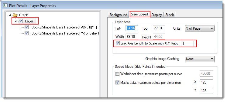
- Double click the plot to bring up the Plot Details dialog. Highlight Layer1 in the left panel. Go to the Size/Speed tab, check Link Axis Length to Scale with X:Y Ratio 1. Click Apply. This makes sure the map isn’t distorted.
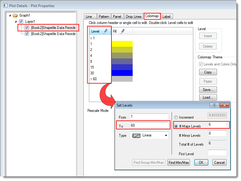
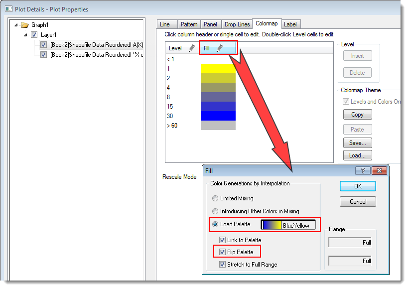
- To customize colormap levels and colors, select Plot on the left panel. Go to the Colormap tab in the right panel. Click on the Level header of the table to bring up the Set Levels dialog. In this dialog, set From = 1 and To = 60. Check # Major Levels and input 6 for it. Click OK back to Plot Details dialog.
- Click the Fill header of the table to bring up the Fill dialog. Check Load Palette and select BlueYellow. Check Flip Palette. Click OK.
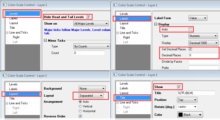
- Double click on the color scale to bring up the Color Scale Control dialog. In the dialog,
- select Levels from the left panel, check Hide Head and Tail Levels.
- select Labels from the left, under Display, uncheck Auto. Check Set Decimal Places checkbox and input 0 for Decimal Places.
- select Layout from the left, set Layout to Separated.
- select Title from the left, check Show checkbox in the right panel
Click OK button. You can move and resize the color scale as desired.
- As the final step, we are going to add Alaska and Hawaii to the graph. Activate the graph, click the duplicate button in the top tool bar twice to make two copies.
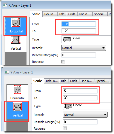
- In the first copied graph, delete the color scale. Select Format: Axis: X Axis…. With Horizontal selected in the left panel, under the Scale tab, set the From = -195 and To = -125. Then select Vertical in the left, set From = 50 and To = 75. Click OK. Alaska is now shown in this graph.
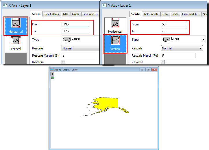
- Repeat previous step for the second graph copy. Set the Horizontal scale as From -195 To -120 and Vertical scale as From 5 To 30.
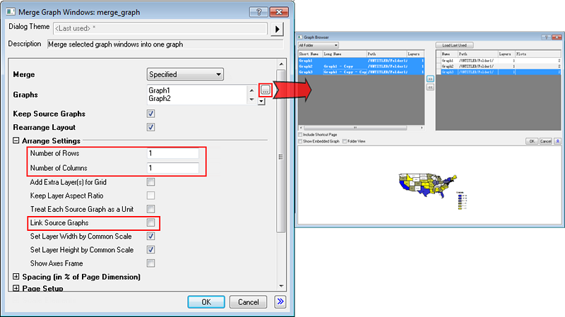
- Click merge button in the right side tool bar. In the Merge Graph dialog,
- Click ... button besides Graphs to open up the graph browser. Select all 3 graphs in the left panel and click >> button to move them to the right and then click OK to add them.
- Set Number of Rows and Number of Columns to 1.
- Make sure Link Source Graphs is unchecked.
Click OK.
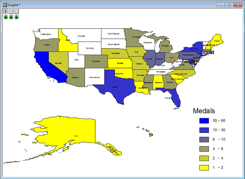
- In the generated merged graph, move and resize the layer for Alaska and Hawaii as desired for better display.
|