10.1.2.2 The Data Info Window and Data Point TooltipData-Info-Tool
Introduction
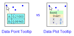
The Data Info window and Data Point Tooltips are related features that use similar dialog boxes to display similar descriptive information about a plotted data point.
- Data Info: This is an older pop-up window that opens automatically when you choose either the Data Reader
 , the Annotation , the Annotation  , or the Data Cursor tool , or the Data Cursor tool  from the Tools toolbar. from the Tools toolbar.
- Data Point Tooltip: is turned on, by default, and appears when you simply hover on a plotted data point.
User Story
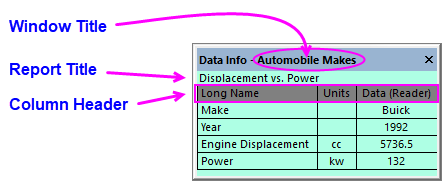
In the image below, we have an automobile dataset comparing models from various manufacturers over a number of years. We begin by making a plot of Power vs. Gas Mileage and we want to do a little exploratory analysis using the resulting plot. We pick the Data Reader from the Tools toolbar and click on a point in the graph that looks to be a bit of an outlier. The Data Info window opens and shows us that we have picked a point in row 334 or our worksheet and that it has coordinates of X = 66 (Power) and Y = 36 (Gas Mileage).
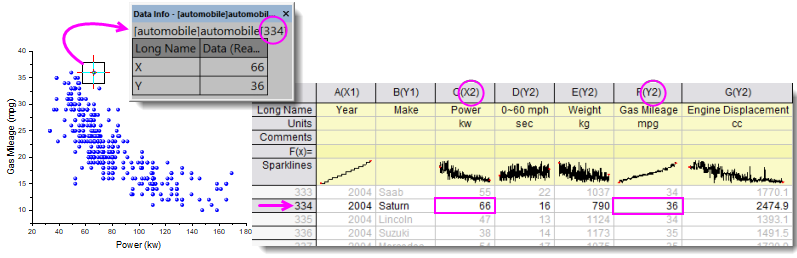
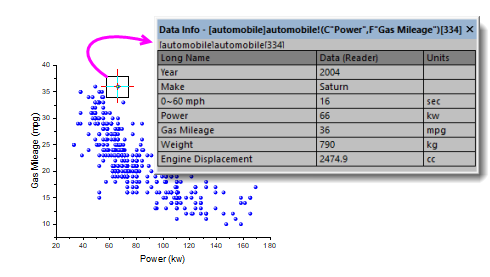
If we return to the source worksheet we find that row 334 happens to be a Saturn model, Year = 2004 and it has a rated Power = 66kw and a Gas Mileage = 36mpg. The Data Info window reports this information in its default configuration; but as we are doing our exploratory analysis, wouldn't it be helpful to know more than just X = 66 and Y = 36? What if, instead of reporting simple XY coordinates, we gave meaningful labels to the X and Y values? Also, wouldn't it be helpful to know automobile make and model and perhaps other available information about this data point (2004 Saturn) -- 0-60mph time, Weight and Engine Displacement? We can add this data to the Data Info window and even save our custom configuration for the next time we need to perform such exploratory analyses.
Data Point Tooltip
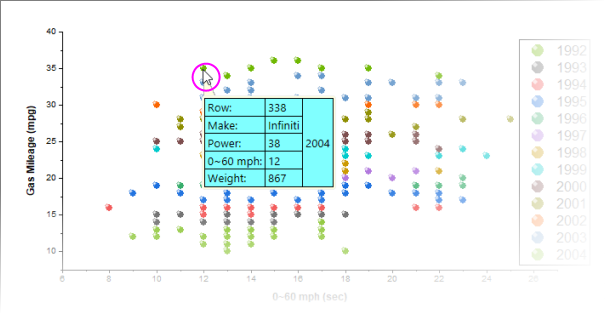
Starting with Origin 2019, you can simply hover on a data point to produce a tooltip that can be configured to report much the same information as the Data Info window. The tooltip is customized via the Data Point Tooltip dialog -- a slightly-simplified version of the Data Info Report Settings window.
Tooltip Shortcut Menu
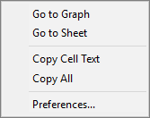
For tooltip customization and other options, right-click directly on the data point tooltip.
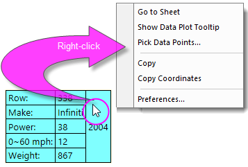
- Go to Sheet pops up the worksheet with source data highlighted.
- Show Data Plot Tooltip toggles display of a non-customizable data plot tooltip in place of the customizable data point tooltip in 2D plots (see, below).
- Pick Data Points puts the cursor into data reading mode and opens a Pick Points dialog. Double-click on points in the graph and when finished, click Done. This generates summary data (source, X-Y coordinates, etc.) for your picked points.
- Copy copies data point tooltip information, including labels, to the Clipboard.
- Copy Coordinates copies only coordinate values. Right-click on a cell and Paste each value to a separate cell within the row; or Paste (keep spaces) to paste values to the selected cell as a space-separated string.
- Preferences opens the Data Point Tooltip dialog allowing you to customize tooltip content and formatting. Use documentation of the Data Info window, below, as a guide to configuring your tooltips.
 | There are a couple of ways to turn off display of the data tooltips (see next tip). The quickest way -- particularly if you find this feature useful but just want to temporarily disable it -- is to activate the graph and click the View menu. Clear the check mark beside Data Tooltips. Tooltips will be disabled for all graphs until you click this menu item again or until you start a new session.
|
| There are two data tooltips, the other one being the older, non-customizable Data Plot Tooltip. You can toggle between the two or you can turn them off completely. To turn Data Point and Data Plot tooltips on or off on startup, change the values of LabTalk system variables @PT and @PTI.
@PT=0; //Disable both data plot and data point tooltips
@PT=1; //Enable data plot tooltips for 2D graph
@PT=2; //Enable data plot tooltips for 3D OpenGL graph  (default)
@PT=3; //Enable data plot tooltips for both 2D graph and 3D OpenGL graph
@PTI=0; //Disable only data point tooltips
@PTI=1; //Enable data point tooltips (default)
|
| By default, the Data Point Tooltip displays with a moderate degree of transparency. You can affect tooltip transparency by changing the value of LabTalk System Variable @TDT. For information on changing the value of a LabTalk System Variable, see this FAQ.
|
Data Info Features
- Highly customizable, both in its appearance and in the displayed content.
- Can display data, metadata stored in the worksheet column label rows, and cell-embedded images.
- A custom configuration can be saved to the graph window, to a single graph layer or even a single data plot.
- A custom configuration can also be saved as a standalone file (Theme) and applied to yet-to-be-created data plots, at some later date.
Context Menu
Right-click on the Data Info window to bring up the context menu.
| Go to Graph
|
Go to the source graph. Not available when the graph window active.
|
| Go to Sheet
|
Go to the source worksheet. Not available when the worksheet is active.
|
| Copy Cell Text
|
Click in a Data Info window cell and copy the text in the cell to the Clipboard.
|
| Copy All
|
Copy all the text displayed in the Data Info window to the Clipboard.
|
| Preferences
|
Open the Data Info Report Settings dialog. Additional information about configuring Data Info Report Settings is provided below.
Note: The Preferences context menu is only available when the graph window is active.
|
Data Info Report Settings
The Data Info Report Settings dialog is used to customize the content displayed in the Data Info window.
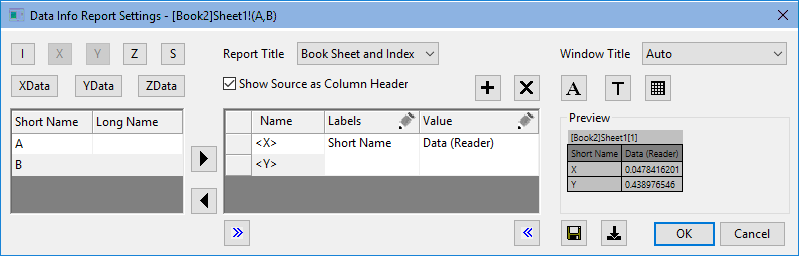
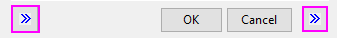
| Use the Show/Hide buttons at the bottom of the dialog to temporarily hide the outside panels so that you can make the center panel wider.
|
Row Controls
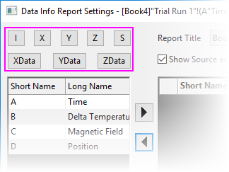
Generally, you will want your Data Info window to display the X and Y values (and Z if they exist) of your selected point. Use these buttons to add data point values to the Data Info window (or Data Point Tooltip).
When plotting numeric data, it is common for graph axis tick labels to be formatted differently than are the corresponding data in the source worksheet. In such cases, you can use either coordinate (e.g.  ) buttons and source buttons (e.g. ) buttons and source buttons (e.g.  ) for adding data point values: ) for adding data point values:
- If you choose coordinates, Data Info and Tooltips will follow the display format of the graph axis, but with more precision.
- If you choose source, Data Info and Tooltips will follow the display format of the worksheet.
Note that in either case, you can still apply a custom format to Data Info or Tooltip display (i.e. you can set distinct formats for (1) worksheet, (2) graph axis and (3) tooltip dislplay) -- see Column Settings, below.

|
<I> Row Index : The worksheet row index of the selected point.
|
|
|
<X> X Coordinate : The x coordinate of the selected point.
|

|
<Y> Y Coordinate : The y coordinate of the selected point.
|

|
<Z> Z Coordinate : The z coordinate of the selected point.
|
|
|
<XData> Source X Data : The source x dataset of the selected point.
|

|
<YData> Source Y Data : The source y dataset of the selected point.
|

|
<ZData> Source Z Data : The source z dataset of the selected point.
|

|
<S> Black Space : Add a separator.
|
Columns Controls
The column controls in the left and center portions of the dialog box are used for adding, arranging and formatting the display of data associated with a particular data point.
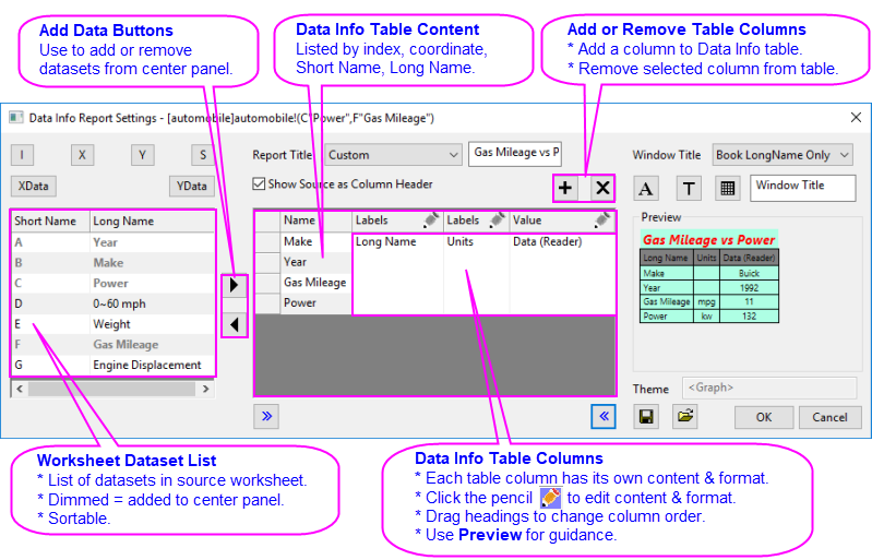
| Worksheet Dataset List
|
This panel lists all datasets (columns) in the worksheet used to create the plot. This list may include unplotted data. Datasets are listed by column Short Name and by Long Name, if it exists.
- The list can be sorted by clicking the Short Name or Long Name header.
- When you move a dataset to the middle panel, the dataset name(s) is dimmed.
|
| Add Data Buttons
|
Use these buttons to move datasets in or out of the Data Info window.
|
| Data Info Table Content
|
This is a listing of all datasets currently added to the Data Info window. These are listed only by column Short Name:
- To move content in or out, click on the dataset, then click the appropriate arrow button.
- Drag the buttons to the left of the Short Name column to reorder.
|
| Data Info Table Columns
|
Each column in the Data Info table (visible in the Preview) is configured independently.
- Click the pencil icon
 above each column, to open the Column Settings dialog and configure content (see Column Settings, below). above each column, to open the Column Settings dialog and configure content (see Column Settings, below).
|
| Add or Remove Table Columns
|
Click to add or remove columns from table content (from the Data Info window). Drag column headings, as needed, to rearrange columns in the table.
|
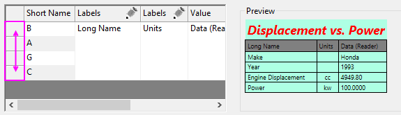
| To reorder rows in your table, drag the buttons to the left-side of the center panel.
|
Title and Header Controls
Use the Title controls to add key information to your Data Info window.
Where are these elements?
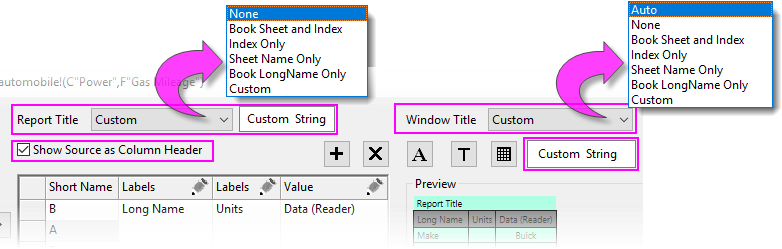
| Report Title
|
Use this drop-down list to specify the report title. The supported options include:
- None: Do not display the report title.
- Book Sheet and Index: Display the book name, sheet name, and row index of the selected point as the report title. Example: [Book1]Sheet1[3].
- Index Only: Use the row index as the report title.
- Sheet Name Only: Use the sheet name as the report title.
- Book LongName Only: Use the book name as the report title.
- Custom: Use a customized string to construct the report title.
|
| Custom String
|
Option only available when Custom is selected for the Report Title. Enter literal strings or build a string using LabTalk String Registers, in combination with variables i (row index) or point coordinates X, Y, Z.
%N = Book Short Name
%A = Book Long Name
%B = Sheet Name
I = Row Index
X,Y,Z = Data Point Coordinates
You can also use elements from this List of @Options, provided you follow the form used in the example column (e.g. %(1,@W)).
example: either [%N]%B[$(I)] or [%(1,@W)]%(1,@WS)[$(i)] displays as [Book Short Name]Sheet Name[Row Index].
|
| Window Title
|
Use this drop-down list to specify the window title. The supported options include:
- Auto: With a Graph active, display the book name, sheet name, column name, and the row index of the selected data point. Example: [Book1]Sheet1(A,B)[3]. With a workbook active, display the graph name, layer index, dataplot index, column name, and the row index of the selected data point. Example:[Graph1]1!1"B"[3].
- None: Do not display the window title.
- Book Sheet and Index: Display the book name, sheet name, and row index of the selected point as the window title. Example: [Book1]Sheet1[3].
- Index Only: Use the row index as the window title.
- Sheet Name Only: Use the sheet name as the window title.
- Book LongName Only: Use the book name as the window title.
- Custom: Use a customized string to construct the window title.
|
| Custom String
|
Option only available when Custom is selected for the Window Title. Enter literal strings or build a string using LabTalk String Registers, in combination with variables i (row index) or point coordinates X, Y, Z.
%N = Book Short Name
%A = Book Long Name
%B = Sheet Name
I = Row Index
X,Y,Z = Data Point Coordinates
You can also use elements from this List of @Options, provided you follow the form used in the example column (e.g. %(1,@W)).
example: either [%N]%B[$(I)] or [%(1,@W)]%(1,@WS)[$(i)] displays as [Book Short Name]Sheet Name[Row Index].
|
| Show Source as Column Header
|
Add a column header to Data Info. The header shows the source of the data in each Data Info table column -- generally, indicated by the column Short Name, Long Name or other worksheet column label row heading; or Data (coordinates) or Relative (distance).
|
Font
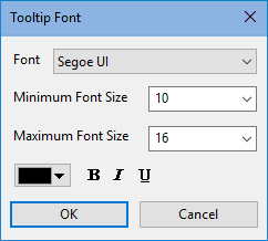
| Font
|
Set font face.
|
| Minimum Font Size
|
Set the minimum font size. Default value is 10. Note that the font size will be changed upon resizing the columns in the Data Info window. Setting a proper minimum size will ensure the text is legible.
|
| Maximum Font Size
|
Set the maximum font size. Default value is 16. Note that the font size will be changed upon resizing the columns in the Data Info window. Setting a proper maximum size will ensure the text is legible.
|
| Font Color and Style
|
Set font color and style for the Data Info window. Note that the Report Title can be configured independently.
- To choose a custom color, see this topic.
- Optionally, choose bold, italicized or underlined text.
|
Title
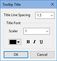
| Title Line Spacing
|
Set line spacing for the Report Title.
|
| Title Font Scaler
|
Scale factor for the Report Title text.
|
| Font Color and Style
|
Set Report Title font color and style.
- To choose a custom color, see this topic.
- Optionally, choose bold, italicized or underlined text.
|
Background
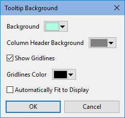
| Background
|
Set background color.
|
| Column Header Background
|
Set background color of the column header.
|
| Show Gridlines
|
Enable or disable grid lines.
|
| Gridlines Color
|
Specify grid line color. To create a custom color, see this page.
|
| Automatically Fit to Display
|
Automatically fit content to the window when the Data Info window is resized.
|
Columns Settings
The Display Tab contains options for customizing the display of the Data Info window.
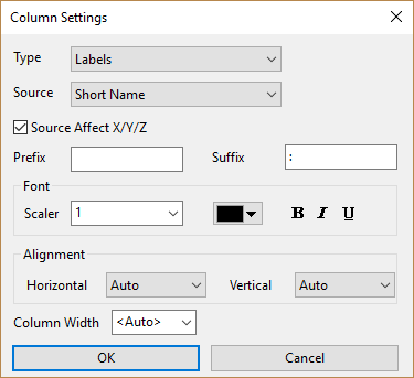
| Type
|
Set what kind of information to show in the current column, options include:
- Separator: Simply adds a narrow, empty column for space.
- Labels: Show a column header from the source worksheet.
- Value: Report the value chosen from the Source list.
- Single Cell: This option merges all cells in the column into a single cell.
- Numeric Display Format: Set the content to show in the current column. See Custom Numeric Formats.
|
| Source
|
When Type =
- Data (Reader)
- Data Cursor (Cursor1, Cursor 2)†
- Relative (Reader - Cursor1, Cursor2 - Cursor1)†
- For information on using the Data Reader, see The Data Reader Tool. For information on setting Data Cursors, see The Data Cursor Tool.
- Single Cell: The inserted column is a single cell that spans the height of the table. The cell displays a worksheet value determined by row index and the worksheet column that you have chosen in the Source list. Especially useful for displaying images and larger blocks of text.
- Numeric Display Format: Inserts a column that is not used to display data but rather is used for formatting numeric data -- row by row -- in other columns in your table. If the default display format is not to your liking (e.g. number of displayed decimal places), you can use these controls to set numeric format, line by line, for your Data Info window or Tooltip:
- Click in a column cell and a list control is shown.
- Click on the list control to choose an appropriate custom format for your numeric data (note that this list merely shows examples and is not exhaustive); or type your custom format directly into the list control.
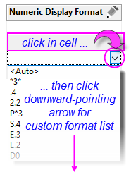
| Date-time formats must be specified by entering "D" or "T", followed by a number N, where N corresponds with the format index (order, starting from "0") in the Display drop down list of the Column Properties dialog box (e.g. D0 corresponds with a display date of 9/17/2018).
|
†Operates only on X, Y or Z data point values.
|
| Source Affect X/Y/Z
|
Check this box to list source data by column Long Name, if it exists; otherwise list by Short Name. This box is automatically selected when you add source data to your table (i.e. you add data values using ).
|
| Prefix
|
Specify a string to prefix to column content.
|
| Suffix
|
Specify a string to append to column content.
|
| Font Scaler
|
Scale factor for the column text.
|
| Font Color and Style
|
Set font color and style for the column text.
- To choose a custom color, see this topic.
- Optionally, choose bold, italicized or underlined text.
|
| Column Width
|
- <Auto>: Resize as Data Info window is resized. For Data Point Tooltip images, <Auto> translates to a width of 60 pixels (height determined by aspect ratio). To control tooltip image size, enter a numeric value for Column Width.
- Width in units of characters
|
| Horizontal and Vertical Alignment
|
- Auto: for horizontal alignment, left-align text, right-align numeric data; for vertical alignment, middle-align..
- For horizontal alignment: Left, Right or Center; for vertical alignment: Top, Middle or Bottom.
- Note that horizontal aligment settings apply to the current column only, while vertical alignment settings control the whole table (all columns).
|
Theme Controls
Your custom Data Info configuration can be saved with the active graph window, the active graph layer or even the active data plot. Further, you can load a named Theme at a later time, saving you the trouble of having to recreate your settings.
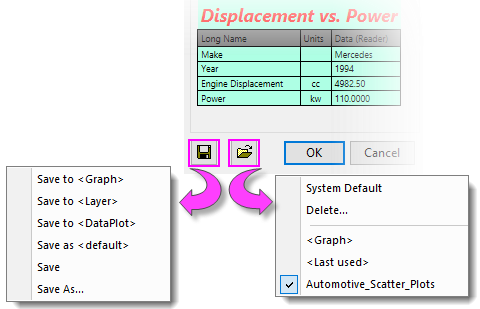
Saving a Theme
- Save to <Graph>: Save the display settings to the active graph window.
- Save to <Layer>: Save the display settings to the active graph layer.
- Save to <DataPlot>: Save the display settings to the active data plot.
- Save as <default>: Save the current display settings as defaults.
- Save: Save the current display settings to the Theme in use.
- Save As: Save the current display settings to a named Theme for later user or for sharing with colleagues.
Loading a Theme
- System Default: Set the display settings to the System Default.
- Delete: Delete selected Themes.
- <Last Used>: Load the last-used Theme (does not need to be saved).
- Other Theme options may appear below the separator.
|