Sankey Diagram
Sankey diagrams are useful for depicting the distribution and fate of some commodity of interest (energy, money, human migration, etc.) throughout a given system. Flows are represented by bands of varying thickness. Thickness is proportional to the contribution of a given pathway, to the total flow.
Despite their somewhat cartoonish appearance, Sankey diagrams are underpinned by numerical values and therefore deserve to be taken seriously as a “scientific” graph type. For some types of data, they are uniquely capable of depicting and quickly conveying an understanding of complex systems.
Sankey Diagrams in Origin are both powerful and easy to be manipulated, allowing for full customization of node and link colors, drag-and-drop ordering of nodes, open and loop branches, arrows at link starting points and/or endings, plus flexible labeling of links and nodes.
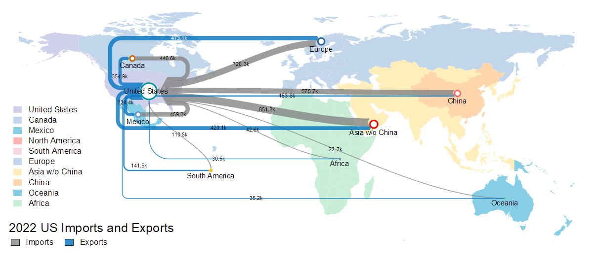
Sankey Map of US Import and Export