4.5.2.5 Unstacking and Sorting Worksheet Columns by LabelUnstack-Sort-Columns-by-Label
Summary
When working with a dataset -- particularly one that was not created with any particular analysis or plotting operation in mind -- one is often faced with "cleaning up" (e.g. rearranging, reducing, etc.) the data before you can do any useful work on it. This can be particularly challenging when the dataset is large and where "cut and paste" rearrangement of data is not practical. Even a CSV file that has a simple row x column arrangement, frequently needs some "massaging" prior to analysis or graphing.
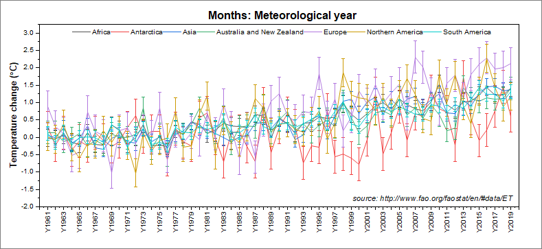
In this tutorial, we will connect to a large UN-FAO dataset of global temperature data for years 1961 - 2019, perform a couple of operations to rearrange the data, then apply data filters to two categorical data columns before plotting the result as an interactive row-wise line series graph with error bars.
Minimum Origin Version Required: Origin 2021
What you will learn
- How to Connect to a web data source
- How to "unstack" a worksheet based on categories in one of the columns
- How to sort unstacked columns by column label
- How to set filters on multiple columns to manage a large dataset and view trends in data
- How to plot a row-wise graph on filtered data
- How to create a dynamic graph title that uses substitution of column metadata to label your graph
Steps
- With a workbook active, click Data: Connect to Web. In the Connect to Web dialog, copy the following into the URL box, then click OK:
- https://www.dropbox.com/scl/fi/nzs4ly3yffvya65dqt4b8/FAO_Temperature_Change.csv?rlkey=wns0x5j0so2mceu98atexuief&st=115mg663&dl=1
- Accept the CSV Import Options settings and click OK to connect the web-data to the Origin worksheet.
- Resize the workbook so that you can get a good look at your data columns and note a few things:
- the second column, labeled Area is a repeating list of geographic regions and economic groupings.
- the fourth column, labeled Months is a repeating list of time periods (months, quarters, years).
- the sixth column, labeled Element contains Temperature change and Standard Deviation categories.
- columns labeled Y1961 to Y2019 contain both Temperature change and Standard Deviation measurements for years 1961 - 2019.
- While there are potentially many ways we could manipulate and plot this data, the horizontal arrangement of the data, plus the inclusion of an error measurement (std. deviation) suggests a row-wise plot with error bars. However, we will need to rearrange our data to get it into a form that we can plot.
- We begin with the need to split the Temperature change and Standard Deviation data into separate columns, by year (i.e. what we want is to have a sequence of measurement > std. dev, measurement > std. dev., grouped by year). For this, we will use the Unstack Columns tool. Click Restructure: Unstack Columns and open the dialog box.
- The temperature data is in the Y1961 - Y2019 columns so click the flyout (arrow) button to the right of Data to be Unstacked and choose Select Columns. In the Column Browser dialog, scroll until you can see LName = Y1961, then hold the Ctrl + Shift keys and press the End key on your keyboard. This will select all temperature data columns. Click the Add as One Block button and click OK to close the Browser.
- Click the Group Columns flyout button and choose F(Y): Element.
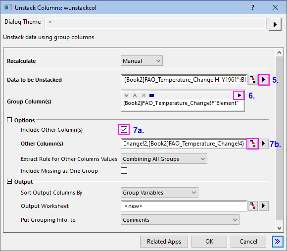
- Under Options, (a) check the Include Other Column(s) box, then (b) click the "Select from Worksheet" button
 to the right of the text box. When the dialog rolls up, hold down the Ctrl key and select worksheet columns B(Y) and D(Y) by clicking on the column headers. Click the to the right of the text box. When the dialog rolls up, hold down the Ctrl key and select worksheet columns B(Y) and D(Y) by clicking on the column headers. Click the  button to restore the dialog, accept remaining dialog defaults and click OK to close and generate your output. button to restore the dialog, accept remaining dialog defaults and click OK to close and generate your output.
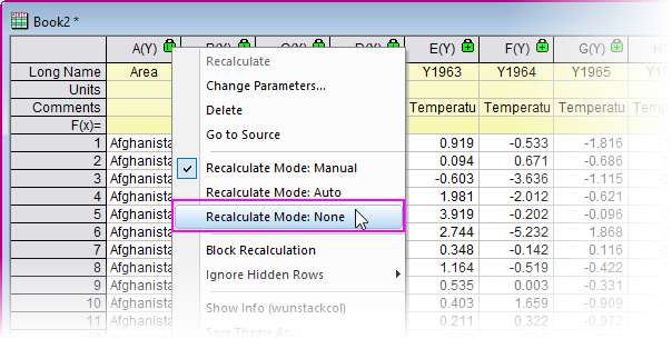
- Click on the added UnstackCols1 tab and note that we now have a clean separation of Temperature change and Standard Deviation measurements. However, we need to reorder columns by year so that each year's Temperature change is followed by its Standard Deviation. We cannot rearrange columns in this sheet because of the "operations locks", so we will proceed by making a copy of the sheet, then removing the operations from the copied sheet (leaving our original output intact).
- Right-click on the UnstackCols1 sheet tab and choose Duplicate. On the UnstackCols2 sheet that is added, click on the green lock icon in the upper-left corner and choose Recalculate Mode: None. Click OK on the attention message.
-
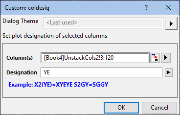
- Now that the protected operations are removed from the output sheet, we are free to sort the columns by label. Click on the UnstackCols2 tab and drag the sheet out to create a separate book. Click on the column C(Y) header (Y1961) to select it, then press Ctrl + Shift + End to select all remaining columns. Click Worksheet: Sort Columns by Label and set the following:
-
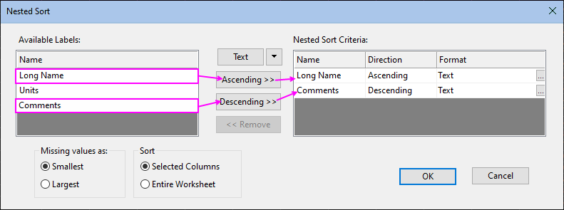
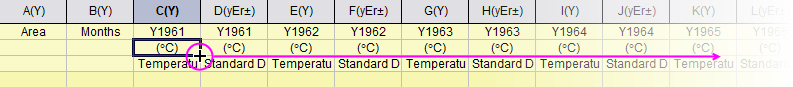
- Click OK to rearrange columns so that each year's Temperature change measurement is followed by its Standard Deviation measurement. Now, right-click on the still-selected data and choose Set As: Custom... and enter YE in the Designation box, then click OK. This will set the selected columns, in sequence, as Y, yEr±, setting the worksheet up for plotting.
-
- One minor detail: Scroll the worksheet so that you can see column C (Long Name = Y1961) and double-click in the Units cell, type a left paren then right-click and choose Symbol Map. Browse the Symbol Map to find a "degree" symbol (F0B0), Insert and Close. Type a capital "C" and a closing paren. Then hover on the lower right corner of the cell until you see the "+" cursor and double-click to extend the (°C) to the end of the sheet.
Adding Data Filters to Categorical Columns
At this point, we have a very large dataset and trying to plot all data in our worksheet would overwhelm the row-wise plot we want to create. To better see trends in the data and make comparisons, we will add data filters to the Area and Months columns.
- Click on the Area column header to select the column, then click Column: Filter: Add/Remove Filter. A filter icon is added to the column heading. Click on the column filter icon and clear the Select All box and clear all check marks, then check the boxes beside Africa, Antarctica, Asia, Australia & New Zealand, Europe, Northern America and South America, then click OK.
- Click on the Months column header to select the column, then click Column: Filter: Add/Remove Filter. Click on the column filter icon and clear the Select All box and clear all check marks, then check the box beside Meteorological year and click OK.
- Select the Area column, right-click and choose Set As X. Press Ctrl and select column C, then press Shift + End to select the remaining columns in the worksheet.
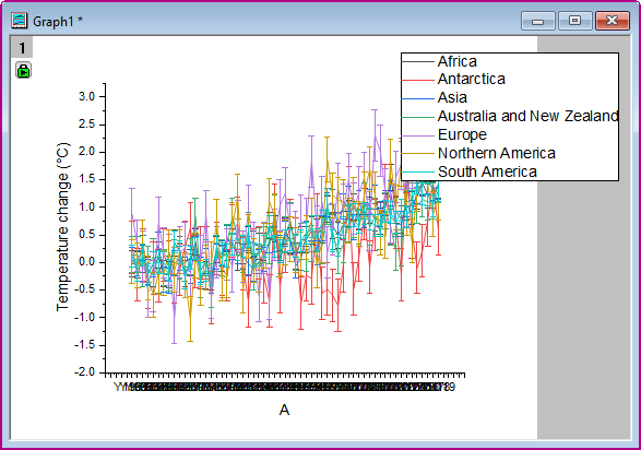
- Click Plot > Basic 2D: Row-wise.... Click the flyout button beside the Y Label in box and choose A(X): Area and X Data in Column label, then click OK.
- Once the graph is created (it may take a few moments), choose Format: Page, click the Legends/Titles tab to the right and set Translation mode of %(1), %(2) to @LA: Long Name.
Labeling the Plot, Cleaning up Cosmetic Issues
- Double-click on the crowded axis tick labels on the horizontal axis. On the Tick Labels > Format sub-tab, set Rotate(deg.) = Auto and check the Auto Hide Overlapped Labels box.
- Click the Scale tab and set From to 0, To to 60, Rescale to Fixed and Minor Ticks to Count = 0. Click OK to close the dialog.
- Right-click in the upper-center portion of the graph window, choose Add Text and in the text object, enter the following text:
- Months: %([Book2]Unstackcols2,@WL,B[F],W)
- Right-click on the label object and choose Properties. Click on the Programming tab and set Link to (%,$), Substitution Level to 1 and click OK. The label now reads "Months: Meteorological year" which is the filter condition that is set for column Months (This is an example of a text substitution of worksheet information. For more information, see Text Label Substitution).
- To change the graph aspect ratio and be able to change graph proportions as desired, choose Format: Page and on the Miscellaneous tab, set View Mode = Window View. Click OK to close Plot Details.
- Press the Ctrl key and drag the graph legend horizontally to create a one-line legend.
- Finally, choose View: Show and place a check mark beside Frame. This adds a frame to the graph layer. Reposition your page title and legend, as needed.
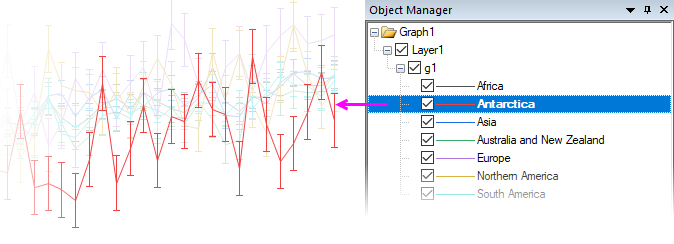
 | By clicking on one of the plots in the Object Manager, you dim all others, giving you a better view of the trend in a single plot.
|
|