29.9.26 Variability ChartVariability-Chart

Data Requirements
Select one Y column with at least one factor column(up to 4 factors).
Creating the Graph
To create a Variability Chart:
- Highlight at least one worksheet column(or a range from one column).
- Select to open the plot_vari dialog.
The plot_vari Dialog Box

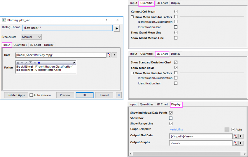
Input tab
| Data
|
Select the source data column(s) to plot.
|
| Factors
|
Select the columns as factors. These columns will be treated as grouping information; if multiple columns have been selected, the grouping will be nested.
|
Quantities tab
| Connect Cell Mean
|
Specify whether connects the mean values of the last factor.
|
| Show Man Lines for Factors
|
Specify whether shows mean lines for factors.
The factors listed here are same organized as the factors you checked in Input tab. You can choose the factor(s) you desired to show the mean lines.
|
| Show Grand Mean Line
|
Specify whether shows the grand mean line in the chart. If this is checked, a reference line at Mean(plot(*,y)) will show.
|
| Show Grand Median Line
|
Specify whether shows the grand meandian line in the chart. If this is checked, a reference line at Meandian(plot(*,y)) will show.
|
SD Chart tab
| Show Standard Deviation Chart
|
Specify whether show SD chart under the variability chart.
|
| Show Mean of SD
|
Specify whether show the mean of the standard deviation values of the last factor.
|
| Show Mean Lines for Factors
|
Choose the factor you desired to show the mena lines on the SD chart. The input factors will be listed here.
|
Display tab
| Show Individual Data Points
|
Specify whether show the individal data points instead of only showing the whisker lines. Checking it will set Box Type to Box + Data Overlap and Box Style is No Box if Show Box is unchecked.
|
| Show Box
|
Specify whether show box plot for each group. Checking it will set Box Style to Box.
|
| Show Range Line
|
Specify whether show range whisker line for each group.
|
| Template
|
By default, template "variability" will be used automatically. If you want to use another template, uncheck Auto to browse and choose the template.
|
| Output Plot Data/Output Graphs
|
Output plot data and graphs to different sheets.
Once you clicked OK button to create the graph, the plot data and result graphs can be outputed to the specified sheets. By default, two new sheets in current workbook will be created to store the plot data and result graphs, named as "VariabilityPlotData#" and "VariabilityGraph#".
|
Template
variability.optu (installed to the Origin program folder)
Notes
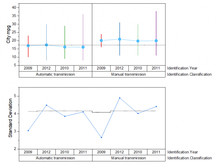
Variability Chart can be used to investigate the relationships between factors and a response, and analyze the root causes for variation. A variability chart plots the data and means for each level of grouping factors, with all plots side by side and panel by panel.
Origin draws variability charts for up to 4 factors. You can selectively draw the Standard Deviation chart into the Variability Chart, showing the standard deviation for each factor level combination.
Note: You can click the Related Apps button at the bottom of dialog to check and install the related app "Gage Study".
Example

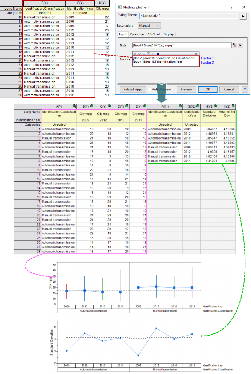
In this example, we select 2 factors in Factors box in the plot_vari dialog: "Identification.Classification" and "Identification.Year"(marked with a red box).
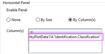
Unstack source data column with factor 2, including the column factor 1(marked with a pink box) ; with 4 unstacked columns, plot box plots only with range whiskers and connected mean points. In Plot Details dialog, set factor 1 as Horizontal Panel Column in Panel tab to divide the plot as two panels.

And, using the grouping columns to seperate the source respone column "City mpg" into 8 groups and calculate the Standard Deviation for each group. Plot the SD values as a line+scatter plot under the variability chart. You can see the standard deviations in this example seem to vary relatively consistently between the two values("Automatic transmission" and "Manual transmission") of factor 1.
Version Information
| Minimum Version: Origin 2025
|
Last Update: Origin 2025b
|
|