29.5.10 Sunburst PlotSunburst-Plot
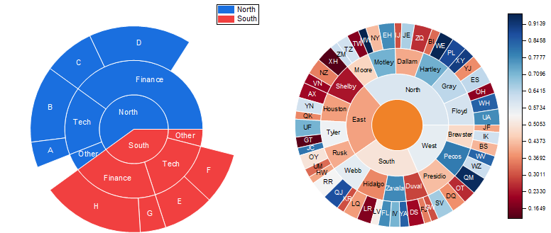
The graph is an example of a colormap sunburst chart. The color of the wedges is mapped to their value. For categories and subcategories, the color is decided by the mean value of category.
The graph is useful in telling the ranking of the categories at one glance, by comparing the colors in the same ring.
Data Requirements
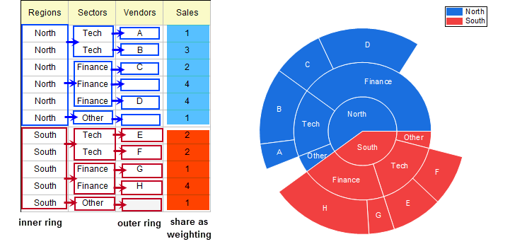
Select at least 2 text columns and one numeric column: The last numeric column should be data values and all other columns are categories and sub-categories.
Creating the Graph
Select required data.
From the menu, choose .
Template
Sunburst.OTP (installed to the Origin program folder).
Notes
The Sunburst Plot is a variant of Doughnut Plot, used to display a hierarchical structure. Each level of the hierarchy is represented by one ring or circle and all rings show how the outer rings relate to the inner rings.
As you can see, the missing values in text/categorical columns is also plotted as wedges but without filling the colors.
Please note, although there are three rings, they will be treated as one plot for further customizations.
To customize the Rotation, Radius/Center or Doughnut, see The (Plot Details) Pie Geometry tab.
To customize the labels of wedges, see The (Plot Details) Labels tab.
|