6.5.1 Complicated Fill Areacomplicated-fill-area
Summary
Minimum Origin Version Required: 9.1 SR0
What You Will Learn
- Fill area between curves with two different colors.
- Use an ordered plot sequence to implement complex graph fills.
Creating the Basic Plot
This tutorial is associated with <Origin EXE Folder>\Samples\Tutorial Data.opj. Note that this tutorial requires numerous steps to produce a complex graph. Users should understand that this is not a basic Origin graphing tutorial.
- Open the Tutorial Data.opj and browse to folder Multiple Fill Area.
- Activate workbook Book2, Sheet1. Highlight columns C through F, then click Plot > Basic 2D : Line. A grouped line plot is created.
- Select and delete the X axis title and legend object from the graph.
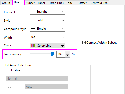
- Double-click on any plot to open the Plot Details dialog. Go to Line tab and set Transparency to 100%.
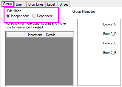
- Go to Group tab and set Edit Mode to Independent, then click Apply. This will allow us to specify custom fill area modes for each line.
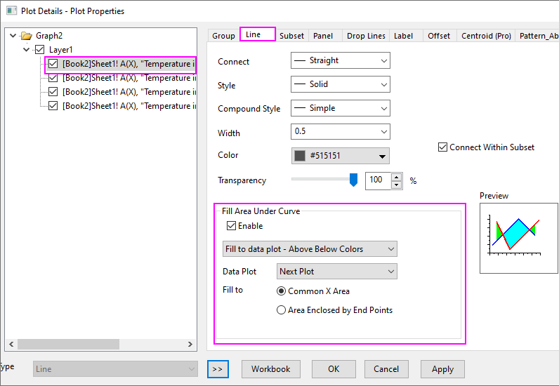
- Highlight the first plot in the left side of Plot Details. On the Line tab, enable Fill Area Under Curve and select Fill to data plot - Above Below Colors.
- Go to Pattern_Above tab and choose settings as shown below.
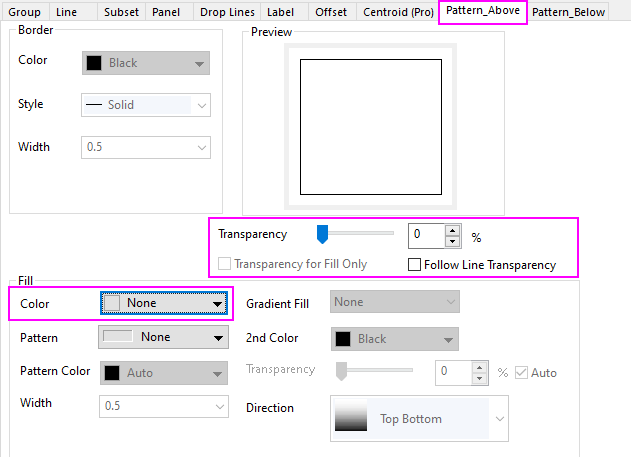
- Go to Pattern_Below tab and set Fill Color to Red, the click Apply. The first filled area part of our plot is added.
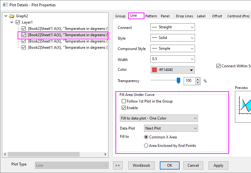
- Highlight the second plot in the left side of Plot Details. Go to the Line tab, enable Fill Area Under Curve and select Fill to data plot - One Color.
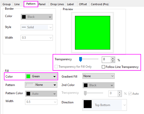
- On the Pattern tab, choose settings as shown below.
- Repeat step 6~8 for the third plot in graph but on the Pattern_Above tab, set Fill Color to None and Transparency to 0 (you must clear Follow Line Transparency). On the Pattern_Below tab, set Fill Color to Blue.
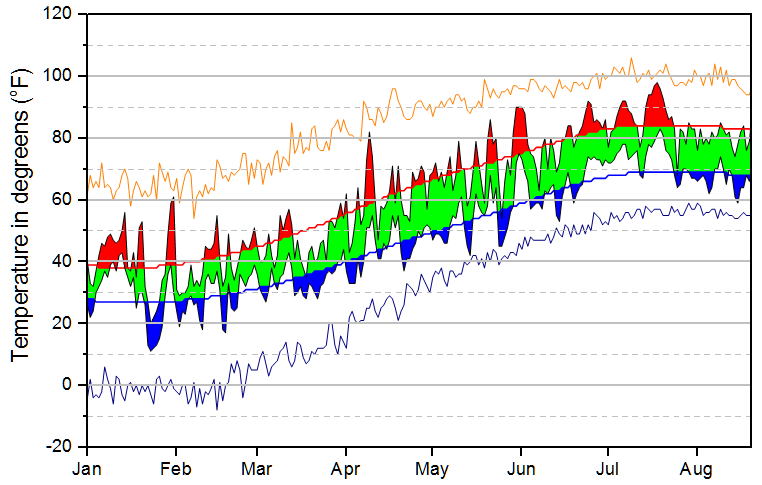
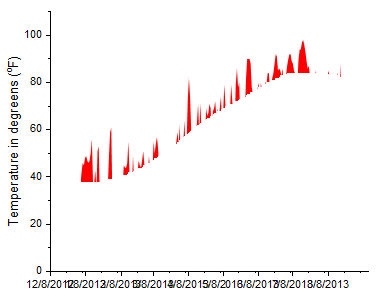
- Your stacked fill area plot should now look like this:
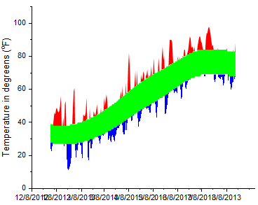
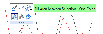
 | As an alternative to the Plot Details Line tab controls, note that you can select any two plots in the graph layer using the Ctrl key, then apply fills between the selected curves using Mini Toolbar buttons.
|
Steps to Eliminate Overlapping Fill Areas
In the graph we just created, there are some overlapping fill areas that we do not want. We will hide them by adding a white fill area to cover them. We will be using the Layer Contents dialog box to add datasets to the graph, some of them multiple times.
- From the menu, select Graph: Layer Contents. Use the right-pointing arrow button in the middle of the dialog to add these plots to the datasets to the right side of the dialog.
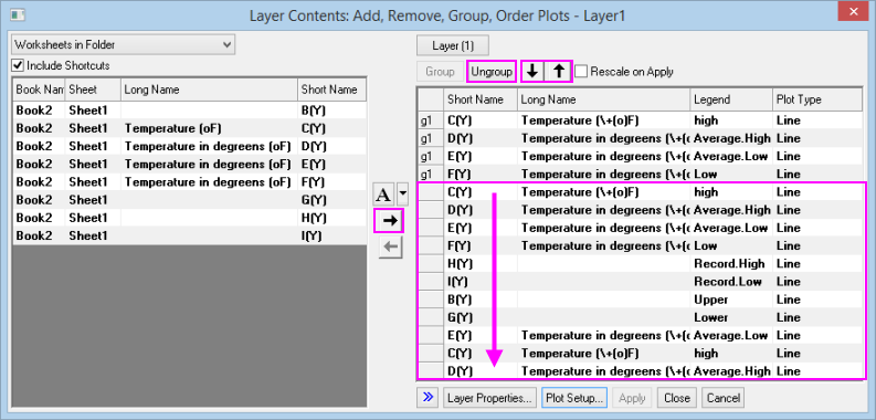
- Use the Ungroup button to ungroup any plots that come over as groups. Grouping is denoted by the gn beside each dataset. You want to make sure that no groups exist (you can ignore the first four datasets that were added).
- Arrange added plots in exactly the order shown. Use the up- or down-arrow buttons above the right side list, to rearrange the list as needed. Note that only ungrouped plots can be independently ordered. When your list looks like the figure above, click OK to close the Layer Contents dialog box.
- Double-click on a data plot to open the Plot Details dialog box.
- In the left side of Plot Details, highlight the fifth plot down (C(Y)). On the Line tab, check Fill Area Under Curve, and from the drop-down choose Fill to data plot - Above Below Colors, Color = Red and Transparency = 0. On the Pattern_Above tab, Transparency = 0 and Fill Color = White. On the Pattern_Below tab Fill Color = Red.
- Highlight the sixth plot down (D(Y)) and set Color = Red and Transparency = 0.
- Highlight the seventh plot down (E(Y)). On the Line tab, check Fill Area Under Curve, and from the drop-down choose Fill to data plot - Above Below Colors, Color = Blue and Transparency = 0. On the Pattern_Above tab set Fill Color to White and Transparency to 0. On the Pattern_Below tab, Fill Color = Blue.
- On the eighth plot down (F(Y)), click the Line tab and set Color to Black and Transparency to 0.
- On the ninth plot down (H(Y)), click the Line tab and set Color to Orange and Transparency to 0.
- On the tenth plot down (I(Y)), click the Line tab and set Color to Blue and Transparency to 0.
- For the eleventh and twelfth plots (B(Y), G(Y) respectively), click the Line tab and set the line Color to Gray and the Transparency to 0.
- For the thirteenth plot down (E(Y)), click the Line tab and from the drop-down set Fill to data plot - Above Below Colors, Transparency = 0. On the Pattern_Above tab, set Fill Color = None, Transparency = 0; on the Pattern_Below tab, Fill Color = White.
- For the fourteenth plot down (C(Y)), click the Line tab and verify that Color = Black and Transparency = 0.
- For the fifteenth (last) plot down, click the Line tab and set Color = Red and Transparency = 0.
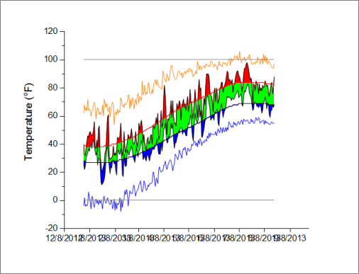
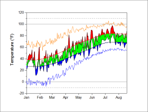
- Close Plot Details and click the Rescale button
 on the Graph toolbar. Your graph should look roughly like the following. To polish your graph, continue with the last section. on the Graph toolbar. Your graph should look roughly like the following. To polish your graph, continue with the last section.
Further Customizations
- Double-click on the X axis (bottom, horizontal) tick labels. This opens the X Axis dialog box. Click the Scale tab and set the date range From 1/1/2013 To 8/20/2013. Set Minor Ticks Count = 0.
- On the Tick Labels tab set Display to show a three-letter abbreviation for month (e.g. Apr).
- Click Apply.
- To draw a box around the whole graph layer, choose View: Show: Frame.
- Lastly, to add the dashed lines at temperature = -10 and +110, double-click on the Y axis (left, vertical). Click on the Reference Lines tab and enter the following:
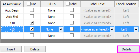
- Click the Details button and in the Reference Lines dialog box, clear Auto Format, set Style to Dash and Thickness to 1. Do this for both the -10 and +110 lines and click OK.
- In the Axis dialog box, click OK to close the dialog. Your graph should now look like this:
|