6.5.8 Symbol Plot with Size and Colormap from Other Columns
Summary
This tutorial will show you how to create a symbol plot with size and color from other columns.
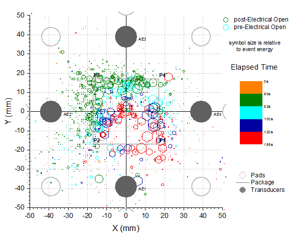
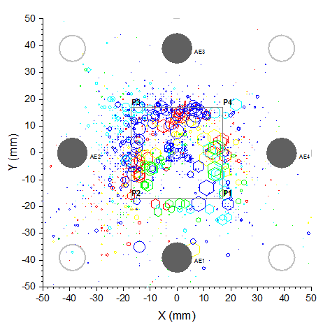
This graph displays a symbol plot of data from multiply columns where the size and color of the symbol have been derived from other data columns in the worksheets. User defined Colormap has been applied to the plot.
Minimum Origin Version Required: 2016 SR0
What you will learn
This tutorial will show you how to:
- How to control the size and color of plot symbols using values in worksheet columns.
- How to set the user defined colormap
- How to edit the grids lines for plot
Steps to Construct a Symbol Plot with Size and Colormap from Other Columns
This tutorial is associated with the Tutorial Data project:<Origin EXE Folder>\Samples\Tutorial Data.opj.
- Open the Tutorial Data project and browse to folder Symbol Plot with Size and Color Mapping in Project Explorer.
- Select the Col(X)and Col(Y) in first sheet of the workbook and click Plot > Basic 2D : Scatter to get a scatter plot.
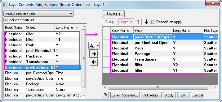
- Click Graph: Layer Contents in main menu with the graph active, and select all the columns with Long name Y, Y1, Y2 and add them into the right panel. Click Ungroup button to ungroup all datasets. Click OK to close dialog. The order and quantity of column Long name listed in right panel should be exactly the same as the graph, use up and down button to adjust the position, and use
 to remove the repetitive items. to remove the repetitive items.
-
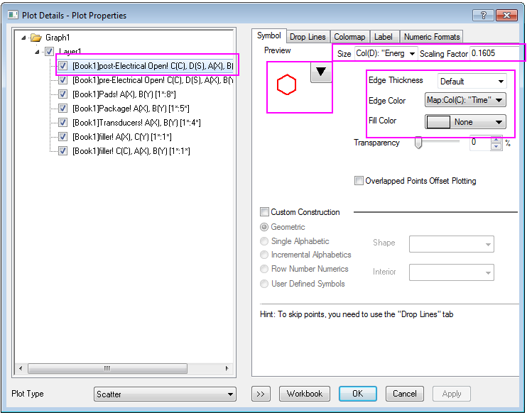
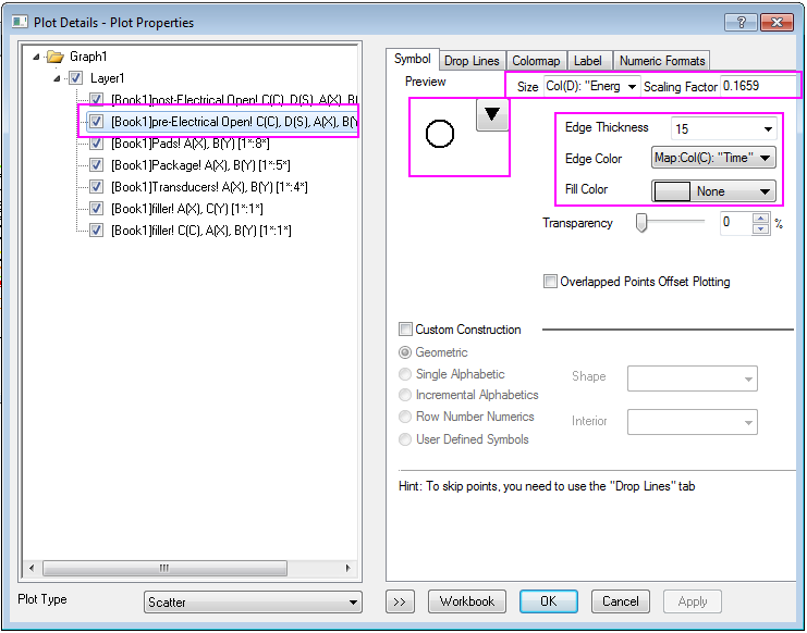
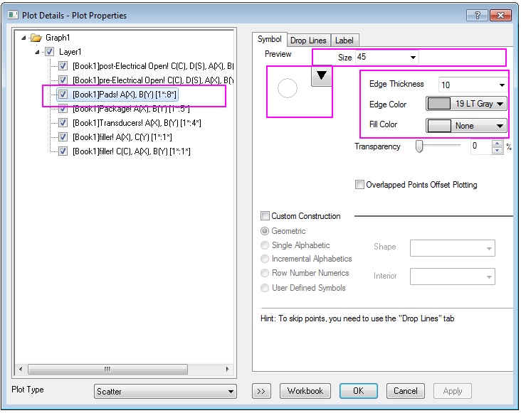
Double click the scatter to open the Plot Details dialog, go to Symbol tab, Set the Symbol for each plot one by one follows the Graph below, after each step setting, please click Apply to make a rudimentary saving.
- The next 7 steps will guide you finish the symbol setting for each dataplot. Symbol setting for dataplot 1:
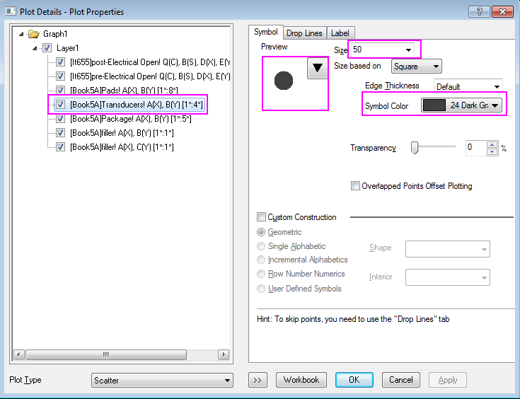
- Symbol setting for dataplot 2
- Symbol setting for dataplot 3
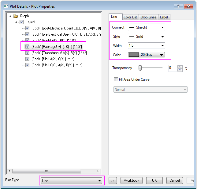
- Symbol setting for dataplot 4
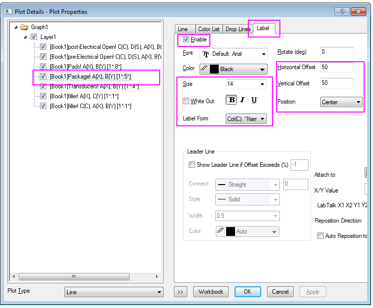
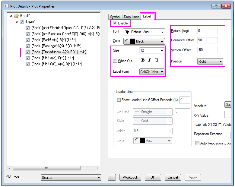
Add label for dataplot 4
- Symbol setting for dataplot 5
Add label for dataplot 5
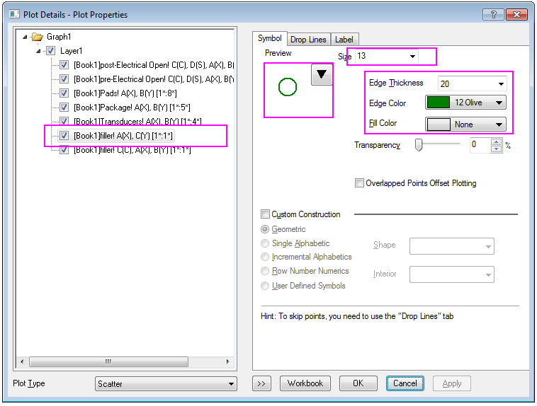
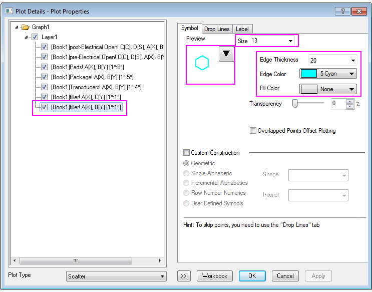
- Symbol setting for dataplot 6 and 7, which act as the legend:
- Then, Click OK to close the window. Double click the Axis X to open the Axis dialog, and set the Scale for both Horizontal and Vertical icons From -50 to 50 with same Major and Minor ticks style:
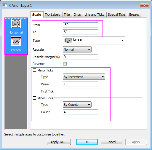
then click OK to apply. you can get a graph like this:
Steps to Set the Colormap and Legend
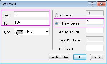
- The Edge color of the post-Electrical Open and pre-Electrical Open plot both used Map:Col(C), so we will further make some style setting for Color scale in Colormap tab. Click Level to open Set Levels dialog, set levels from 0 to 155 with Major Levels 5.
- Double click each Level value to edit them and double click each Fill color to edit them as well:
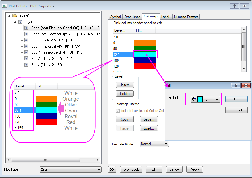
Click Apply to apply these color setting to the graph (for the post-Electrical Open scatter).
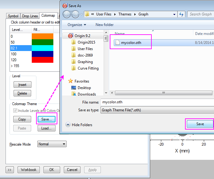
- Then we would like to save the setting as a theme named as mycolor.oth.
The theme will be applied to the post-Electrical Open scatter.
Apply the theme to the pre-Electrical Open scatter.
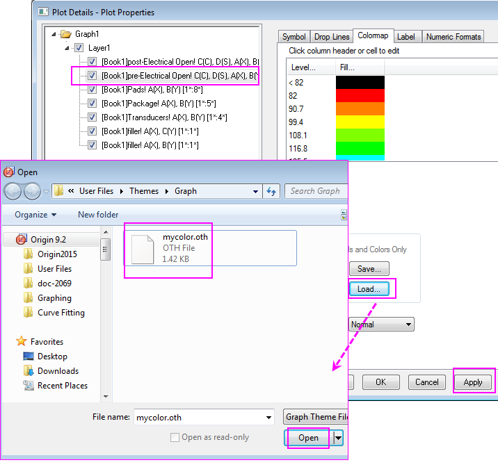
Click OK to close the window.
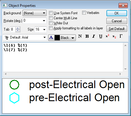
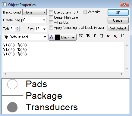
- Click Graph: Legend: Dataplot in main menu, a legend will display in the graph. Right click the legend and click Properties in list, and edit the content in Object Properties dialog as follows graph, then click OK.
- Click Insert: Color Scale in main menu, an Color Scale will display in the graph.
More Customization Steps
-
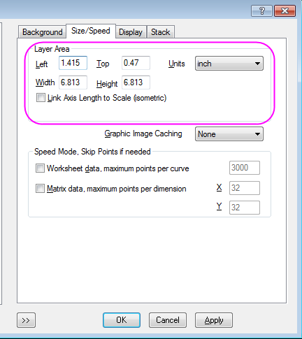
Select Format: Layer in main menu to open the Plot Details dialog, go to the Size/Speed tab, edit the Layer Area as follows:
-
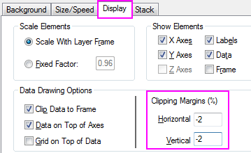
Go to the Display tab in Plot Details dialog, edit the Clipping Margins(%) to -2%, click OK to close dialog.
-
Copy the previous Legend and paste it on the graph, edit the new legend in this way:
click OK to close dialog.
-
Double click the color scale to open the Color Scale Control, go to the Levels page, check on Hide Head Level and Hide Tail Level, then go to the Labels page and set the Display as graph below:
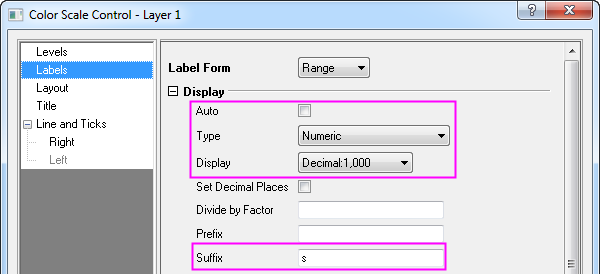
Add a title Elapsed Time for the color scale in Title tab, Click OK to apply.
-
Double click the axis to open the Axis dialog. Set Grids line for both Horizontal and Vertical in Grids tab in the same style as shown in graph below:
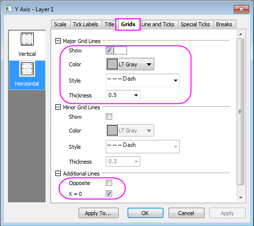
Click OK to apply the setting and close dialog.
-
At last, add a Text "symbol size is relative to event energy" in the graph by using Text Tool
 in Tools box. in Tools box.
|