8.13.8.2 Plot Setup: Plot Designations (Middle) PanelPS-Dialog-Middle
The middle panel of the plot setup dialog is for choosing plot types and columns for the data plots.
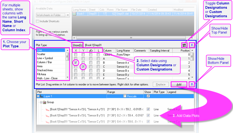
Selecting Plot Type
From the Plot Type list, you can select a plot type for the data plot. After you highlight the Plot Type, the columns to the right will be updated according to the requirements and options of that Plot Type.
Designating Column
There are two display modes in the middle panel: Custom Designation Mode and Default Designation Mode, which are used to decide the plot designation of listed columns. Clicking the  button allows you to switch between modes. button allows you to switch between modes.
Custom Designation Mode
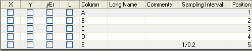
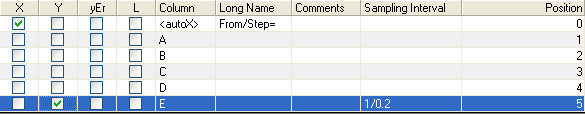
In this mode, you can use the check boxes before the column names to set the plotting designation (such as X, Y, Z, Label, X Error, Y Error, etc) for each column. The graph will be plotted according to the specified designation instead of the default plotting designations set in the worksheet. Note that you can only set one column as X at one time, but you may set another as X after adding your selection to a plot layer.
If you set a column with a sampling interval as Y (for example, column E in the list), the autoX column will be set as X automatically. (Note: If you select the autoX check box for a Y column that does not have a sampling interval, the row numbers will be used as X values for plotting.)
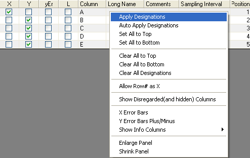
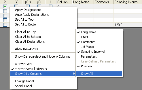
Context menu in the Custom Designation Mode
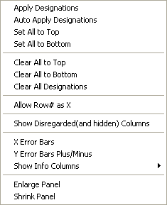
The context menu that appears when you right-click on this panel.
Apply Designation
This allows you to quickly apply the default designations to the columns. Select the Apply Designation menu option to apply the plotting designations from the source workbook. If you select Auto Apply Designation, this dialog will apply the plotting designations from the source workbook as the default next time you use this dialog to plot graphs. If you right-click on the designation column to open this context menu, the Set All to Top and the Set All to Bottom menu items can be used to set the corresponding designation from the current row to the top row and to the bottom row, respectively. The Clear All to Top, Clear All to Bottom and Clear All Designations menu items are for clearing the designations from the current row to the top row, to the bottom row, and clearing all designations, respectively.
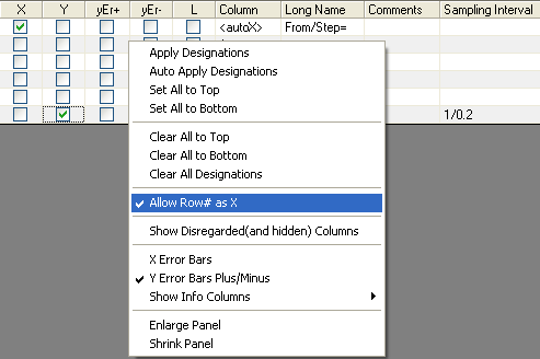
Allow Auto X
When you select Allow Row# as X, an auto X row will be added. If your data set has a sampling interval, the auto X row will appear, already set as X, which means the sampling interval will be used as X automatically. Otherwise, the row numbers will be used as X automatically.
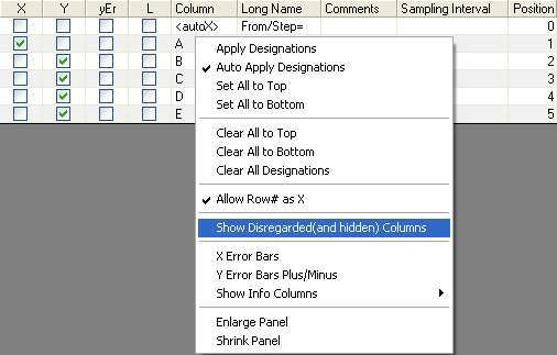
Show Disregarded Columns
When you select Show Disregarded(and hidden) Columns, all columns in the source worksheet with Disregard designation will show on the table. Otherwise, these columns cannot be seen in this table.
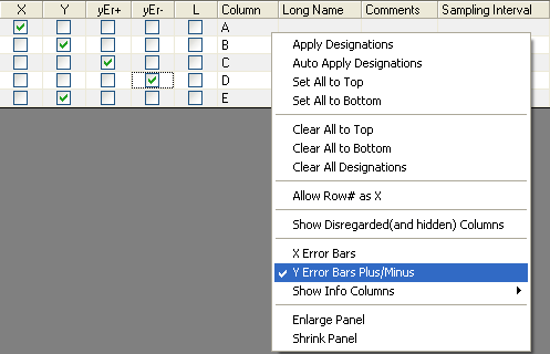
Add/Remove Error Bar Columns
The context menu can also show more plot designations. X Error Bars is used to add an X error column, and Y Error Bars Plus/Minus is used to add Y Error+ and Y Error-. After that, you can assign data sets as xEr, yEr+ or yEr- by checking the corresponding check boxes.
Show Info Columns
With the context menu, you can turn on/off the display of header columns in the column table, such as sampling interval, 1st value, parameter, position and so on. Simply select Show Info Columns from the context-menu and set the header type to display or hide.
Default Designation Mode

In this mode, you cannot set custom plot designations for each column. Origin assumes that the plot designations from the worksheet columns will be used for plotting. So you only need to highlight the column names and then add them to a graph layer or replace existing plots with them; the associated X columns will be automatically used for plotting.
Plotting columns with the same Long Name, Short Name or Index
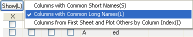
The ( , ,  and and  ) buttons in the middle panel control the list of available columns in the column table according to common Long Name, Short Name or Index when multiple sheets are selected in the top panel. In the tutorial below, you will learn how to plot columns sharing a Long Name, using the Plot Setup dialog. ) buttons in the middle panel control the list of available columns in the column table according to common Long Name, Short Name or Index when multiple sheets are selected in the top panel. In the tutorial below, you will learn how to plot columns sharing a Long Name, using the Plot Setup dialog.
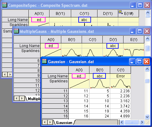
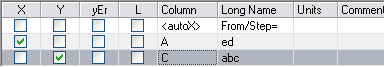
From the screenshot, you can see that there are several columns sharing common Long Names in different worksheets.
You can follow the steps below to plot these columns as a group in a layer:
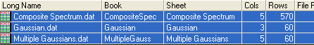
- Highlight all of the worksheets in the top panel of the Plot Setup dialog.
- If you're in default mode, click the button in the middle panel to switch to custom mode.
- If the button shows as or , click it and then select Show Columns with Common Long Names; the button will show as .
 - As you can see, two columns of the first worksheet in the top panel are listed in the table. One has the long name of "ed"; the other has the long name of "abc".
- Select the X check box corresponding to the data column "ed", to set it as X. Similarly, set the "abc" data column as Y by selecting the corresponding Y check box.
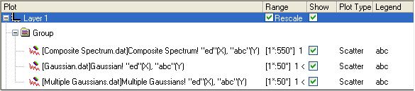
- Click the Add button. After that, all the data sets with common long names are grouped and listed in the bottom panel.
- Click OK in the bottom panel to close the Plot Setup dialog and create the graph.
Plotting common Short Name columns is similar, while plotting by Index ignores column names and plots columns that share the same position (column index) in all selected sheets.
|