6.3.3 Multi Layer Graph CustomizationMultiLayer-Graph-Customization
Summary
The graph layer is the basic building block of all Origin graphs. A graph layer consists of a set of coordinate axes and (usually) one or more data plots, plus attached axis titles, plot legends, text labels, drawn objects, button objects, etc. The graph layer can be moved to any location or resized to any dimensions within the graph window. An Origin graph window contains between 1 and 1,024 graph layers.
When working with graphs that contain multiple layers, it helps to have some tools and a strategy for applying customizations to multiple layers a time, as opposed to simply modifying each plot or each axis scale individually. Beginning with Origin 2018b, you can edit multiple graph layers simultaneously using the Plot Details Layers tab Common Display controls.
Minimum Origin Version Required: Origin 2018b
What you will learn
- How to control the scaling of elements (axis titles, tick labels and graph legends) when graphs are merged.
- How to merge graph windows containing a single layer into a multi-panel graph.
- How to configure the merged graph so that plot or axis customizations made in one layer are applied to all layers.
- How to fix scaling issues with fonts in merged graphs.
- How to remove white space from the merged, multi-panel graph.
- How to remove unneeded legend objects and customize one object so that it serves as a legend for the multi-panel graph.
Steps
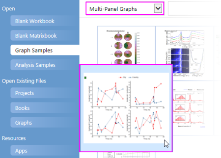
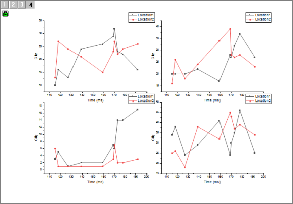
- Start a new project. Press F11 to open Origin Central, click the Graph Samples tab, set the graph drop-down list to Multi-Panel Graphs and double-click on the Multiple Panel Graph from Index Data.
-
- In the worksheet that opens, click on the Output Data tab and resize the window so that you can see all 12 columns of data. Note that the column headings have (1) a green lock on them, indicating that these are calculated values and (2) the column designations repeat in the pattern X1, Y1, Y1, X2, Y2, Y2, etc.
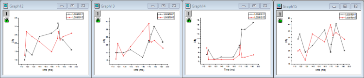
- Select columns B(Y1) and C(Y1) and click the Line + Symbol button
 on the 2D Graphs toolbar. Repeat the process for columns E(Y2)+F(Y2), H(Y3)+I(Y3), K(Y4)+L(Y4). You should now have 4 similar graph windows, each containing a single graph layer with two plots (Note that you don't need to select the X column when making these graphs because Origin's default behavior is to plot Y values against any X column immediately to the left of selected Y columns). on the 2D Graphs toolbar. Repeat the process for columns E(Y2)+F(Y2), H(Y3)+I(Y3), K(Y4)+L(Y4). You should now have 4 similar graph windows, each containing a single graph layer with two plots (Note that you don't need to select the X column when making these graphs because Origin's default behavior is to plot Y values against any X column immediately to the left of selected Y columns).
-
Scale Elements
We are going to merge the above graph windows into a single 4-panel graph window but before we do that, we will briefly discuss element (axis titles, graph legends, etc.) scaling so that we understand how to control this in a merged graph.
- Click on one of the four graph windows -- it doesn't matter which one -- and click Format: Layer.
- In the Plot Details dialog box, click the Display tab and note the Scale Elements settings. By default, Scale With Layer Frame is selected. This tells us that when the size of the layer is changed, the size of attached elements such as the axis titles, graph legend, etc., will be scaled accordingly.
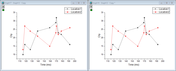
- Click OK to close Plot Details, then right-click on the graph window title bar and choose Duplicate. You now have two identical windows.
- Click on the duplicated window and click Format: Layer, again. Click on the Display tab again, but this time, set Scale Elements to Fixed Factor: 1, then click OK to close Plot Details. We now have two identical graphs, one with Scale Elements = Scale With Layer Frame and one with Scale Elements = Fixed Factor: 1.
- Reposition and resize your identical graphs so that we can do a side-by-side comparison.
-
- As mentioned, we ultimately plan to merge 4 separate graphs into a single, 4-panel graph and in doing so, we must shrink the size of our graphs to fit four to a page. What will be the effect of shrinking on text elements, for instance? We have set up a comparison to identical graphs, one with elements set to scale with the layer and one with elements set to a fixed size.
- In the graph window that is set to Scale With Layer Frame, click once in an empty portion of the graph page and when the green selection handles appear, hold the CTRL key and drag a corner handle so that the graph covers approximately 25% of the page.
- Repeat the last step with the graph window that is set to Fixed Factor: 1.
- Now, compare the resulting smaller graphs and note, in particular, the difference in the way that the various elements -- the plot symbols, the text and legend objects -- behaved when the graph was made smaller.
-
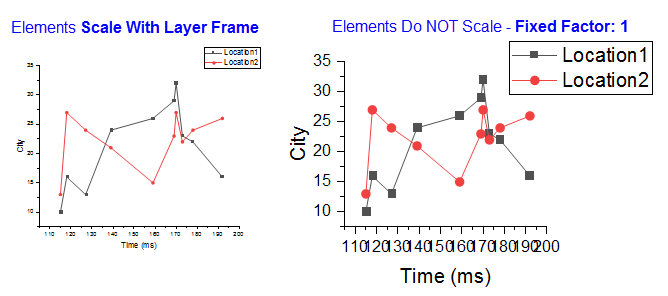
- We can see that setting the elements to Fixed Factor: 1 is probably going to cause problems when four graphs are merged onto a single page, so when we merge, we will leave the default setting for each of the merged graphs to Scale With Layer Frame.
- So that you don't get it mixed up with the other graphs, delete the "Fixed Factor" graph.
Merging Graph Windows
- With all four (and only the four) of your original graph windows showing in the workspace, choose Graph: Merge Graph Windows and open the Merge Graph Windows dialog box.
- Make sure that all four graphs are listed in the Graphs box, then expand the Scale Elements branch and make sure that Scale Mode is set to Auto. Note the Preview pane to the right side of the dialog box, showing an approximation of your final, merged graph. Tip: If you want to keep your original graphs, make sure the Keep Source Graphs box is checked, or the graphs will be destroyed.
- Click OK and a four-panel graph is created. Note the four layer icons in the upper-left corner of the merged graph -- one icon for each graph layer.
-
Common Display Controls for Simultaneous Edits to Multiple Layers
Suppose that we want to customize some elements or properties of the layers, plots and axes in a multi-panel graph? We could make edits to each layer, one-by-one, but this would be tedious. Beginning with Origin 2018b, you can use the Plot Details Layers tab Common Display controls to apply edits made to one layer, to other layers.
- With your 4-panel (merged graph) active, click Format: Page. This opens the Plot Details dialog box.
- Click on the Layers tab.
- Under Common Display, check the Plot Properties box. As the "blue hint" tells us, we should check the appropriate boxes here first, then make customizations at the Layer/Plot level. We can use the Apply to controls to selectively apply Common Display changes (see documentation of Apply to controls).
- In the left panel of Plot Details, click the arrow to the left of the Layer1 icon to expand to show the two data plots in the layer.
-
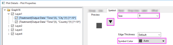
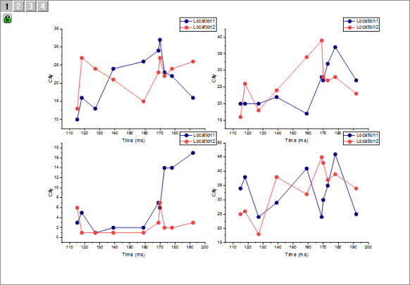
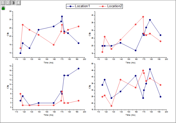
- Click on the first plot in the layer, then on the Symbol tab to the right side of Plot Details, click on the symbol gallery (downward-pointing arrow) and change plot symbol shape to Circle, then change Size to 15. Leave Symbol Color as Auto as that will allow symbol color to follow line color. Click OK to close Plot Details and note that the symbol size is increased in all plots in our 4-panel plot.
- We can continue to customize our 4-panel plot using Format and Style toolbar buttons. Click on one of the gray plots and note that both plots in the layer are now highlighted. Pause slightly and click a second time on the gray plot and this time, you will see that only that plot is selected.
- Click the Line/Border Color button on the Style toolbar and choose Navy. Note that gray plots in each of the four panels are now navy blue in color. The graph should look something like this:
-
Fix Scale Factors
At this point, we have a satisfactory graph and we may consider our work finished. However, one thing that we should be aware of is that when the four graphs were merged, the scaling down of font size produced one small issue.
- Select one of the graph legend objects, then hover over it with your mouse and you will see a tooltip that appears something like this:
-
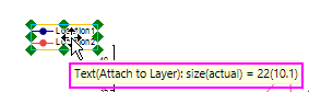
- The tooltip reports that the (font) size = 22 but that the actual size is 10.1. This occurs because, as we expected, the font was scaled down when we merged graphs. The problem now is that we have a font size that looks like it is 10.1 but Origin still thinks of it as a size = 22 (Look to the Font Size list on the Format toolbar and it will report the original size of 22). We can correct this conflict with a simple menu command.
- With the graph window active, choose Graph: Fix Scale Factors and accept the default value of 1 by clicking OK. Now, select one of the four legend objects, hover and you'll see that the tooltip now reports that both size and actual = 10.1 (the decimal is not meaningful as Origin rounds to the nearest 0.5). Note also, that the Format toolbar now reports Font Size = 10.
While we could have skipped this detail, it is not uncommon for users to want to be confused by conflicting information about scaled font sizes and this menu item is the best way to reset font size so that you know just what you are working with.
Fit Layers to Page
At this point, our graph looks satisfactory but we could do a couple of things to improve it. One would be to remove extra white space from the graph. We have a couple of options there but one quick way to do this is to choose the Fit Layers to Page menu item.
- With the graph window active, choose Graph: Fit Layers to Page. This opens the Fit Layers to Page:gfitp dialog.
- Set a Margin of 5 and clear the Maintain Layer Aspect Ratios box, then click OK. Our graph layers are slightly re-proportioned and the white space around the outside is reduced.
Graph Legend Adjustments for Panel Graphs
We don't need the four graph legend objects since each panel plots the same two variables. So, we will eliminate three objects and slightly reconfigure the fourth to act as a legend object for the four panels.
- Press CTRL + select three of the legend objects and when the green selection handles appear surrounding the three, press Delete.
- Drag the remaining legend object to the top-center of the graph page.
- With the legend object still selected (green handles showing), press CTRL again and drag one of the green handles on the side of the legend object and drag it out horizontally until it looks like this:
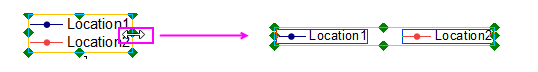
- Center the graph legend on top of the page. Your graph should now look something like this:
-
|