Get Your Engineering Point Across With More Descriptive Charts
Ralph Lombard
President
Lombard Technical Consulting
Charlotte, North Carolina
Introduction
Engineers tend to be stronger in the visual/spatial skills and weaker in the verbal skills. Engineers presenting their ideas to colleagues should therefore make better use of charts and graphs. When properly arranged and captioned, one good chart can explain your entire proposition. A visually appealing presentation is likely to get better reception from people who, in many cases, have chosen to pursue engineering careers because they are used to thinking visually.
Some examples of charts that I have produced as a consulting engineer will provide the best way to explain my thinking on this subject. I have spent most of the past 20 years working with portable power equipment such as chain saws and hedge trimmers. For the past six years, I have spent a considerable amount of time participating in the development of emissions standards for hand held power equipments and communicating the effects of setting emissions standards at various levels.
The regulatory "picture"
Figure 1 was produced to show a disadvantage of basing regulations on emissions per unit of displacement. I present an example the situation where the exhaust port of a chain saw engine becomes plugged after 39 hours of operation.
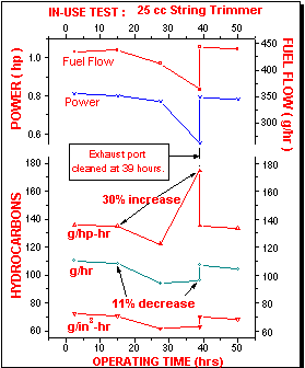
As the exhaust port gradually becomes plugged, the amount of fuel burned by the engine and the power it generates is reduced. The top line on the hydrocarbons section of the chart shows that the amount of emissions per unit of power, expressed in grams per horsepower-hour, rises by 30%. So that means the engine is generating more air pollution, right? Wrong! The middle line in the hydrocarbons section shows that, even though the engine is operating less efficiently from an environmental standpoint, the fact that the engine is burning less fuel is also reducing the total amount of emission generated (expressed in gm/hr) over a period of time.
This chart clearly demonstrated to regulators one pitfall of the direction that they were heading. By basing emissions requirements per unit of displacement they could be encouraging the industry to build larger engines which generated less emissions per unit of horsepower but more emissions on an absolute level by burning a larger amount of fuel.
Another point not mentioned on the chart, but apparent to industry experts who saw it, was that the emissions per unit of power benchmark was quite sensitive to the way the engine was tuned. It was quite possible that an engine which had been carefully tuned might meet a standard that would be impossible for the same engine to meet under actual field conditions.
The important point to note with this chart is that if I had given the committee a table of numbers or a 20 page technical report, it would never have had the impact of simply putting a graph together that tells the story completely. An important part of the graph is the text labels that highlight the point that the graph is making. In this case, the most important annotations are those showing that as the grams per horsepower-hour numbers are increasing, the grams per hour numbers are going down. These showed the regulators how they may be encouraging exactly what they were trying to get rid of.
