Effect on Sensory Nerves by Vertebral Column Movement
Summary
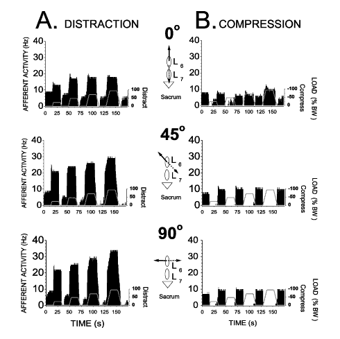
A neurophysiologist has performed studies designed to understand
how mechanical movement of the vertebral column affects sensory
nerves that innervate the paraspinal tissues. In particular, the
researcher put a biomechanical load on an individual lumbar vertebra
and, in the example below, recorded nerve activity from a muscle
spindle located in the multifidus muscle innervated by that spinal
segment. The load was placed on the vertebra in the horizontal plane
and translated in 3 different directions relative to the long axis
of the spine.

Getting the Data into Origin
The data was first reduced in an Excel worksheet and set up appropriately
for graphing. The first row of the Excel spreadsheet contained what
became the column titles in Origin and the second row contained
what became the column label. The data represented two types of
outcome variables:
- Biomechanical Data - changes in force that were continuous in
time
- Neurophysiological Data - increases in afferent (nerve impulse)
activity measured in Hz and determined for successive 500ms bins
of time
Thus the final plots included two types of Y data (a Line graph
showing the change in force over time and a Bar/Column graph showing
each bar representing 500ms of nerve activity).
Manipulating the Data
To create these plots the data was copied and pasted into an Origin
worksheet. Each column was then appropriately named. In order to
do this (because there were so many columns), two script buttons
were created. The first button moved the first row of the worksheet
data into the respective column's title and the second row into
the respective column's label. These first two rows were then automatically
deleted with the second button.
|
Making Presentation Quality Graphs
The next step involved creating the graph template to be
used in creating 6 graph windows. Two layers were made in
a graph window: one included the Line plot mentioned above
and the other the Bar/Column graph. The layers were then positioned
on top of each other. Finally, all labels, fonts, ticks, scales,
etc were adjusted to create the desired effect. The graph
was then saved as a graph template and used to create the
5 remaining graphs with additional data sets obtained during
the study.
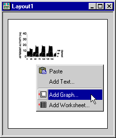
The six graphs were placed in Origin's Layout window and
positioned appropriately. All 6 graphs were selected and sized
identically using the Uniform Height and Uniform Width toolbar
buttons on the Object Edit toolbar. The 3 graphs making up
each of the 2 columns were aligned vertically using Origin's
set of vertical alignment buttons on the Object Edit toolbar.
The 2 graphs making up each of the 3 rows were then aligned
horizontally using the set of horizontal alignment buttons
on the Object Edit toolbar.
|
|
 |

The three graphics in the center of the Layout page were drawn
using the drawing tools on the Tools toolbar. When possible, objects
were copied and pasted so that they were similar in size. All elements
for each graphic were grouped with the Group button on the Object
Edit toolbar. The three graphics were then aligned using the alignment
tools on the Object Edit toolbar. Each cartoon represented a different
direction of movement.
Biography
Joel G. Pickar is a Neurophysiologist
at the Palmer Center for Chiropractic Research in Davenport, Iowa.