Get Your Engineering Point Across With More Descriptive Charts
Page 2 - Presenting the complete picture
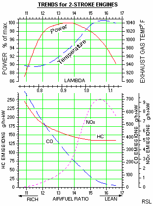
The second graph visually addresses another idea that has been proposed by many engineers to reduce emissions . By increasing the air-to-fuel ratio, engineers argued that one can get a reduced level of hydrocarbon (HC) and carbon monoxide (CO) emission and hence reduce overall environmental pollution. However, that argument is only partially correct. The effect of higher air:fuel ratio on the total emission is presented after adding more parameters in the same graph.

As seen, beyond an optimum air:fuel ratio of 14.7:1 (designated as Lambda =1) the power output starts dropping sharply, the temperature of the engine rises and most importantly, the nitrous oxide emission (NOX) starts rising steeply. The collective picture was not clear to many engineers because the tool to visually present all these data on a single graph in a uncluttered manner was not available to them. The tools (available in Origin) that really enhanced this set of graphs are : (i) the ability to produce two sets of graphs on a page and, (ii) the choice of adding a third y axis. By adding a third axis and shifting it to right, and then adding a second graph on the same page, more information was added to present a complete picture.
