Automating Chart Production Reduces Time Required to Produce Quarterly Portfolio Reports
Templeton Global Investors, Incorporated
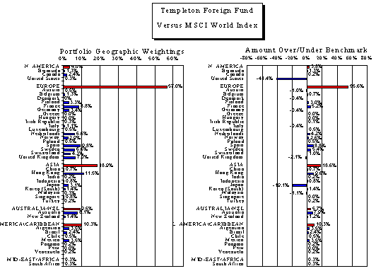
Templeton Global Investors, Incorporated provides investment information and management of mutual funds as well as private accounts for institutional investors. In order to keep their clients informed of their strategies, Templeton developed the "Over/Under" chart. The over/under chart enables the client to examine in a clear and concise manner a comparison of their investments to major investment indices. This chart is also used by Templeton to keep clients aware of the structure of their portfolio. When the spreadsheet software Templeton was using to create charts proved inflexible for their growth, they discovered that a technical graphics and data analysis software, OriginÔ, was capable of producing the complex charts automatically.
The services provided by Templeton require a large amount of reporting that requires conveying complex data in a simple manner. Automating over/under chart production reduced the amount of time required to generate quarterly portfolio reports. There are two types of over/under charts used quarterly by Templeton; a geographic weighting over/under chart, and an industry weighting over/under chart. These charts were formerly produced with a spreadsheet software package, which automatically set the label size in the charts. With the growth of Templeton's funds into new geographic areas and industries, the number of rows in the spreadsheets grew to the point that the labels became illegible and ineffective.

Figure 1.Geographic Over/Under Chart. The above chart displays a hypothetical portfolio for demonstration purposes and does not represent a real Templeton portfolio. The chart on the left shows the portfolio's weight in each region and, beneath each region, the countries comprising that region. The chart on the right shows the portfolio's weight minus the benchmark weighting (relative weighting) in each region and country. A client examining the charts above could quickly determine that Europe had the largest weighting of all of the regions in the portfolio at 39.2% by looking at the left hand chart. The right hand chart shows that the largest difference in regional weightings versus the index is Asia. The portfolio has 14.5% less of its assets in Asia than does the index.
