6.10.4 Grouped Box Plotgrouped-box-plot
Summary
In Origin, a grouped box chart can be created from either indexed data or raw data. The indexed data is arranged as one data column and one or more group columns, while the raw data is arranged as multiple data columns grouped according to the column label row(s).
Once a grouped box plot has been created there are many options to customize the box plots and the axes. The customization options are the same for grouped box plots created from raw data as well as those created using indexed data.
Minimum Origin Version Required: 2015 SR0
What You Will Learn
This tutorial will show you how to:
- Create a grouped box plot from indexed data
- Create a grouped box plot from raw data
- Customize the box plot using the Plot Details dialog
- Customize the table-style axis tick labels
Steps
Create Grouped Box Plot from Indexed Data
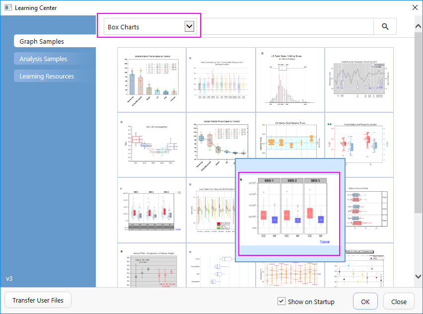
- Select Help: Learning Center menu or press F11 key to open Learning Center. Select Graph Sample tab and then select Box Charts from the "Category" drop-down list. Double-click on the graph sample below to open the sample "Box Charts - Grouped Box Chart with Color Indexed Data Points".
- Note: This tutorial is associated with the folder Grouped Box Plot and Axis Tick Table of the "Tutorial Data" project:<Origin EXE Folder>\Samples\Tutorial Data.opj.
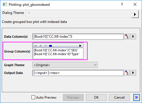
- In the workbook Book10, the data in the CC.MI-Index worksheet is indexed data. Column E is the data column and columns C and D can be used as grouping columns. Highlight column E and select Plot > Categorical : Grouped Box Charts - Indexed Data to open the plot_gboxindexed dialog.
- In this dialog, click the trianlge button at the top of Group Column(s) box to select columns C and D.
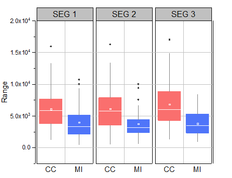
- Click OK to create a grouped box plot. The plot will resemble the image below. A new output sheet will be added into the workbook too.
 | For another short tutorial on creating grouped box plots from indexed data, see Example 2.
|
Customization by Plot Details Dialog
- Activate the graph window created from the indexed data. Select and delete the legend object.
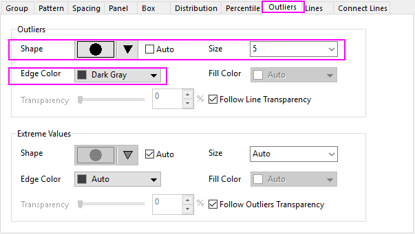
- Select Format:Plot to open the Plot Details dialog. To customize Symbol style, select the Outlies tab and set the following:
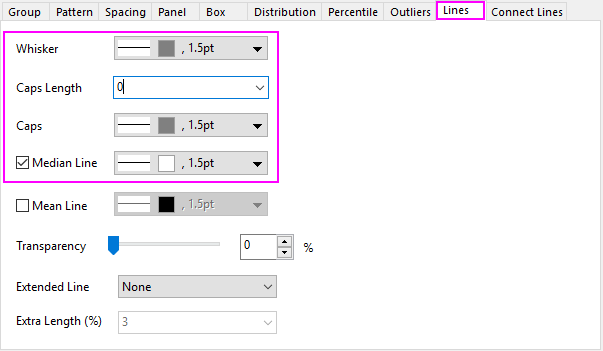
- On the Spacing tab change Gap Between Subgroups (in %) to 5. On the Lines tab change the line colors as shown below:
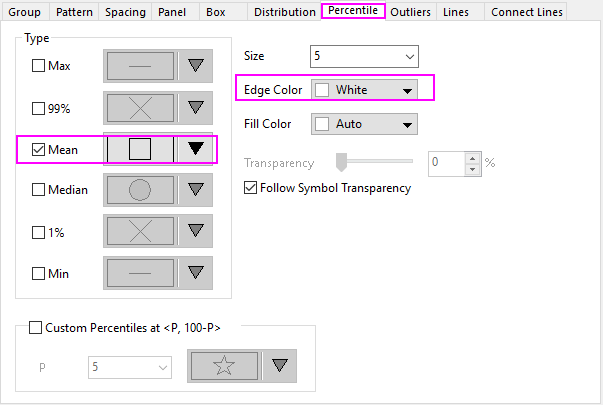
- On the Percentile tab in order to set the Max/99%/1%/Min to none, select the last option in the symbol map. Set the rest of the options as shown below:
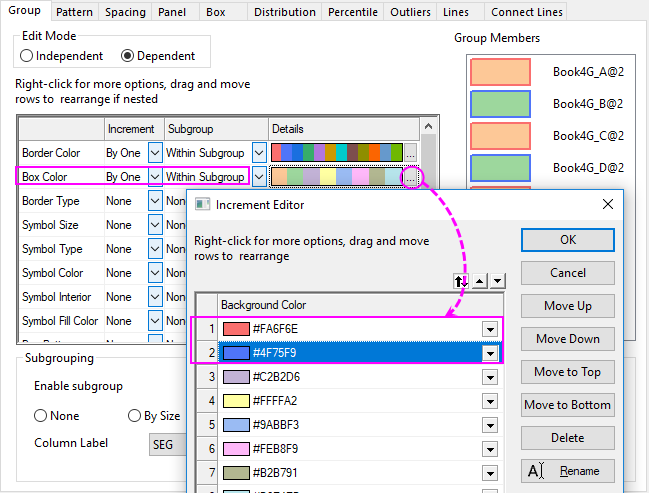
- On the Group tab, for the Border Color row, set the Increment as By One and Subgroup as Within Subgroup .
- Next, click the ... button on the right end of the Details column to open the Increment Editor. Click the first color to expand the color chooser, then click the last vacant color under Custom control to open the Colors dialog. In the dialog that opens, you can define a custom color by entering the HSL values (Hue=0, Sat=240, Lum=180). OK to close the dialog. Follow the same procedure for the second color in the Increment Editor dialog with the settings Hue=160, Sat=240, Lum=164. OK out of the Increment Editor:
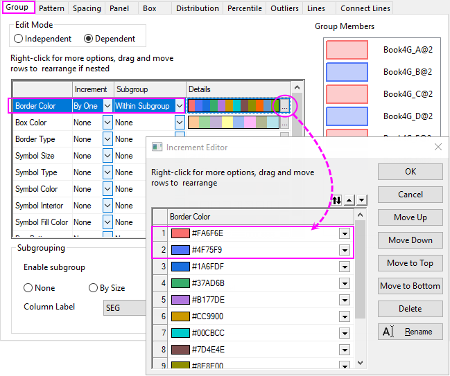
- In regard to the Box Color, select the first two colors of current color list to the ones we just defined at the previous step, and then select By One for Increment cell and Within Subgroup for Subgroup cell:
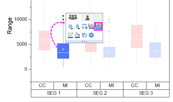
- Click OK to apply all the previous settings and close the Plot Details dialog. Click on a box, and in the popup mini toolbar, click the Smaller Gap button thrice to reduce the gap between subgroups.
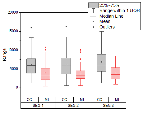
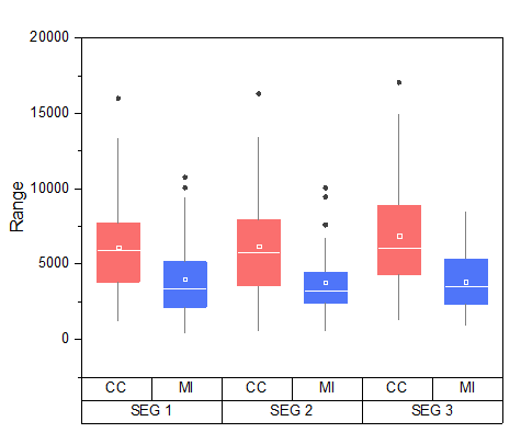
 - Finally, the graph should resemble the image below:
Customization by Axis Dialog
Continue with the graph from the previous section.
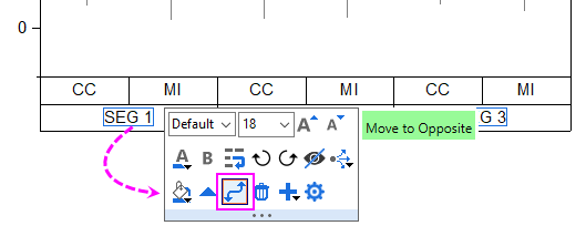
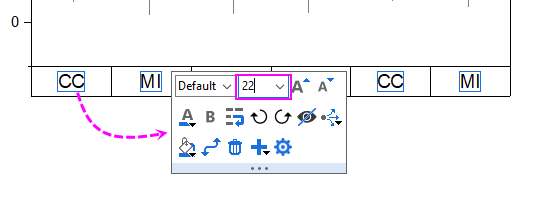
- Click on the bottom table row of the X axis, in the popup mini toolbar, click Move to Opposite button to move it to the top axis.
- Click on the tick labels of bottom table row to set the font size to 22. And, click the tick labels of top axis to change the font size to 24 using the mini toolbar.
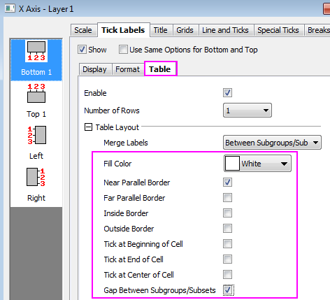
- Double-click on the bottom axis to open the Axis dialog. With Bottom 1 selected in the left panel, go to the Table sub-tab of Tick Labels tab to set the table format as below:
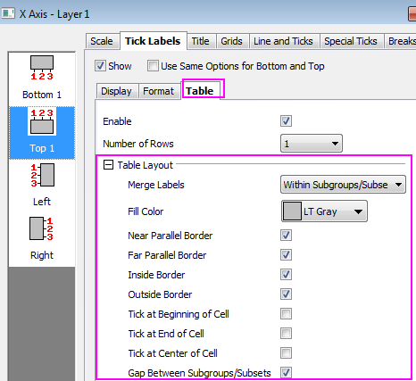
- Select Top 1 in left panel, go to the Table sub-tab of Tick Labels tab to set the table format as below:
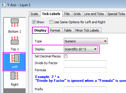
- Click the Left icon (for Y axis) and change the display format for the Y tick labels:
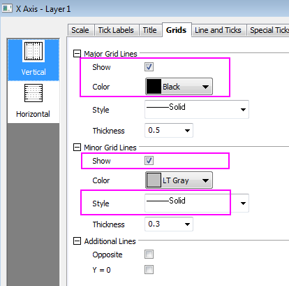
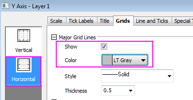
- Click Apply button. To turn on major and minor grid lines, go to the Grids tab and set as following for X(Vertical) and Y(Horizontal) grids respectively:
- Click OK to apply the settings and close the Axis dialog. The final graph should appear as shown below:
| You can click to select table labels and nudge them using the arrow keys on your keyboard.
|
|