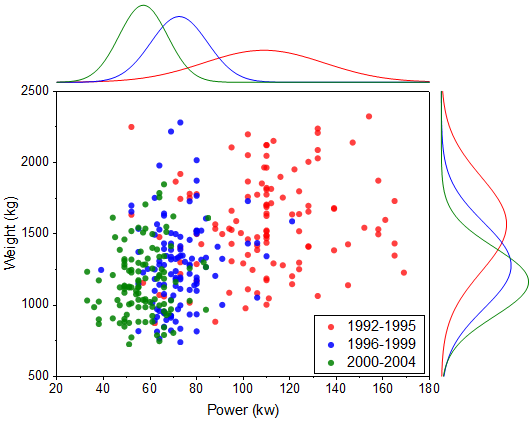
6.10.3 Marginal Distribution CurveMarginal-Distribution-Curve
Summary
Graphs in Origin are highly customizable. This tutorial will show how to customize the marginal histogram to display distribution curves instead of columns.
Minimum Origin Version Required: 2015 SR0
What you will learn
- Create marginal histogram
- Use filter lock to create plots with different filter conditions.
- Group plots manually
Steps to Use the Filter Lock
Origin9.1 includes a special feature that allows you to set up different data filters in a single source worksheet and to, for instance, graph data for each filter condition without destroying the previous plot. This is made possible by copying filtered data to a new sheet and placing a "filter lock" on the filtered data.
- Import <Origin EXE Folder>\Samples\Statistics\automobile.dat to a new blank workbook.
- Highlight col(A), right click and select Filter: Add or Remove Filter.
- Click the filter icon in the column header and select Between....
- In the Between dialog, set From to 1992, To to 1995 and press OK.
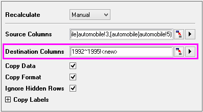
- Highlight Col("Power") and Col("Weight"), right-click and select Copy Columns to....
- In the colcopy dialog, enter 1992~1995!<new> in the Destination Columns text box as shown below and click OK.
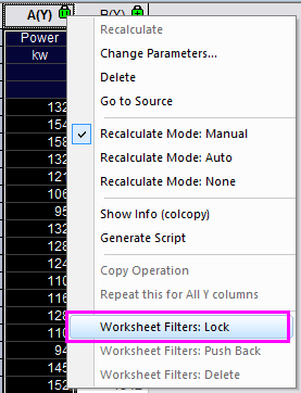
- In the newly created sheet, click the green lock in the Col(A) heading and select Worksheet Filters: Lock.
- Go back to the "automobile" sheet and repeat steps 4~7 twice more with Col("Year")'s filter conditions set to 1996~1999 and 2000~2004, respectively. You need to type a sheet name in colcopy dialog manually each time. The filter conditions are locked with each sheet, you can push them back using Worksheet Filters: Push Back.
Steps to Create a Plot with Marginal Distribution Curves
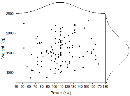
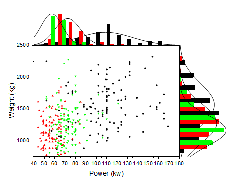
- Go to sheet "1992~1995", highlight all columns and select Plot > Statistical: Marginal Histograms
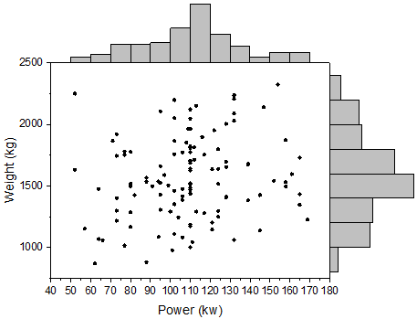
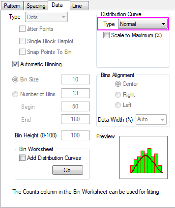
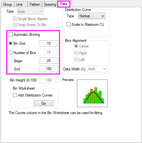
- Double-click any on any bar in the top histogram to open the Plot Details dialog. Go to the Data tab and set Distribution Curve: Type as Normal. This is for Layer 2.
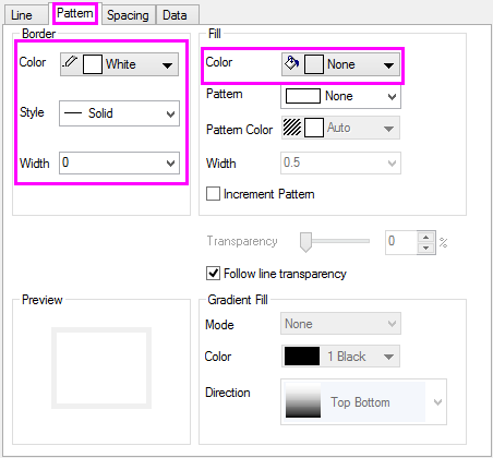
- Go to the Pattern tab and reproduce the settings shown below to hide bin bars.
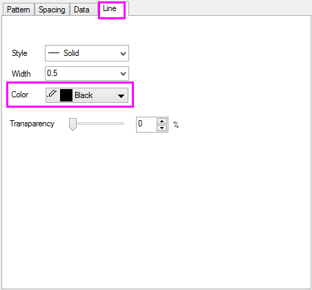
- Go to the Line tab and set Color to Black. Click Apply to see the changes.
- Repeat steps 2~4 for Layer3 (right histogram).
Steps to Plot Grouped Marginal Distribution Curves
- Select Graph: Plot Setup from menu.
 | In order to show all three panels in Plot Setup dialog, please expand Plot Type panel by clicking  and expand Available Data panel by clicking again. and expand Available Data panel by clicking again.
Please refer to Plotting using Plot Setup for more information.
|
- Select Layer 1 in lower panel. Set controls as shown below and click Add.
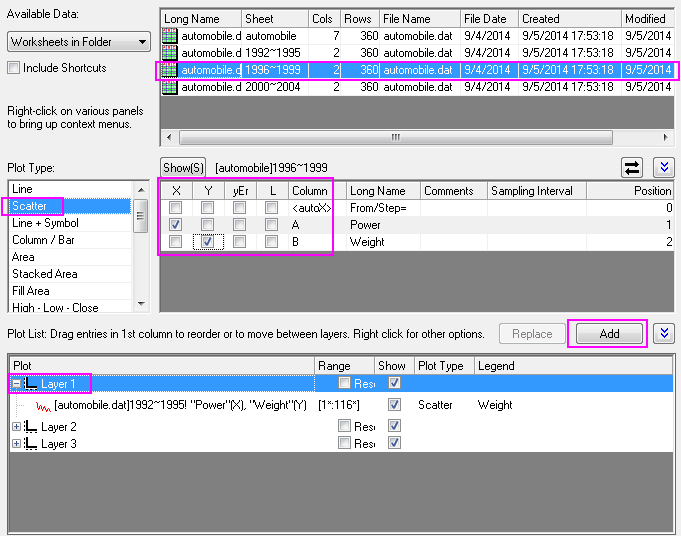
- Add the "Power" histogram to layer2.
- Add the "Weight" histogram to Layer3.
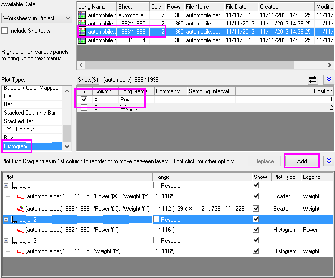
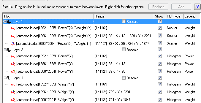
- Repeat steps 2~4, to add 2000~2004 data to each layer. The plot list should look like the following.
- Click OK to close the Plot Setup dialog box and rescale the graph.
Steps to Group the Plots
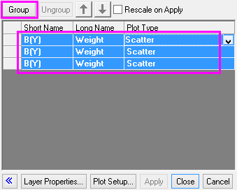
- Right-click the layer icon
 at the upper-left corner of the graph window and select Layer Contents.... at the upper-left corner of the graph window and select Layer Contents....
- Highlight all three plots and click Group, then click OK.
- Repeat step 2 for layer2 and layer3.
Steps to Further Customization
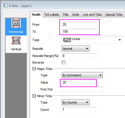
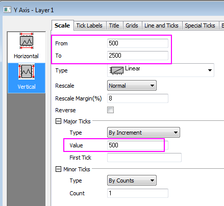
- Double click the bottom axis to open the Axis Dialog for layer 1, then go to the Scale tab, and set the axis scale for the Horizontal(X axis) and Vertical(Y axis) as below respectively:
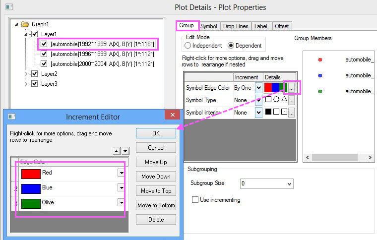
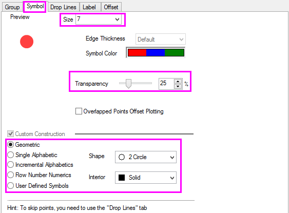
- Click OK to close axis dialog. Double click on the graph to open the Plot Details dialog box and select the first dataplot in layer 1 to go to Group tab. Set Symbol Type as None and duplicate the following settings:
- Click Ok to close the dialog. Go to the Symbol tab and duplicate the following settings.
- Go to Layer 2, Data tab and set the bin scale to be the same as the X scale, then click Apply.
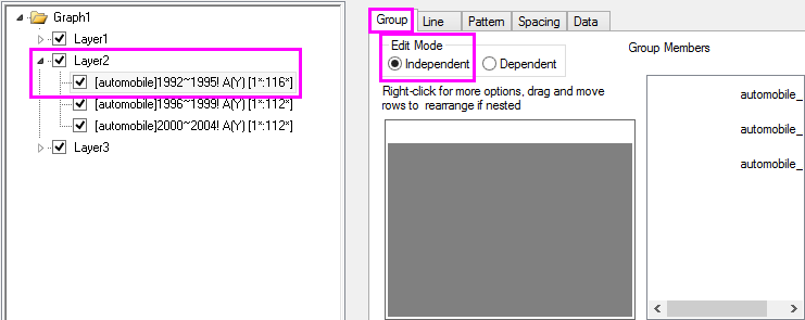
- Go to the Group tab for plots in Layer 2 and set the Edit Mode to Independent so that we can individually customize the plot styles, click Apply.
- Go to the Pattern tab and hide bars for all three dataplots in Layer2 as what we did in Steps to Create a Plot with Marginal Distribution Curves, Step3.
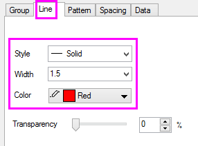
- Go to Line tab of the 1992~1995 data plot and set as below.
- Repeat step 7 for the other two plots in Layer2 and set line color to the corresponding symbol color in Layer1.
- Repeat steps 5~8 for Layer3, click OK to close Plot Details dialog and apply settings.
- Activate Layer1 and select Graph: Legend: Data Plots from the menu.
- Right click the legend object and click Properties..., set Background to Black Line, and font Size to be 18. Click OK.
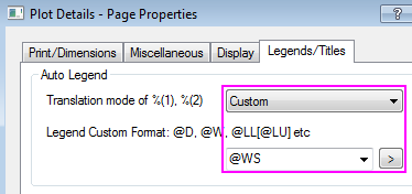
- Use Format: Page to open the Plot Details - Page Properties dialog, go to Legends/Titles tab and set as the following so that worksheet name will be used as legend text:
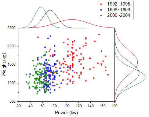
- Drag and move the legend to a new position as needed. At this stage the graph should look like below:
Steps to Reposition the Graph Layers
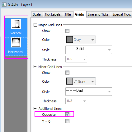
- Double click bottom axis to open Axis Dialog for layer 1, go to the Grids tab, hold Ctrl key to multiple select Vertical and Horizontal icon and set the following:
- Click OK to close dialog. Open the Axis Dialog for layer 2. Go to the Line and Ticks tab, make sure Bottom axis icon is selected and clear the Show Line and Ticks check box to hide the bottom axis line. Do the same for the axis line of Left in layer 3.
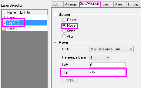
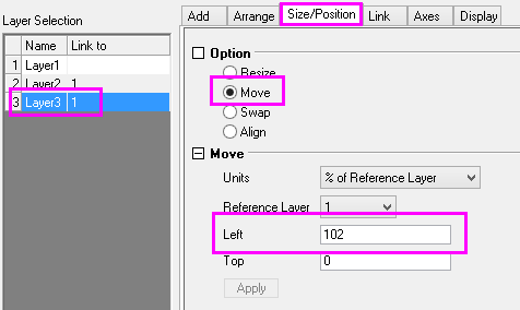
- Open the Layer Management dialog box, highlight Layer2 then go to the Size/Position tab, select Move and set Top to be -35. Click Apply.
- Set Left for Layer3 to be 102. Click Apply. Then click OK to close the dialog box.
|