6.11.1 Polar ContourPolar-Contour
Summary
This tutorial will show you how to create a Polar Contour graph from both XYZ worksheet data and matrix data.
What will you learn
- Create a Polar Contour graph from both XYZ data and matrix data
- Customize the graph using the Plot Details dialog box
Steps
Plot Polar Contour from XYZ data
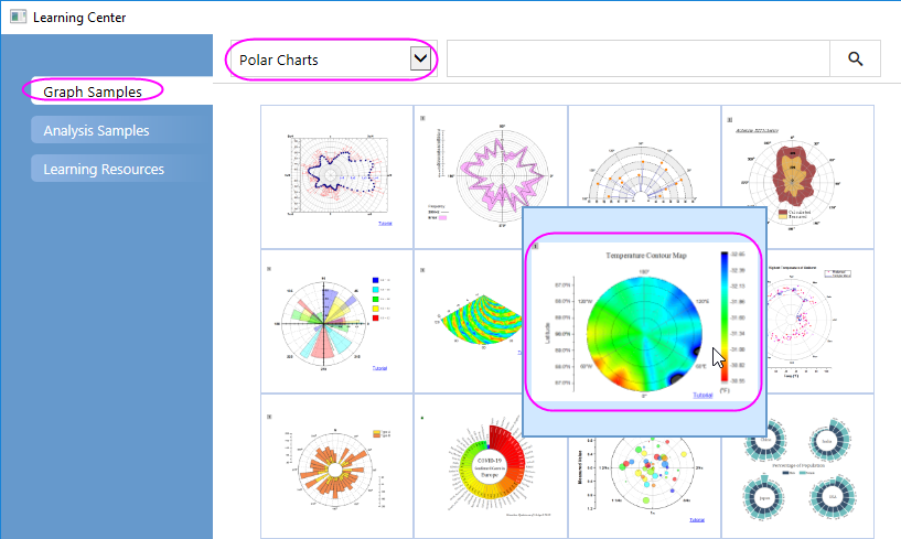
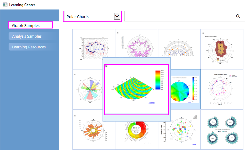
- Select Help: Learning Center menu or press F11 key to open Learning Center. Select Graph Sample tab and then select Polar Charts from the "Category" drop-down list. Double-click on the graph sample below to open the sample "Polar Chart - Polar Contour".
Note: This tutorial is associated with the folder Polar Contour of the "Tutorial Data" project:<Origin EXE Folder>\Samples\Tutorial Data.opj.
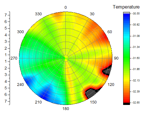
- Activate the first worksheet of the workbook Temperature and Location containing the temperature and location data and select column C. Select Plot > Contour : Polar Contour theta(X) r(Y) from the menu to create a polar contour graph. The graph should look like this:
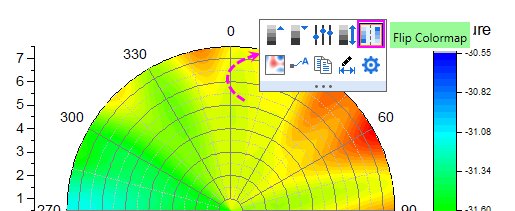
- Next, we will customize the contour graph using the Mini Toolbars. Click on the contour plot, and in the pop up mini toolbar, click the Flip Colormap button
 to reverse the color order of the colormap. to reverse the color order of the colormap.
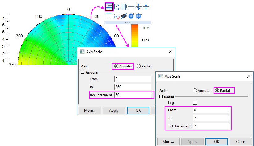
- Click on the angular axis(the circular arc edge of the polar), and in the popup Mini Toolbar, click the Axis Scale button
 to open Axis Scale dialog. In this dialog, with Angular Axis selected, set Tick Increment to 60; with Radial Axis selected, set From and To to 0 and 7, Tick Increment to 2. to open Axis Scale dialog. In this dialog, with Angular Axis selected, set Tick Increment to 60; with Radial Axis selected, set From and To to 0 and 7, Tick Increment to 2.
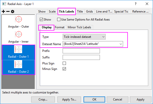
- Next, let us open the Axis dialog to do further customization for the axes and axes labels. Double-click on the Radial axis to open the Axis dialog. Go to Tick Labels tab. Pressing Ctrl key and select both Radial - Outer 1 and Radial - Outer 2 in the left panel. In the right panel, go to Display tab, select Tick-indexed datasetin Type drop-down list, then select [Book2]Sheet2!A"Latitude" from the Dataset Name drop-down list.
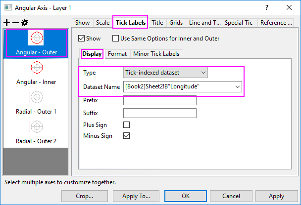
Select Angular - Outer in the left panel. In the right panel, go to Display tab, select Tick-indexed dataset in Type drop-down list and then select [Book2]Sheet2!B"Longitude" from the Dataset Name drop-down list.
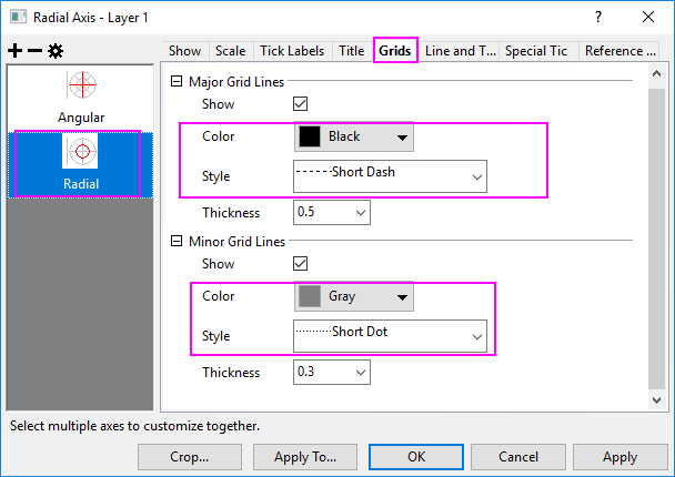
- Click Apply button. Go to Grids tab, and make sure Radial is selected in the left panel. Edit the dialog box settings as in the following image. Click OK to close the Axis dialog box.
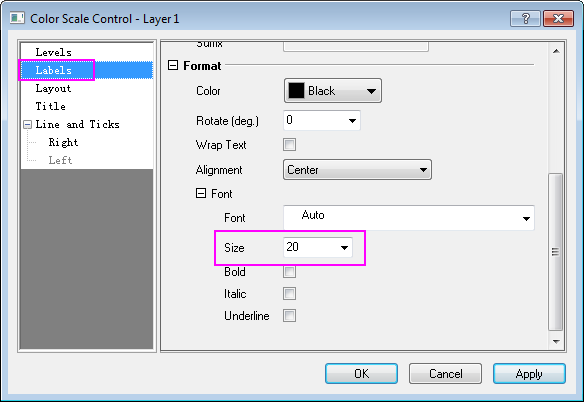
- Double-click on the Color Scale to open the Color Scale Control dialog box and edit settings as follows
- In the Labels page, set font size to 20.
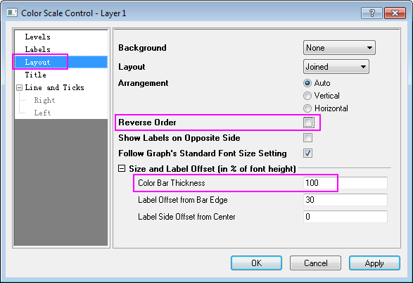
- In the Layout page, uncheck Reverse Order check box, and set Color Bar Thickness to 100.
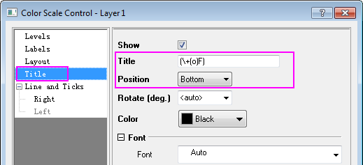
- In the Title page, enter (\+(o)F) in the Title, which is supposed to be displayed as (oF) as the unit for temperature. And set the Position to Bottom.
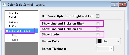
- In the Line and Ticks page, uncheck Show Line and Ticks on Right and Show Border check box. Then Click OK to save the setting and close the dialog.
Note: The text used for Title is (\+(o)F), which is supposed to be displayed as (oF) as the unit for temperature.
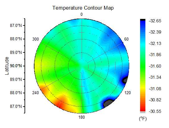
- Add the graph title Temperature Contour Map, axis title Latitude to the graph. The graph should look like this:
Plot Polar Contour from Matrix data
- Select Help: Learning Center menu or press F11 key to open Learning Center. Select Graph Sample tab and then select Polar Charts from the "Category" drop-down list. Double-click on the graph sample below to open the sample "Polar Chart - Polar Contour from Matrix".
Note: This tutorial is associated with the folder Polar Contour of the "Tutorial Data" project:<Origin EXE Folder>\Samples\Tutorial Data.opj.
- Activate MBook1. Select Plot > Contour : Polar Contour theta(X) r(Y) from the menu or click the Polar Contour theta(X) r(Y) button on the 3D and Contour Graphs toolbar.
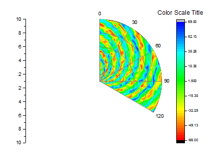
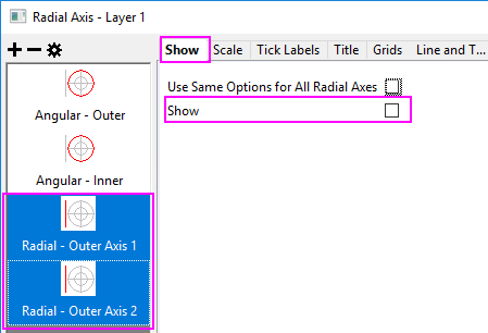
- Double click the axes to open the Axis dialog, we also can customize the Radial Axes and Angular Axesfor this polar graph.
- Go to Show tab, keep pressing Ctrl key to select both Radial - Outer 1 and Radial - Outer 2 in the left panel, uncheck Show check box in right panel to hide these two axes. Click Apply button.
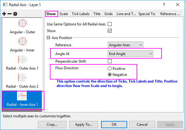
- Click Add a radial axis button to add a inner radial axis. Choose this Radial - Inner Axis 1 in the left panel. From the Angle At drop-down list, select End Angle and set Flow Direction to Negative.
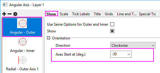
- Choose Angular - Outer in the left panel, in the Axes Start at (deg.) box, enter -30. Click OK to save settings and close the dialog.
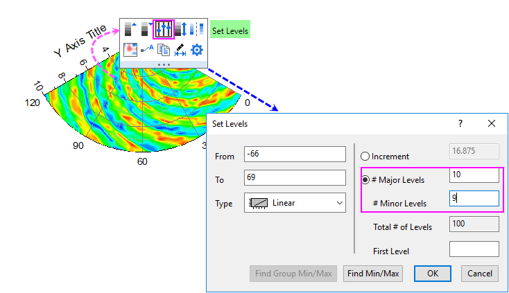
- Click on the contour area, and in the popup Mini Toolbar, click the Set Levels button
 to open the Set Levels dialog to do settings as below: to open the Set Levels dialog to do settings as below:
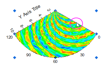
- Click the right edge of this sector to select the graph layer as below. Drag and drop the sector up to the center of the graph window.
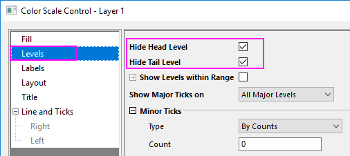
- Double-click on the Color Scale object to open the Color Scale Control dialog.
- In the Levels page, check the Hide Head Level and Hide Tail Level check box.
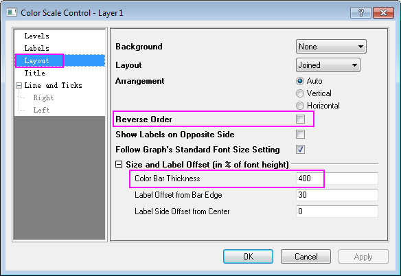
- In the Layout page, uncheck Reverse Order and set Color Bar Thickness to 400.
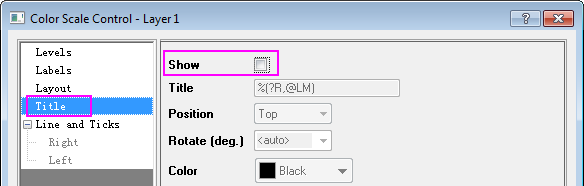
- In the Title page, uncheck Show check box.
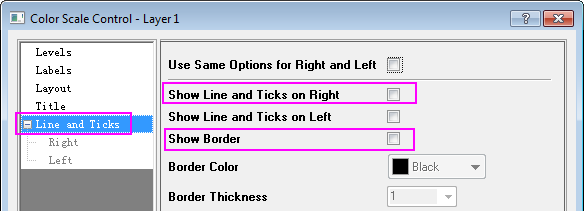
- In the Line and Ticks page, uncheck Show Line and Ticks on Right and Show Border. Click OK to save settings and close the dialog.
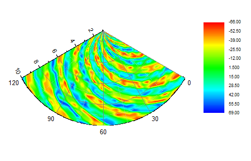
- Click on the Color Scale object and use the anchor points to resize it from vertical direction. The resulting graph should look like this:
 | Polar contour graphs from matrix data support filling color to contour lines or to the matrix grid. For more information, see these two topics:
|
|