9.3.4 SQL Editor for Database AnalysisSQL-Editor-for-Database-Analysis
Summary
 | The database used in this tutorial has been set up on Microsoft Azure.
|
This tutorial shows how to import data from database using SQL Editor, perform common operations such as column filtering and pivot table, and then use pivot table result to plot graph. Finally put graph in workbook so everything is inclusive that the workbook can be saved as an analysis template for future use.
The procedure is based on Origin 2023b.
What you will learn
This tutorial will show you how to:
- Use SQL Editor to import data from database
- Add column filter to only show products of interest.
- Create a pivot table for sum of LineTotal of different products in different States.
- Plot column graph to visualize the result.
- Insert the graph into the worksheet and save such self-contained workbook as analysis template.
- Load the analysis template and reimport data.
Steps
Import Data from Database
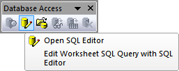
- Start a new project. Choose Data: Connect to Database: New... menu or click clicking the Open SQL Editor button on the Database Access toolbar.
- Choose Connection ctring radio button and click OK. Paste the Connection String below.
Driver={SQL Server}; Server=olab.DATABASE.windows.net; Port=1433;
DATABASE=sample1; Uid=Olabts; Pwd=Origin@2024;
If you are using ODBC Drive 18 for SQL Server, use
Driver={ODBC Driver 18 FOR SQL Server}; Server=olab.DATABASE.windows.net; Port=1433;
DATABASE=sample1; Uid=Olabts; Pwd=Origin@2024;
- Click the OK button to connection to the database.
- Copy and paste the following query into the SQL Editor text box. The query shows data for the year 2003:
SELECT SalesLT.SalesOrderDetail.LineTotal,
SalesLT.ProductCategory.Name,
SalesLT.ProductCategory.ParentProductCategoryID,
SalesLT.Address.StateProvince,SalesLT.Address.CountryRegion
FROM SalesLT.SalesOrderDetail
INNER JOIN SalesLT.Product
ON SalesLT.SalesOrderDetail.ProductID = SalesLT.Product.ProductID
INNER JOIN SalesLT.ProductCategory
ON SalesLT.ProductCategory.ProductCategoryID =SalesLT.Product.ProductCategoryID
INNER JOIN SalesLT.SalesOrderHeader
ON SalesLT.SalesOrderHeader.SalesOrderID =SalesLT.SalesOrderDetail.SalesOrderID
INNER JOIN SalesLT.CustomerAddress
ON SalesLT.CustomerAddress.CustomerID = SalesLT.SalesOrderHeader.CustomerID
INNER JOIN SalesLT.Address
ON  SalesLT.Address.AddressID =SalesLT.CustomerAddress.AddressID
ORDER BY SalesLT.ProductCategory.ParentProductCategoryID
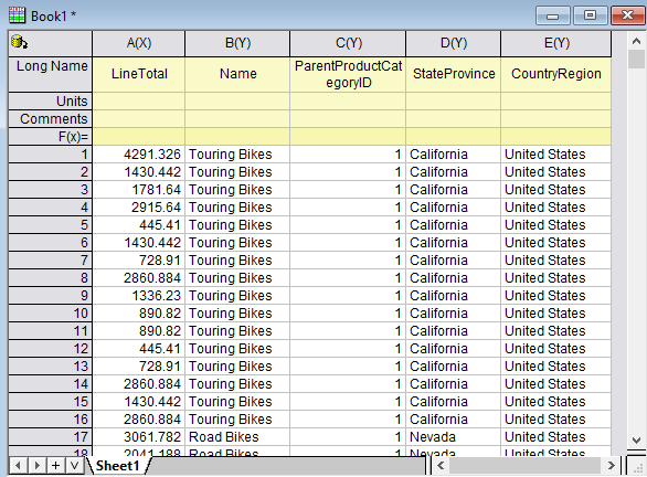
- Click the OK button to import data to workbook. By default the SQL is saved together with worksheet.
- The icon on the top left of the workbook indicates the sheet contains an SQL query.
Filter Data
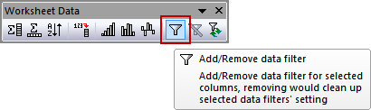
- Origin has a data filter feature similar to Excel. We can use this feature to choose specific data for graphing and analysis without removing the rest of the data.
- Select column C (ParentProductCategoryID) and column E (CountryRegion) and then click the Add/Remove data filter button on the Worksheet Data toolbar to add a filter on them.
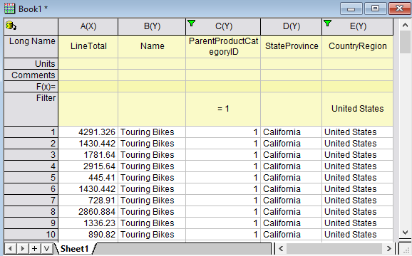
- Click the funnel icon on column E. From the list that appears, uncheck United Kingdom and click OK.
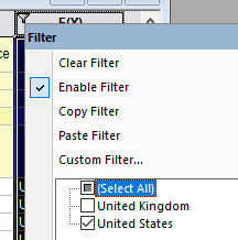
- If a reminder message about hidden data appears, select the Yes radio button and click OK.
- Click the funnel icon on column C, it shows Equals, Less than, .... numeric filter menus since the ParentProductCategoryID are treated as numbers.
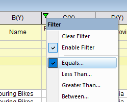
- Choose Equals... and enter 1 as Value. Click OK.
- Now the worksheet only shows the sales of various Bikes in USA.
Create Pivot Table and Plot Column Graph
- We can create a pivot table to see total sales of each bike type in different states.
- With nothing selected in worksheet, select Restructure > Pivot Table
- In the dialog that opens set Recalculate Mode to Auto. This will make the pivot table manipulation update if the data is re-imported from the SQL Editor.
- Set the Row Source as Name.
- Set the Column Source as StateProvince (the column with the filter on it).
- In order to see the Total Sales, set the Summarize by option as Sum , and set the Pivot Table Data Source option that appears as LineTotal.
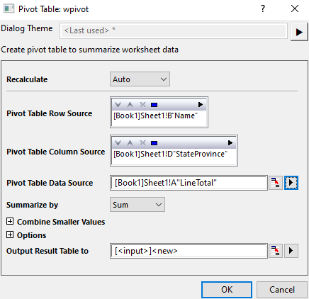
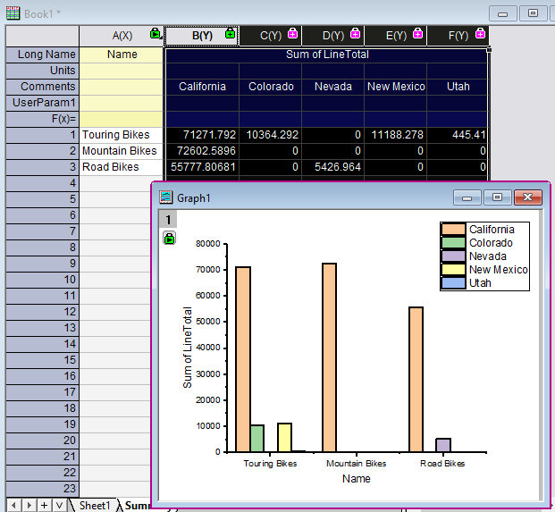
- Click OK. A new worksheet is created named Pivot1. Rename it as Summary
- Now highlight the pivoted data and click on the Column Plot button to create a column plot.
Customize Graph and Create Analysis Template
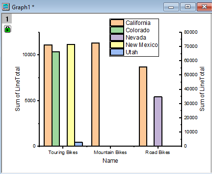
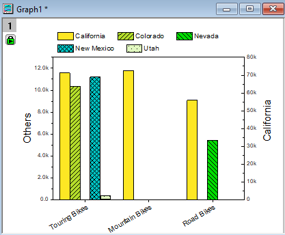
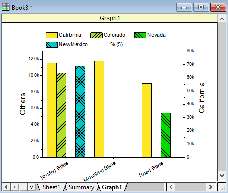
The Colifornia Sales are much higher than other states, making it hard to see Utah sales column. Also we can customize the color and pattern of column/bars to make it more appealing.
- Single click on any California bar. On the mini toolbar that shows, go to Single tab and click Plot on Right Y so California bars will be plotted against a right Y axis.
- Double click the right Y axis title and set it as %(1Y, @LC), which means use 1st Y plot's Comments info. as Axis title. The right Y axis title will become California.
- Double click the left Y axis title and set it as Others.
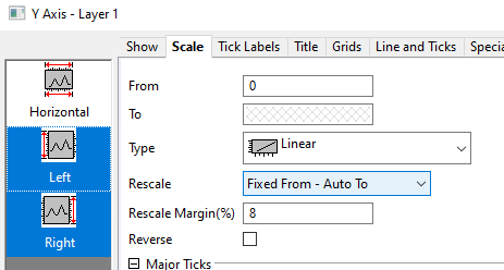
- Double click on any Y Axis to open the Axis dialog.
- Select both Left and Right on the left panel. On Scale tab, set the Rescale dropdown to Fixed From - Auto To.
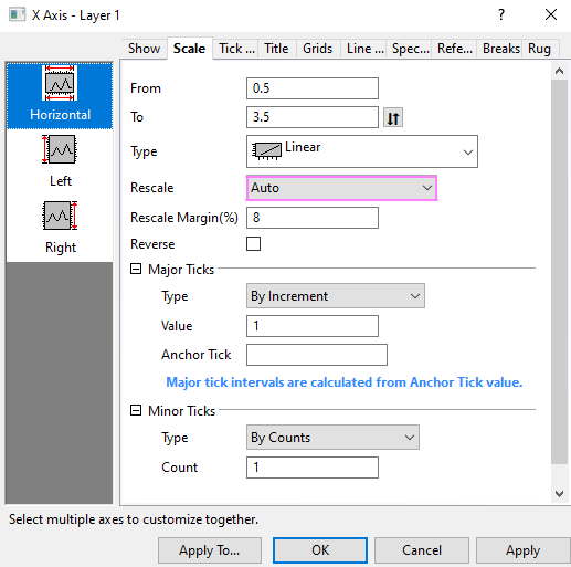
- Select Horizontal on the left panel. On Scale tab, set the Rescale dropdown to Auto.
- Go to Tick Labels tab, Select both Left and Right on the left panel and set Display as Engineering:1k. Click OK.
- Customize fill colors and patterns of columns, legend, horizontal tick labels, etc. e.g.
Add Graph in Worksheet and Save Analysis Template
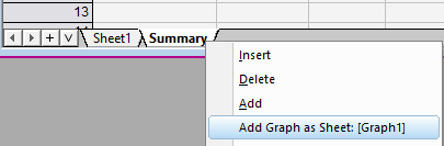
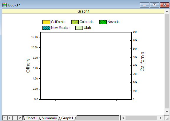
- Right click on Summary sheet tab and choose Add Graph as Sheet:[Graph1] to add the graph as a separate sheet in workbook.
- If you need to customize the graph further, double click it to bring up the independent graph window again to customize. And then click the return button on graph window title to bring it back to worksheet.
- Now workbook is self-contained with everything: database connection, data filtering, analysis (pivot table) and graph.
- Choose File: Save Workbook as Analysis Template... and name it LineTotal_By_State
Change Query and Re-import Data to Automatically Update Analysis
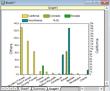
- Go to File: Recent Books menu to load the LineTotal_by_State you just saved. This will open a blank analysis template workbook.
- Go to Sheet1. Click on the
 and click Import or click the Import Data button and click Import or click the Import Data button  to reimport from database. to reimport from database.
- Summary sheet and Graph1 sheet are both updated as well.
- In the new workbook, click the funnel on column C and change check 2 only.
- You can also click on the and click SQL Editor to modify the Query as well.
 | - You may need to manually reapply filter
 after reimport new data from Database, or choose Worksheet: Worksheet Script... menu. Check After Import checkbox and enter script wks.runfilter() so that everytime after import new data, all filters will auto apply. after reimport new data from Database, or choose Worksheet: Worksheet Script... menu. Check After Import checkbox and enter script wks.runfilter() so that everytime after import new data, all filters will auto apply.
- By default when you save project file (OPJU), the imported database data is excluded so that the OPJU file size will not be huge. But you can click on the and uncheck Exclude imported when saving so that data is kept with OPJU file.
- Or keep Exclude imported when saving checked but instead, click on and check Auto Import so that everytime the database data will auto import when reopen the OPJU file.
|
|