1.3 Data SelectionGSB-data-selection
In this lesson we will learn about flexible ways of selecting data for plotting.
Plotting Data from Multiple Worksheets
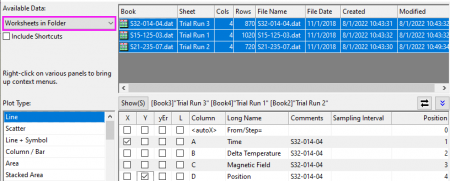
- Let's start with the project we saved in lesson two: Graph Templates and Batch Plotting. Select any workbook, and make sure no data columns are selected. You can click in the gray area outside of columns to remove selection.
- Select menu Plot > Basic 2D: Line. The Plot Setup dialog will open.
- Click the
 button on the right side to expand the upper panel if it is not already open. button on the right side to expand the upper panel if it is not already open.
- Set the Available Data: drop-down list in the left panel to Worksheets in Folder.
 | To pick up worksheets from anywhere in your project, set the drop down to Worksheets in Project.
|
- Hold down shift key and select all three data sheets named Trial Run 1, Trial Run 2 and Trial Run 3.
- Using the check boxes in the middle panel, assign Time as X and Position as Y. Click OK button to create the graph.
| This dialog has a third bottom panel which can be used to assign data to different layers in a multi-layer graph. If that panel is open, you can simply collapse it and then click OK to create the graph.
|
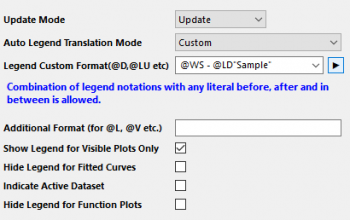
- We will now customize the legend for this graph. Right click on the legend and select Legend: Update Legend...
- In the dialog that opens, set Auto Legend Transition Mode as Custom. Clear the Legend Custom Format (@D, @LU etc) edit box and then click the
 button on the right of this edit box, and in the fly-out menu select @WS: Sheet Display Name. button on the right of this edit box, and in the fly-out menu select @WS: Sheet Display Name.
- In the edit box, type a hyphen - after the string @WS, and again click the right arrow button. This time select @LD"Sample": Sample, which corresponds to column header row Sample in the worksheet. Click the OK button. The legend will now display the sheet name and the sample name.
Using another Column to Set Color of a Plot
- Go to Project Explorer. In the upper panel, right-click on the root level and choose New Folder.
- Right-click on newly created folder, select Rename, and assign the name Data Selection. Click on the empty folder and open it.
- Select Help: Open Folder: Sample Folder... to open the "Samples" folder. In this folder, open the Graphing subfolder and find the file US Mean Temperature.dat. Drag-and-drop this file into Origin workspace to import it into a new worksheet.
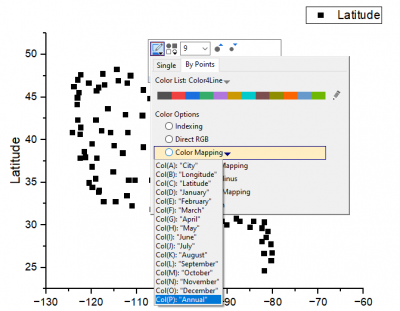
- We want to plot the positions of US major cities (columns Longitude and Latitude) as a scatter plot and then colormap the data points with the annual mean temperature (column Annual). Click on the header of column named January and drag and expand the selection all the way to the column named December. Then right click to choose Hide/Unhide Columns: Hide.
- Select the Longitude columns, in the pop-up mini toolbar, select Set As: X button
 . .
- Select the Latitude and click Scatter button
 on the bottom left toolbar to create the plot of longitude vs. latitude. on the bottom left toolbar to create the plot of longitude vs. latitude.
- Click on the plot, in the pop-up mini toolbar, click the Symbol Edge Color button to expand the color chooser, switch to the By Points tab. In this tab, click the Color Mapping drop-down and select Col(P): "Annual" in the list. The symbol color will be mapped to the column Annual.
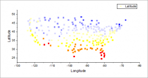
- Let us now set the axes lengths to scale with the range of X and Y values represented in the graph. Click on the white space of the layer to select the layer, in the pop-up mini toolbar, click Isometric button
 . .
| You also can double-click on the white space of the layer to open the Plot Details dialog with the Layer1 node been selected on the left panel. Then go to the Size tab on the right side. Check the Link Axis Length to Scale with X:Y Ratio box and keep the ratio as 1.
|
- Now, let us select another color palette to apply it to the symbol color as colormap. Click on any data point in the graph, and then click on the Palette toolbar button
 in the Style toolbar. Select the Temperature palette to better reflect the data. Click anywhere on the graph to deselect the plot. in the Style toolbar. Select the Temperature palette to better reflect the data. Click anywhere on the graph to deselect the plot.
- From the menu, choose File: Save Project and save your modified project.
Selecting Multiple Non-adjacent Columns for Plotting
- Open a new workbook window by clicking on the New Workbook button
 in the Standard toolbar. in the Standard toolbar.
- Select menu Data: Connect to File: Excel. In the file dialog that opens, browse to <Origin EXE Path>\Samples\Import and Export folder and select the file United States Energy (1980-2013).xls. Press Open.
- In the Excel Import Options dialog that opens, make sure Auto checkbox to the right of Main header lines is checked and Long Names is set to 1 and Units to 2.
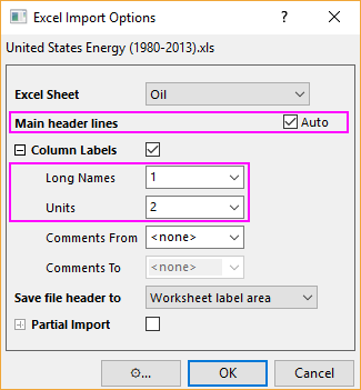
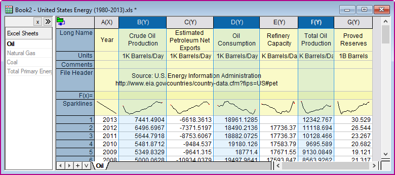
- Press OK to import the file. Then go to the first sheet named Oil. Hold the Ctrl key to select Crude Oil Production, Oil Consumption and Total Oil Production columns.
- Then go to menu Plot > Multi-Panel/Axis: Stack... and accept default settings in the dialog, to create a stacked plot.
- Click Save Project button
 on the Standard toolbar to save your project file. on the Standard toolbar to save your project file.
|