6.2.1 Multiple Axis BreaksMultiple-Axis-Breaks
Summary
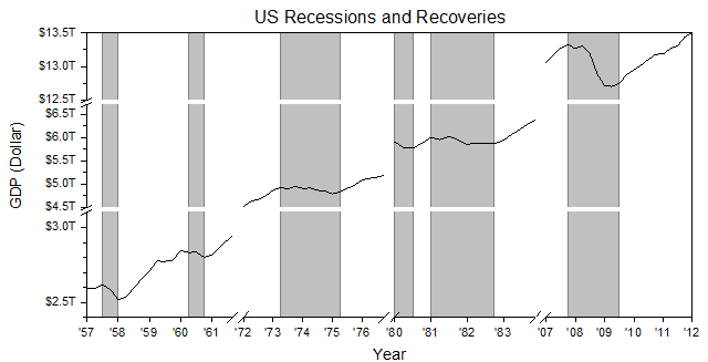
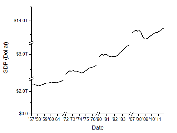
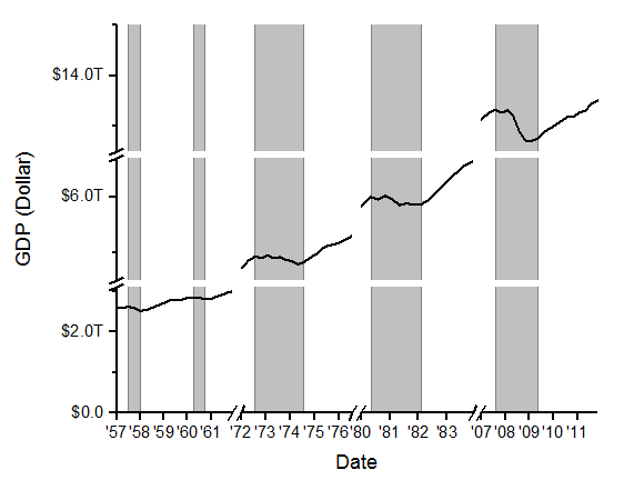
Origin supports multiple breaks on an axis as shown below. The number of breaks and the break positions can be customized in the Axis dialog box. Furthermore, you can add recession bars( the "vertical bars" shown as below) by adding multiple reference lines on the X axis and fill the gaps between them.
Minimum Origin Version Required: 2017 SR0
What you will learn
This tutorial will show you how to:
- Add multiple breaks to both X and Y axes
- Customize axis tick label format
- Fill spans that are broken by missing values vertically
Steps to Customize Label Display and Add Axis Breaks
This tutorial is associated with the Multiple Axis Breaks folder of the sample project <Origin EXE Folder>\Samples\TutorialData.opj.
Also, you can see this graph in Learning Center(Select Help: Learning Center menu or press F11 key). It is listed under the Line and Symbol sample graph table. Double-clicking on the thumbnail will open the target folder.
- Activate the workbook. Highlight Col(A) and Col(B) and select Plot > Basic 2D: Line from the main menu to plot a line graph. Select and delete the legend.
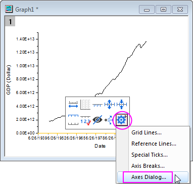
- To customize the graph axes, click on the bottom axis, and then select Axis dialog from the drop-down list of the last button in the Mini toolbar.
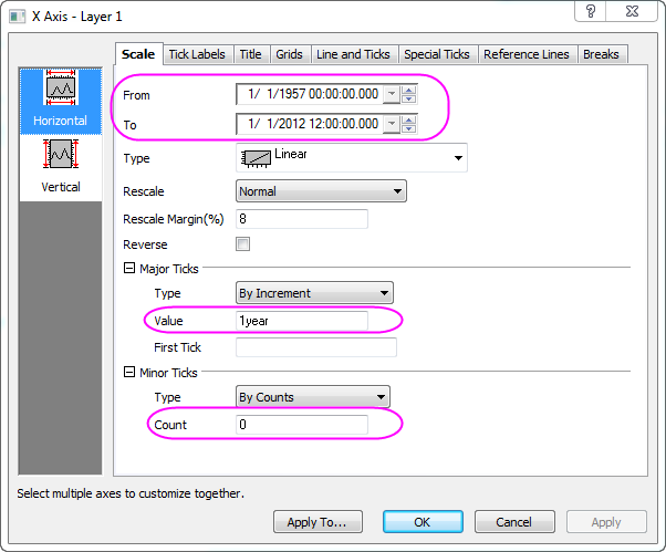
- In the Scale tab for Horizontal axis in the dialog, set the X axis scale as graph below:
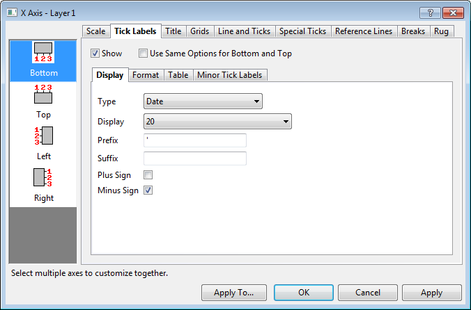
- Go to Bottom icon in Tick Labels tab, change the display format of tick labels to 20 (means year as yy) and add a prefix ' .
- In order to add several breaks to the X axis select the Horizontal icon in Breaks tab . Check the Enable box and set 3 axis breaks.
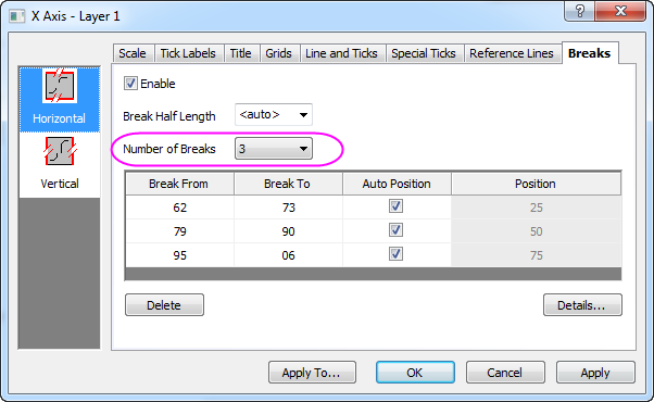
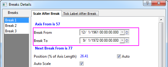
- Click the Details... button to open the Breaks Details dialog, set Break1 from 12/1/1961 to 9/1/1972:
- Select the Break 2 node in the left panel, change it to be from 3/31/1977 to 8/29/1980. Switch to Break 3 node, change it to be from 7/27/1984 to 3/1/2007. Click the OK button to apply and exit the Break Details dialog and in the Axis dialog, click the Apply button to view the changes.
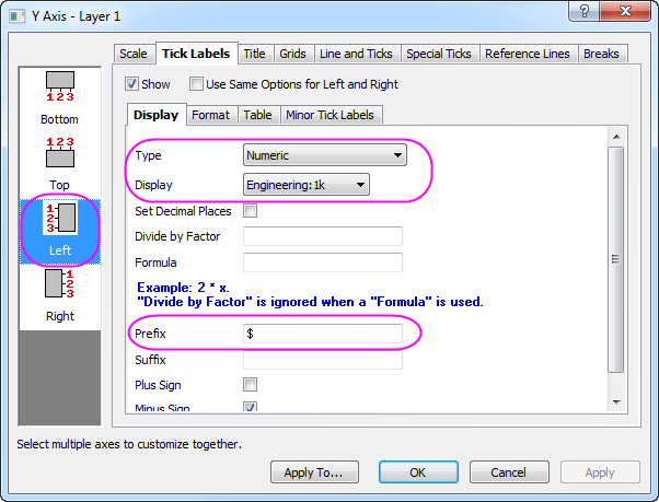
- To customize the Y axis, select the Left icon under the Tick Labels tab and use the format Engineering:1k as the tick label display. Set the prefix as "$". Click Apply to view the changes in the graph.
- Go to the Breaks tab again and with the Vertical tab selected, enable 2 axis breaks at scale value 3.1 T to 4.5T and 6.7T to 12.5T, as we had done for the X axis in Step 4 to 6.
- Click OK to apply the settings and get the graph similar as follows:
 | Once axis breaks are added to the graph axis, you can customize their appearance by clicking on the axis break and using the Mini Toolbar buttons for changing break symbol length, symbol gap, symbol shape, etc.
|
Steps to Add Recession Bars
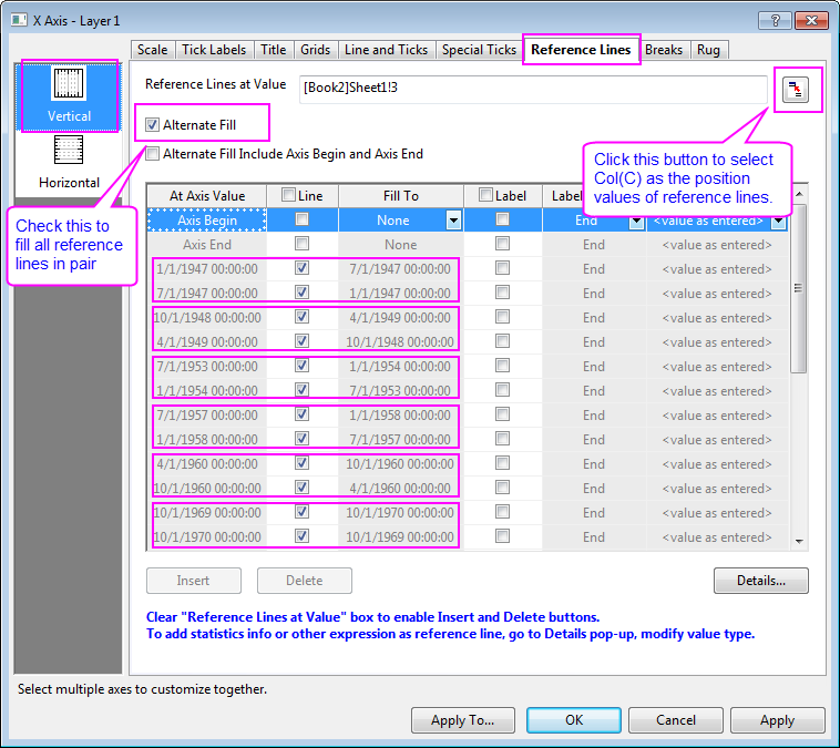
- Double-click on X axis to open the Axis dialog. Go to Reference Lines tab, click the interactive button
 beside the Reference Lines at Value text box to select col(C) from worksheet. The x coordinates of all recession periods will be listed in the display table as reference lines. Then check Alternate Fill box to fill each period. beside the Reference Lines at Value text box to select col(C) from worksheet. The x coordinates of all recession periods will be listed in the display table as reference lines. Then check Alternate Fill box to fill each period.
- Click OK to apply the settings.
More Customization Steps
The following steps can further customize the graph to be exactly the same as the image in Summary.
- Double click X axis title Date in the graph and rename it as Year.
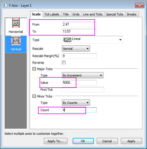
- To change Y axis range, click on the left axis, and then select Axis dialog from the drop-down list of the last button in the Mini toolbar. In the Scale tab for Vertical axis in the dialog, set From, To, Major and Minor ticks as below.
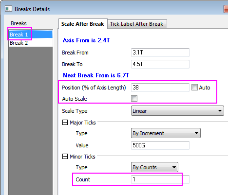
- Go to the Breaks tab again, select the first axis break and click Details to open the Break Details dialog with the Break 1 node selected. Clear the Auto check box next to the break position option and change it to 38%. Clear the Auto Scale check box and then change the tick settings as below:
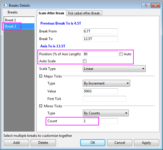
- Select Break 2 node, set break position, Major Ticks and minor ticks as below:
- Click OK to apply and exit the Breaks Details dialog. Click Apply in the Axis dialog to apply settings.
- Select Grids tab. Select both Vertical and Horizontal icons on the left panel, check Opposite to show a frame around top and right axes.
- Right click in a blank area inside graph layer 1 and select Add/Modify Layer Title from the context menu. Enter US Recessions and Recoveries as the layer title.
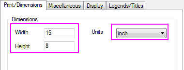
- Adjust the page dimension with Graph node selected in Plot Details dialog.
|