Description
This is a grouped bar chart, with error bars added by co-selecting yEr± datasets when plotting.

With the four columns of data selected and the worksheet active, click Plot:Column/Bar/Pie:Grouped Columns - Indexed Data....
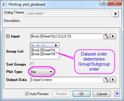
Groups and subgroups are set up in the plot_gindexed dialog box. Dataset order in the Group List box determines which are plotted as main groups and which are plotted as subgroups. The same grouping information is used to build the
tick label tables that appear on the X axis.
To plot horizontal bars instead of vertical columns, set Plot Type to Bar before clicking OK.
Four asterisk bracket objects are added to indicate significant differences. To add an asterisk bracket object to a graph, click the  button on the Add Object to Graph toolbar. Manually manipulate bracket size and position using handles on the bracket object.