Learn how to create this graph
here.
Description:
This graph demonstrates Origin’s ability to set custom tick positions using values stored in a data column. It also demonstrates the display of custom tick labels along a second X-axis using information from another data column.
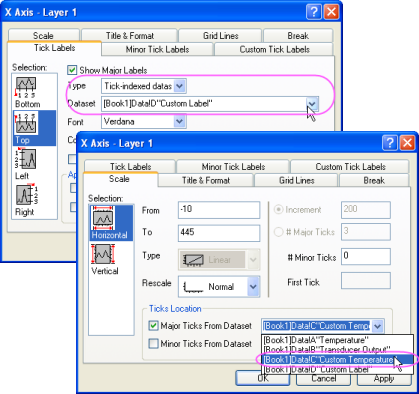
In Origin’s Axis dialog, you can use datasets to specify custom tick locations for major and minor ticks.

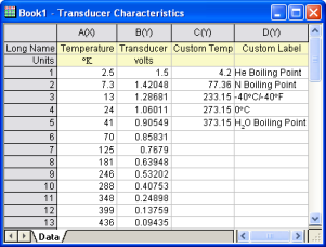
The first two columns contain the X and Y values for the scatter plot. The third column contains the data for the tick locations. The fourth column contains the corresponding tick labels for the top X axis. |
|

In the Scale tab of the Axis dialog, select a dataset to set custom tick locations. In the Tick Labels tab, select another dataset for the tick label text. |