Learn how to create this graph
here.
Description:
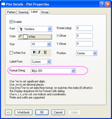
This stacked column plot illustrates the projected racial makeup of the United States through the year 2050. Custom formatting was used to label the columns with percentages.

The Label tab allows you add labels to your data using XY values or other information from your worksheet. When you use this dialog, it is not necessary to designate Label columns. Custom formatting allows you the flexibility to combine and format information from any column in the worksheet.
|