Learn how to create this graph here.
Description:
This figure was submitted by Carol DeSantis, MPH, an epidemiologist working for the American Cancer Society, Inc.
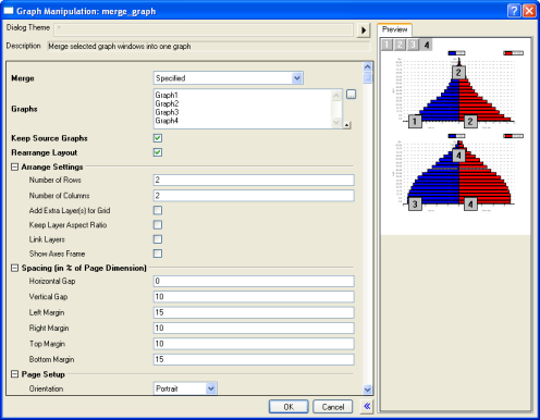
This graph uses four bar chart layers to compare the population of Africa in 2010 to a projection of the African population in the year 2050. Populations are grouped by age in five-year increments, with males on the left side of the Y-axis and females on the right.
You can create a four-layer graph like this by using the Merge Graph tool to merge four bar charts into a single graph window.

The Merge Graph dialog allows you to select which graphs in the project you wish to combine. It also has controls to specify how you want the individual graphs arranged on the new graph window.