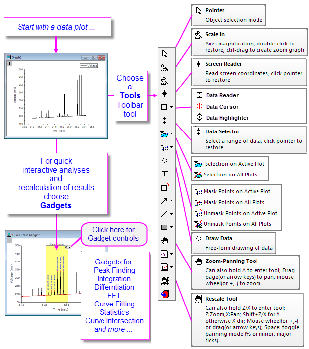
Origin includes a number of tools for graphically exploring your data including those for zooming and panning data plots, reading XY coordinate values and other data point metadata, or highlighting or masking selected data points.
With Origin 2016, OriginLab began releasing add-on tools called Apps. Many exploratory and analysis-related tools have been added to OriginLab's File Exchange since that time. If you find you need some exploratory or analysis tool that is not a standard part of Origin, you might check to see if the tool exists as an App. If it does not, request it!. |
While plot highlighting can be used to select a subset of data for more in-depth analysis, at a basic level it is useful for quick visual comparisons.
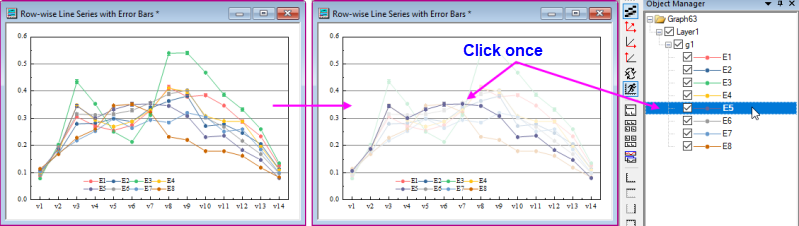
To engage plot highlighting:
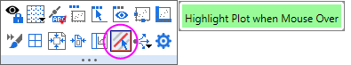
Other Origin features useful for quick visual inspection of data plots:
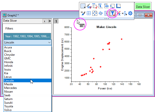
If you are plotting worksheet data where a data filter has been applied, you can enable a Data Slicer panel, make quick changes to filter conditions and see the effect on your plot. The tool is intended for plotting and comparing single categories.
This section discusses the use of toolbar tools, and keyboard and menu commands that change the view of your 2D graph. We have split these tools and commands into two groups:
Page level zoom and pan do not alter the graph; they only determine which portion of the graph page is visible within the graph window. You can read the current zoom level in the Zoom dropdown list of the Standard toolbar. Page-level zoom and pan will not affect the printout or export of the graph. On the other hand, axis rescaling tools (e.g. |
| Action | Button | Shortcut Key | Menu | Notes |
|---|---|---|---|---|
| Zoom-Panning: Zoom and pan the graph page. | A + +/- keys (zoom) or arrow keys (pan) |
Click the toolbar button; or with the Pointer tool
| ||
| Stepped Zoom-Pan†: Zoom graph in or out, by increment. | CTRL + I CTRL + M |
View:Zoom In and View:Zoom Out |
| |
| Whole Page: Show the whole graph page. | CTRL + W |
View: Whole Page |
| |
| Zoom All: All objects in the window are shown. | -- | -- | View: Zoom All |
|
†Notes:These are older tools and methods that have been deprecated. Toolbar buttons are not shown by default. To add them to the workspace, use the Customize Toolbars dialog box (View: Toolbars > Graph button group).
| Action | Button | Shortcut Key | Menu | Notes |
|---|---|---|---|---|
| Rescale: Rescale and pan the graph in both X and Y dimensions. | |
Z + right mouse button and drag vertically(scale in Y)/horizontally(scale in X) | -- |
|
| Rescale the graph in the X dimension. | -- | Z + scroll wheel or |
-- |
|
| Pan the graph in the X dimension. | -- | X + scroll wheel or |
-- |
|
| Rescale X: Rescale the graph in the X dimension. | |
-- | -- |
|
| Rescale the graph in the Y dimension. | -- | SHIFT + Z + scroll wheel or |
-- |
|
| Pan the graph in the Y dimension. | -- | SHIFT + X + scroll wheel or |
-- |
|
| Rescale Y: Rescale the graph in the Y dimension. | |
-- | -- |
|
| Rescale XY: Rescale the graph in both X and Y dimensions. | |
-- |
-- |
|
| Rescale Z: Rescale the graph in the Z dimension. | |
-- |
-- |
|
| Scale In/Scale Out: Rescale the graph in X and Y dimensions. | -- | -- |
| |
| Rescale: Rescale the graph in the all dimensions. | |
CTRL + R | Graph: Rescale to Show All |
|
| 3D Graphs | ||||
| Rescale in the X dimension. | -- | Z + scroll wheel | -- | If the plot extends beyond the 3D frame, go to Plot Details > Miscellaneous tab (layer level) and set controls under Clipping. |
| Rescale in the Y dimension. | -- | SHIFT + Z + scroll wheel | -- | |
| Rescale in the Z dimension. | -- | D + scroll wheel | -- | |
|
This openGL toolbar that previously displayed when a 3D layer was selected, has been replaced by layer-level Mini Toolbar buttons. |
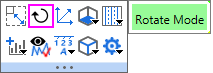
When you click inside the layer of a 3D graph, the layer is selected and a Mini Toolbar appears. Click the Rotate Mode button to enter rotation mode; then use one of the hotkey/mouse combinations listed below; or drag the radial rotation handles in the graph with your mouse.
| Hot Key | Menu/Action | Context |
|---|---|---|
| Rotate 3D graphs with the 3D floating buttons | ||
| X + Arrow key | Rotate the 3D graph around the X axis. | With graph layer active and with Rotate Mode button selected in the 3D floating button group. |
| Y + Arrow key | Rotate the 3D graph around the Y axis. | |
| Z + Arrow key | Rotate the 3D graph around the Z axis. | |
| Q + Arrow key | Rotate the 3D graph in screen. | |
| W + Arrow key | Rotate the 3D graph around any axes. | |
| Rotate 3D graphs using R key | ||
| R + Mouse | Drag to rotate the 3D graph in an arbitrary direction. | Press "R" before pressing other keys. Hovering on a 3D graph while pressing "R" changes the Pointer tool |
| R + Ctrl + Mouse/Arrow key | Rotate the 3D graph around the X axis. | |
| R + Shift + Mouse/Arrow key | Rotate the 3D graph around the Y axis. | |
| R + Ctrl + Shift + Mouse/Arrow key | Rotate the 3D graph around the Z axis. | |
Origin provides several tools to aid in labeling and graphical exploration of your data plots. Most of these tools are available from the Tools toolbar (View: Toolbars). There is a related tool -- Vertical Cursor -- available from the Gadgets menu.
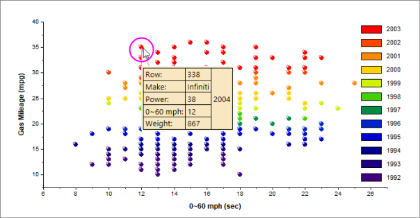
Most 2D plot types, 3D Scatter, XYY Bar and XYZ Bar plots support a floating, customizable tooltip that reads data point values when you hover on a data point.
Tooltip Shortcut Menu
For tooltip customization and other options, right-click directly on the data point tooltip.
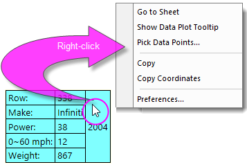
The Data Point Tooltip dialog is a slightly simpler version of the Data Info window's preferences dialog (Data Info Report Settings). See The Data Info Window for help with customizing your Data Point Tooltip.
By default, the Data Point Tooltip displays with a moderate degree of transparency. You can affect tooltip transparency by changing the value of LabTalk System Variable @TDT. For information on changing the value of a LabTalk System Variable, see this FAQ. |
There is a second tooltip that can be displayed in place of the Data Point Tooltip and this we refer to as the Data Plot Tootip. This non-customizable tooltip displays the source book, worksheet and coordinate datasets, on hover.
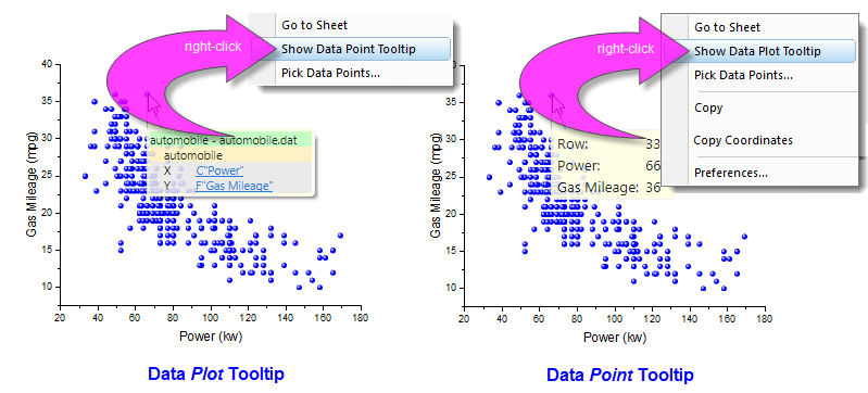
The Data Point Tooltip displays by default. If you prefer to use the Data Plot Tooltip, right-click on the Data Point Tooltip and choose to Show Data Plot Tooltip. Conversely, right-click on the Data Plot Tooltip and choose Show Data Point Tooltip.
You can turn off display of data tooltips by activating the graph window, clicking on the View menu and clearing the check mark beside Data Tooltips.
There is a second way to control tooltip display that is more complicated but allows a greater degree of control. This entails changing the value of LabTalk system variables @PT and @PTI.
@PT=0; //Disable both data plot and data point tooltips
@PT=1; //Enable data plot tooltips for 2D graph
@PT=2; //Enable data plot tooltips for 3D OpenGL graph (default)
@PT=3; //Enable data plot tooltips for both 2D graph and 3D OpenGL graph
@PTI=0; //Disable only data point tooltips
@PTI=1; //Enable data point tooltips (default)
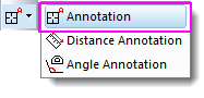
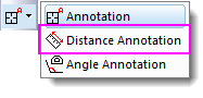
The Annotation tool shares a "split-button" with the Distance Annotation and Angle Annotation tools.
Use the Annotation tool to label a data point. The tool works with Symbol/Line+Symbol and Column/Bar plots. Choose from several standard data point labels or create your own custom label using LabTalk script.
To annotate a data point:
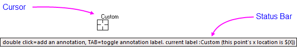
Tutorial: Customizing the Annotation String The annotation string can be customized by combining literal characters with the X and Y coordinate values:
|
Adjustments using the Pointer Tool:
| Note: Please view more information on string formatting in the Programming help file:
Help: Programming: LabTalk > Language Reference > Object Reference > Alphabetical Listing of Objects > String |
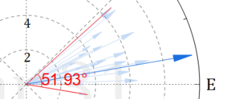
The Screen Reader ![]() uses the Data Display window to report the XY(Z) coordinates of the cursor on the graph page. Note that the Screen Reader is not reading data point coordinates; rather it is reading page coordinates relative to the graph axes.
uses the Data Display window to report the XY(Z) coordinates of the cursor on the graph page. Note that the Screen Reader is not reading data point coordinates; rather it is reading page coordinates relative to the graph axes.
The Data Display window opens automatically when you select the Screen Reader tool from the Tools toolbar (by default, the Data Display window is docked at the bottom of your Origin workspace).
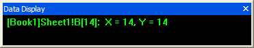
You can alter basic properties of the Data Display window by right-clicking on the window title bar or by right-clicking inside the window.
To use the Screen Reader:
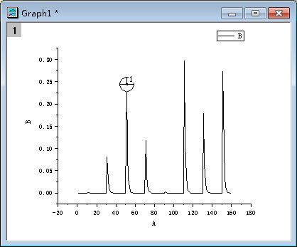
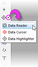
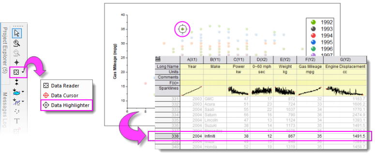
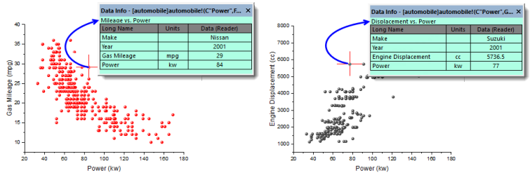
The Data Reader ![]() is used to read information associated with a data point in your plot. This could be coordinate values or it could be more complex information including metadata or even images that relate to the data point. The Data Reader works in concert with the customizable Data Info window.
is used to read information associated with a data point in your plot. This could be coordinate values or it could be more complex information including metadata or even images that relate to the data point. The Data Reader works in concert with the customizable Data Info window.
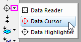
The Data Reader tool is grouped with two related tools -- the Data Cursor ![]() and the Data Highlighter
and the Data Highlighter ![]() . Only one of these toolbar buttons will show at any given time. To select a hidden tool, click on the small arrow to the right of the button and select a tool from the pop-up menu.
. Only one of these toolbar buttons will show at any given time. To select a hidden tool, click on the small arrow to the right of the button and select a tool from the pop-up menu.
You can zoom into the graph while using the Data Reader. While the tool is active, press CTRL and use your mouse wheel to zoom in or out on the page. |
To use the Data Reader tool:
There are a number of system variables that control Arrow key acceleration and data-increment for the Data Reader. For more information, see the summary table in Reading Coordinate Values in the Graph. |
The Data Cursor tool -- grouped on the Tools toolbar with the Data Reader tool -- allows you to place one or more cursors on a data plot and (using the Data Info window) read the cursor coordinates or measure the X and Y distance between two cursors, or the distance between a cursor and a point selected with the Data Reader.
Tutorial: Using the Cursor Tool to Measure Relative Distance
|
The Distance Annotation tool ![]() shares a Tools toolbar "split-button" with the Annotation and Angle Annotation tools.
shares a Tools toolbar "split-button" with the Annotation and Angle Annotation tools.
Use the Distance Annotation tool for drawing a scale-labeled, double-headed arrow between two points on a 2D graph.
The Angle Annotation tool ![]() shares a Tools toolbar "split-button" with the Annotation and Distance Annotation tools.
shares a Tools toolbar "split-button" with the Annotation and Distance Annotation tools.
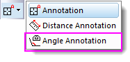
Use the Angle Annotation tool to draw and label an interior angle of < 180°.
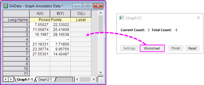
The Data Highlighter is grouped on the Tools toolbar with the Data Reader and Data Cursor tools. Use the Data Highlighter to pick one or more points in the your graph and simultaneously highlight the corresponding data row in the worksheet. Unselected points are dimmed in the graph and the worksheet.
While in Data Highlighter mode ...
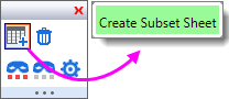
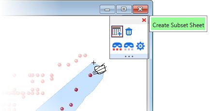
Some users did not know about ESC'ing (Highlight mode) in the graph window and found that when trying to plot selected data in the worksheet, the Plot Setup dialog opened. In this case, you can skip pressing the ESC key by setting system variable @QDHT=1. This will allow you to go directly to the worksheet and directly plot the highlighted data. Another option, is to use the graph window's Create Subset Sheet Mini Toolbar button to output selected points to a new worksheet. |
When the Data Highlighter is active, a Mini Toolbar displays at the upper-right corner of the graph or worksheet window. The toolbar has buttons to Create Subset Sheet, Delete Points, Mask/Unmask Highlighted Points or Dimmed Points; plus a Highlighter Properties for configuring how to pick and collate data from multiple worksheets.
How to Pick Points Plotted from Multiple Sheets
Use this method for picking a subset of points from a graph window containing plots from multiple worksheets, and adding them to a single sheet:
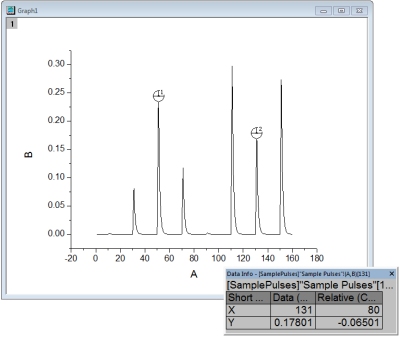
The Data Info window opens when you choose either the Data Reader ![]() , the Annotation
, the Annotation ![]() or the Data Cursor tools
or the Data Cursor tools ![]() . When you click on a plotted data point with one of these tools, the Data Info window displays information about this particular data point.
. When you click on a plotted data point with one of these tools, the Data Info window displays information about this particular data point.
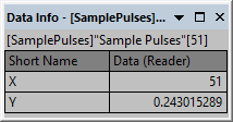
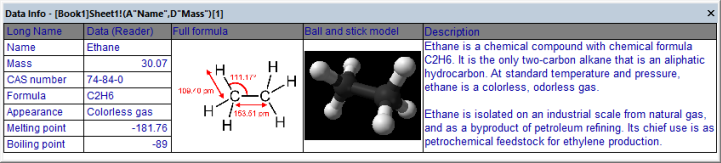
In its default configuration, the Data Info window reports only a column short name, plot designation (e.g. "X") and the XY coordinate values of a data point. However, the window is capable of displaying any of the worksheet-contained information that is associated with a data point including metadata and images.
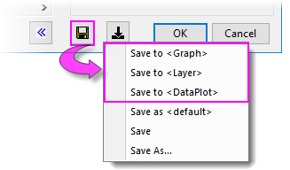
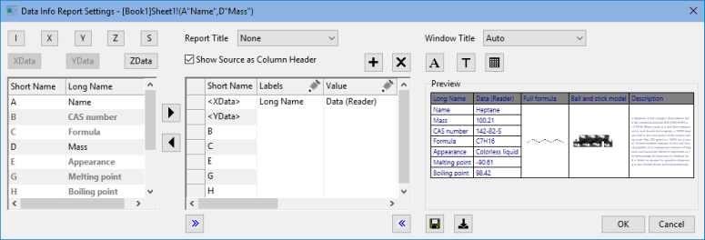
To customize the Data Info window:
If you save your Data Info Theme settings in the graph, then save the graph window as a standalone graph window file (OGG, OGGU), know that the OGG/OGGU file travels only with the data that are plotted in the graph. Therefore, if your Data Info Theme uses data in other columns in your worksheet, the Data Info display will be incomplete if, for instance, you reopen the window file in a new project. |
For more information on customizing the Data Info window, see:
Origin provides several Gadgets for data exploration and analysis. These gadgets are accessible from the Gadgets menu when a graph window is active. Three gadgets in particular are suitable for data exploration:
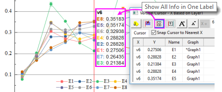
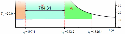
The Vertical Cursor gadget is especially useful for reading XY coordinate values for data points in stacked panel plots or multi-plot graphs, where plots share a common X scale.
To open the Vertical Cursor:
Using the controls in this Gadget's dialog box, you can add data labels to the graph, increase or decrease label font size, hide labels, etc.
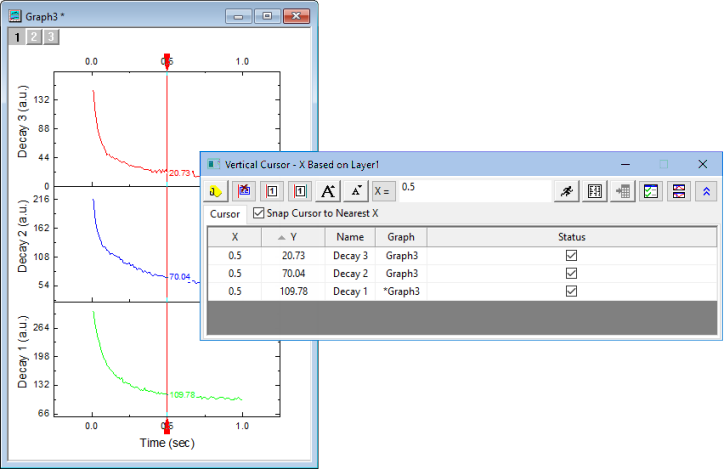
When labeling plots with the Vertical Cursor, you can opt to combine separate data labels into a single label by clicking the gadget's Show All Info in One Label button. |
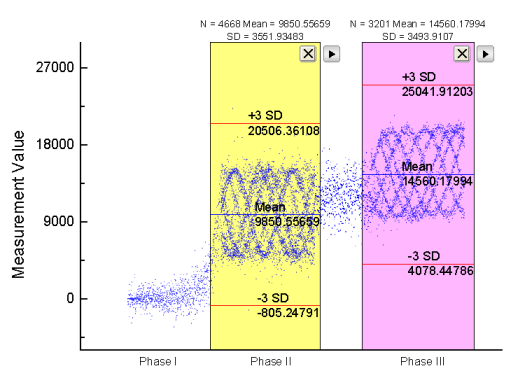
The Statistics gadget returns basic statistics on data points falling inside a rectangular region-of-interest (ROI) on the graph.
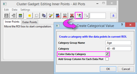
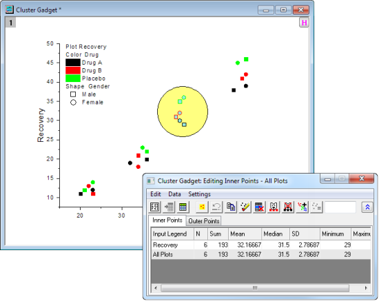
The Cluster gadget (available in OriginPro) provides the following features:
When you use the Cluster gadget to define a category (points within a ROI on a plot), you can apply a differentiating color to points within the ROI. |
| Note: To learn more about these gadgets, see:
Help: Origin: Origin Help > Gadgets |
This section discusses methods of graphically creating and modifying data plots.
This collection of tools and menu-driven operations is helpful in exploring certain "what if" scenarios, or to quickly generate some data for purposes such as testing a fitting function. These procedures work only with 2D scatter plots.
Move data point in graph will change the underlying data in worksheet. For data imported with data connector, by default it's locked with the external data and therefore unmovable. You would need to click the data connector icon and unlock imported data, disconnect sheet, or fully remove data connector before moving data points in graph. Then do the following :
The data point is moved in the plot and the X and Y coordinates are changed in the worksheet cell.
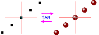
By default, Move Data Points function caused scatter points to revert to the template's default style. You can press the TAB key to toggle between default symbol and customized symbol. |
You can delete individual data points from your graph:
The data point is deleted from both the data plot and the worksheet cell. In the worksheet, only the data cell for the Y value will be cleared and shown as missing value.