29.10.2 Grouped Columns
grouped-column-index-data
Data Requirements
You need to have at least one Y column as input data. Optionally, you can have an additional associated Y error column for each Y column. Another column provides grouping information.
Creating the Graph
Open the plot_gindexed dialog by one of three methods:
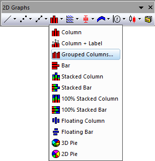
- Select Plot > Categorical: Grouped Columns... menu items
- Click the
 button in the 2D Graphs toolbar
In the dialog that opens, select the input data range. Add at least one group column and determine where to put the calculated data. You can then generate a grouped column plot.
You can refer to the section below for the detailed dialog controls:
The plot_gindexed Dialog Box

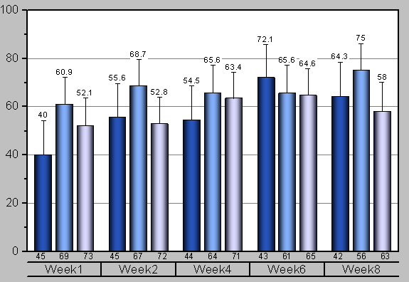
In this example, all sales data will be plotted as bars against the groups(on X axis) selected in Group Columns.

In this example, the mean values of height and weight data will be plotted as bars against the groups(on X axis) selected in Group Columns.
For Summarized Data
By default, the Data Form has been set to Summarized Data. This mean the input data is indexed data.
| Data Column(s)
|
This branch is used to specify the input data.
|
| Group Column(s)
|
Choose the grouping column(s).
|
| Label
|
Check this box to select a column or multiple columns as label column(s).
For the graph with multiple input data columns, if only one label column has been selected, all these plots share same label column; if the same number of label columns have been selected, each plot will has its label column in the order of selection.
|
| Graph Arrangement
|
- Multiple Data :Choose how to arrange the multiple input data.
- Overlay on Same Graph: Plot the seleted input data as overlapping plots on the same graph layer.
- Seperate Layers on Same Graph:Plot the seleted input data into seperate layers on the same graph layer.
- Seperate Graphs:Plot the seleted input data on the seperate graph windows.
- Split Panels by: Once this check box has been checked, you can select another grouping column to enable horizontal panels which show a grouped column plot for each grouping value seperately. Wrap Panels will be enabled, ticks and labels will be shown on alternate sides by default. When there are multiple columns selected, only one panel info label row will be shown on top, panel banner string will include all factors and separated by comma.
- Split Pages by: Once this check box has been checked, you can select other grouping column(s) to split the input data and created grouped columns in different graph pages. Each page only plots the columns within the same page related group. Page related group info will be shown in layer title, separated by comma if there are multiple factors. Report graph sheet will list all pages.
|
| Plot Type
|
Specify the plot type, column plot, bar plot or scatter.
|
| Stack
|
Specify whether to stack the columns/bars when multiple input variables overlay in same graph. You can choose Side by Side, Stacked or 100% Stacked. This option is not avaiable for Plot Type being Scatter.
|
| Graph Template
|
Specify a user template if needed. By default, the Auto check box is checked and the built-in template GBOX is used.
|
| Output Data
|
Specify where to output the calculated data.
|
| Output Graphs
|
Specify which sheet the result graphs is output to.
|
In addition, you can preview the final graph in this dialog.
| Note: In order not to sort the grouping range with default alphabetical order, set it(them) as categorical and modify the orders in the Categories tab.
|
For Raw Data
If you choose Raw Data for Data Form dropdown list, two options about statistics will appear to let you specify which statistic information of selected Input data will be shown as columns or bars and their error bars; and another option Stack Data will show up for Column and Bar plot type, which is used to specify the data to stack.
- Bar Statistic: You can choose one kind of statistical values to be shown as columns or bars. There are Mean, N, N Missing, Median, Min, Max, Sum, SD, Geometric Mean, Harmonic Mean and Variance available under the drop-down list.
- Error Bar Statistic: You can choose one kind of statistical values to be shown as error bars for the columns or bars. There are None, SD, SE of Mean, 95% CI of Mean, 10%-90%, 5%-95%, 1%-99%, Q1-Q3, Min-Max and Median Absolute Deviation available under the drop-down list.
- Stack Data: Specify the data to stack. When Variables is selected, stack columns by input variables for each subset in layer level cumulatively. When Last Group is selected, stack columns by last group column. Note: Stack last group is only supported when the number of group columns is greater than 1.
Other options are same as that of Summarized Data.
Examples

|
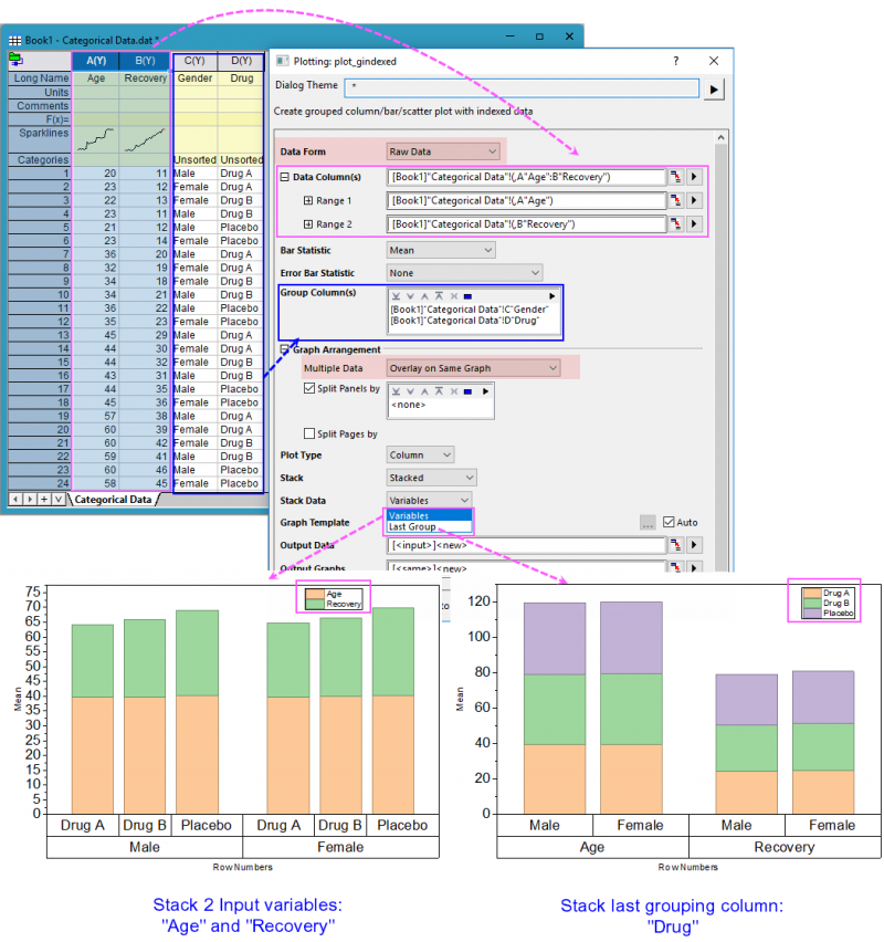
- Create a new workbook and click the
 button to import the Categorical Data.dat file under <Origin EXE Folder>\Samples\Graphing path. button to import the Categorical Data.dat file under <Origin EXE Folder>\Samples\Graphing path.
- Highlight column B and select Plot > Categorical: Grouped Columns... from top menu to open the plot_gindexed dialog.
- In the Group Column(s) section, click the Add button
 in the top right corner and add column D as the first grouping range, then similarly add column C as the second grouping range. in the top right corner and add column D as the first grouping range, then similarly add column C as the second grouping range.
- Click OK to output the plot data and graphs into the newly generated sheets.
|
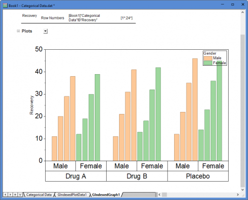
 | For a more extensive tutorial, you can try Grouped Column with Error Bars and Data Labels. The tutorial addresses such things as Fill Pattern and the use and customization of tick label tables (seen in the above graph) for labeling the X axis.
|
Template
gColumn.otpu
(installed to the EXE folder of Origin)
Notes
- If there is more than one grouping range (in the Group Column(s) box), X axis tick labels will, by default, display as tables. You can control this behavior and formatting of the tick labels table, in general, by opening the Table tab in the Tick Labels tab of the Axis dialog.
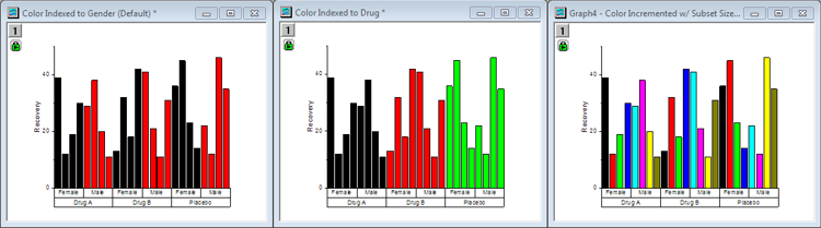
- By default, this plot uses Indexing to apply fill color, but there are other options. The following figure shows three variations of the same graph, the difference being in the way that color is applied to the bars:
- In the graph on the left, bar color is indexed to subgroup (Gender). This is the default and should work for most situations including unbalanced plots.
- In the middle graph, bar color is indexed to main group (Drug).
- In the graph on the right, bar color is set to increment, with subset size of 8.
- For more information, see:
- You can modify the spacing between columns or column groups using controls on the Spacing tab of Plot Details as well.
- If you want to create a grouped bar plot, just change the Plot Type to Bar in the plot_gindexed dialog. Alternately, you can create a grouped column plot using the menu command, then choose Graph: Exchange X-Y Axis.
- If you want to created a grouped scatter plot, just change the Plot Type to Scatter in the plot_gindexed dialog. The source data will be sugrouped according to your Grouping column.
Version Information
| Minimum Version: Origin 9.1
|
Last Update: Origin 2026
|