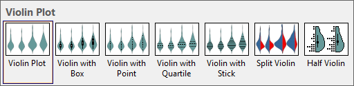
Origin supports seven violin plot graph template, you can create these violin graph type by the memu directly.
To create a violin plot:
Each Y column of data is represented as a separate violin plot. The column names or labels supply the X axis tick labels.
To customize the violin plot display:
or
Both actions open the Plot Details dialog with the violin data plot icon active on the left side of the dialog. The violin plot controls are available on tabs on the right side of the dialog.

For more information on Box Chart customizations, see the following topics:
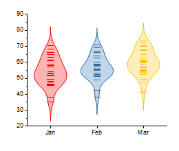
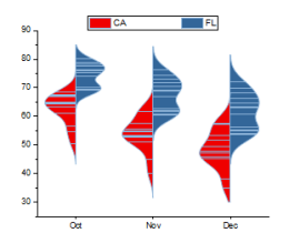
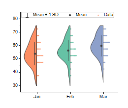
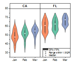
Several box chart examples are displayed below. All examples were created from the data in Violin Plots - Horizontal Split Violin file, in the ‘Help: Learning Center: Graph Sample’. The table references datasets (columns) in the US Mean Temperature worksheet and lists customizations made in the graph's Plot Details dialog box.
|
Plotted from Col(D) through Col(F) Menu Entry: |
Distribution tab:
|
|
Plotted from Col(M) through Col(P) Menu Entry: |
Box tab:
|
|
Plotted from Col(D) through Col(F) Menu Entry: |
Box tab:
|
|
Plotted from Col(D) through Col(F) Menu Entry: |
Panel tab:
|