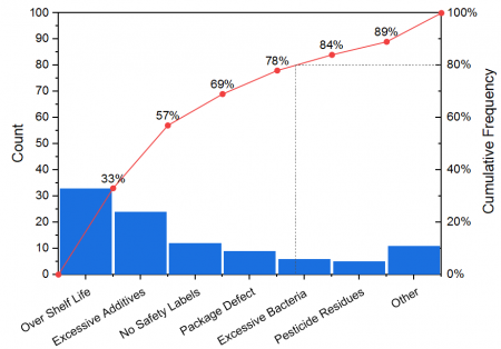
The pareto chart is a special type of bar chart accompanied with a line+scatter graph. Typically, the vertical bars, whose heights reflect the frequency or impact of problems, are in descending order of significance and the line+scatter graph is ascending monotonously.
Pareto charts can be used to identify factors that have the greatest cumulative effect on the system. Thus, it is helpful in screening out the less significant factors in an analysis.
According to the different source data, Origin supports to create these two Pareto Charts:
If you have already had binned data, you can create a pareto chart from it by using the Plot > Statistical: Pareto: Pareto Chart - Binned Data menu command, or click the Pareto Chart - Binned Data button ![]() on the 2D Graphs toolbar. This will bring up the plot_paratobin dialog.
on the 2D Graphs toolbar. This will bring up the plot_paratobin dialog.

If you have raw data, you can create a pareto chart from it by using the Plot > Statistical: Pareto: Pareto Chart - Raw Data menu command, or click the Pareto Chart - Raw Data button ![]() on the 2D Graphs toolbar. This will bring up the plot_paratoraw dialog.
on the 2D Graphs toolbar. This will bring up the plot_paratoraw dialog.

Specify whether to show the cumulative percent as a line+scatter plot on the Pareto chart.
Specify whether show the scatter symbol at the right side of bar. Note: This line+scatter plot will start from the Origin(0,0) and put the scatter point at the right-side of bar if you checked this check box.

Specify whether to combine the data of which the counts are below a threshold.

Enable the combination of specified smaller count values.
Specify how to define the threshold value: By Percent, By Count or By Bar Number.
Enter the threshold value according to the selection of Threshold drop-dwon list.
Enter a label text for the combination bar.